
 数据结构
数据结构 网络
网络 关系数据库管理系统 (RDBMS)
 操作系统
操作系统 Java
Java MS Excel
 iOS
iOS HTML
HTML CSS
CSS Android
 Python
 C语言编程
C语言编程 C++
C++ C#
C# MongoDB
 MySQL
MySQL Javascript
 PHP
PHP 物理学
物理学 化学
化学 生物学
生物学 数学
数学 英语
英语 经济学
经济学 心理学
心理学 社会学
社会学 时尚研究
时尚研究 法学研究
法学研究使用HTML和CSS创建玻璃质感登录表单
本文将向您展示如何使用HTML和CSS设计一个玻璃质感登录表单。玻璃质感是一种流行的UI设计趋势,它基于磨砂玻璃效果,使元素看起来半透明,并带有模糊的背景。
在本文中,我们将使用HTML和CSS创建一个玻璃质感登录表单。
什么是玻璃质感?
玻璃质感是一种UI设计风格,它使元素具有磨砂玻璃效果。
- 模糊背景:创建玻璃状的磨砂效果。
- 透明度:允许部分背景显示。
- 浅色边框和阴影:增加深度并定义形状。
在本文中,我们将了解如何使用HTML和CSS创建一个玻璃质感登录表单。
使用HTML和CSS创建玻璃质感登录表单
我们将遵循三个步骤。
创建HTML结构
我们首先构建登录表单的结构。我们使用单个容器来容纳用户名和密码输入字段以及提交按钮。
<!DOCTYPE html>
<html lang="en">

<head>
    <meta charset="UTF-8">
    <meta name="viewport" content="width=device-width, initial-scale=1.0">
    <title>Glassmorphism Login Form</title>
    <link rel="stylesheet" href="styles.css">
</head>

<body>
    <div class="glass-container">
        <h2>Login</h2>
        <form>
            <input type="text" class="input-field" placeholder="Username" required>
            <input type="password" class="input-field" placeholder="Password" required>
            <button type="submit" class="btn">Login</button>
        </form>
    </div>
</body>

</html>
解释
- 容器包含表单并将其居中于页面。
- `glass-form` 类为表单提供了特定的类来应用玻璃质感样式。
- 在表单内,我们有一个标题(h2)、两个输入字段(用于用户名和密码)和一个提交按钮。
使用CSS设计表单
* {
     margin: 0;
     padding: 0;
     box-sizing: border-box;
     font-family: Arial, sans-serif;
}
/* Background Animation */
 body {
     display: flex;
     justify-content: center;
     align-items: center;
     height: 100vh;
     background: linear-gradient(135deg, #ff8a00, #da1b60);
     overflow: hidden;
}
/* Background Gradient Animation */
 body::before {
     content: '';
     position: absolute;
     width: 200%;
     height: 200%;
     top: -50%;
     left: -50%;
     background: linear-gradient(135deg, #ff8a00, #da1b60, #fcb045, #e91e63);
     background-size: 400% 400%;
     z-index: -2;
     animation: gradient-animation 8s ease infinite;
}
 @keyframes gradient-animation {
     0% {
         background-position: 0% 50%;
    }
     50% {
         background-position: 100% 50%;
    }
     100% {
         background-position: 0% 50%;
    }
}
/* Glass Effect Container */
 .glass-container {
     position: relative;
     width: 350px;
     padding: 40px;
     background: rgba(255, 255, 255, 0.1);
     border-radius: 15px;
     box-shadow: 0 8px 32px rgba(0, 0, 0, 0.4);
     backdrop-filter: blur(15px);
     -webkit-backdrop-filter: blur(15px);
     border: 1px solid rgba(255, 255, 255, 0.2);
}
/* Heading Styling */
 .glass-container h2 {
     text-align: center;
     color: #fff;
     margin-bottom: 20px;
     font-size: 1.8em;
}
/* Input Styling */
 .input-field {
     width: 100%;
     padding: 12px 10px;
     margin: 15px 0;
     border: none;
     outline: none;
     background: rgba(255, 255, 255, 0.15);
     color: #fff;
     font-size: 1em;
     border-radius: 5px;
     transition: 0.4s ease;
}
/* Focused Input Field Effect */
 .input-field:focus {
     background: rgba(255, 255, 255, 0.3);
     box-shadow: 0 4px 8px rgba(0, 0, 0, 0.3);
     transform: scale(1.02);
}
/* Button Styling */
 .btn {
     width: 100%;
     padding: 12px;
     margin-top: 20px;
     background: linear-gradient(135deg, #ff8a00, #da1b60);
     border: none;
     border-radius: 5px;
     color: #fff;
     font-size: 1em;
     cursor: pointer;
     transition: all 0.4s ease;
     text-shadow: 0px 0px 5px rgba(0, 0, 0, 0.5);
}
/* Glowing Button Hover */
 .btn:hover {
     background: linear-gradient(135deg, #e91e63, #ff8a00);
     box-shadow: 0 0 15px rgba(255, 138, 0, 0.6), 0 0 15px rgba(234, 30, 99, 0.6);
     transform: scale(1.05);
}
/* Placeholder Styling */
 ::placeholder {
     color: rgba(255, 255, 255, 0.7);
     opacity: 0.9;
}
 * {
     margin: 0;
     padding: 0;
     box-sizing: border-box;
     font-family: Arial, sans-serif;
}
/* Background Animation */
 body {
     display: flex;
     justify-content: center;
     align-items: center;
     height: 100vh;
     background: linear-gradient(135deg, #ff8a00, #da1b60);
     overflow: hidden;
}
/* Background Gradient Animation */
 body::before {
     content: '';
     position: absolute;
     width: 200%;
     height: 200%;
     top: -50%;
     left: -50%;
     background: linear-gradient(135deg, #ff8a00, #da1b60, #fcb045, #e91e63);
     background-size: 400% 400%;
     z-index: -2;
     animation: gradient-animation 8s ease infinite;
}
 @keyframes gradient-animation {
     0% {
         background-position: 0% 50%;
    }
     50% {
         background-position: 100% 50%;
    }
     100% {
         background-position: 0% 50%;
    }
}
/* Glass Effect Container */
 .glass-container {
     position: relative;
     width: 350px;
     padding: 40px;
     background: rgba(255, 255, 255, 0.1);
     border-radius: 15px;
     box-shadow: 0 8px 32px rgba(0, 0, 0, 0.4);
     backdrop-filter: blur(15px);
     -webkit-backdrop-filter: blur(15px);
     border: 1px solid rgba(255, 255, 255, 0.2);
}
/* Heading Styling */
 .glass-container h2 {
     text-align: center;
     color: #fff;
     margin-bottom: 20px;
     font-size: 1.8em;
}
/* Input Styling */
 .input-field {
     width: 100%;
     padding: 12px 10px;
     margin: 15px 0;
     border: none;
     outline: none;
     background: rgba(255, 255, 255, 0.15);
     color: #fff;
     font-size: 1em;
     border-radius: 5px;
     transition: 0.4s ease;
}
/* Focused Input Field Effect */
 .input-field:focus {
     background: rgba(255, 255, 255, 0.3);
     box-shadow: 0 4px 8px rgba(0, 0, 0, 0.3);
     transform: scale(1.02);
}
/* Button Styling */
 .btn {
     width: 100%;
     padding: 12px;
     margin-top: 20px;
     background: linear-gradient(135deg, #ff8a00, #da1b60);
     border: none;
     border-radius: 5px;
     color: #fff;
     font-size: 1em;
     cursor: pointer;
     transition: all 0.4s ease;
     text-shadow: 0px 0px 5px rgba(0, 0, 0, 0.5);
}
/* Glowing Button Hover */
 .btn:hover {
     background: linear-gradient(135deg, #e91e63, #ff8a00);
     box-shadow: 0 0 15px rgba(255, 138, 0, 0.6), 0 0 15px rgba(234, 30, 99, 0.6);
     transform: scale(1.05);
}
/* Placeholder Styling */
 ::placeholder {
     color: rgba(255, 255, 255, 0.7);
     opacity: 0.9;
}
解释
这里我们只解释了关键的CSS属性。
- 背景动画:::before伪元素在玻璃容器后面创建平滑的渐变动画,增加了动态视觉效果。
- 背景滤镜:backdrop-filter: blur(15px) 属性将磨砂玻璃模糊效果应用于容器。
- 透明度 (RGBA):我们使用rgba(255, 255, 255, 0.1)作为背景颜色,它结合了透明度和白色,营造出玻璃状的半透明外观。
- 输入字段焦点效果:当用户点击输入字段时,轻微的缩放和阴影效果增强了交互性,使用了transform: scale(1.02) 和 box-shadow。
- 按钮悬停辉光:登录按钮在悬停时使用渐变和阴影效果,创建柔和的光晕以吸引注意力。
完整代码(HTML & CSS)
<!DOCTYPE html>
<html lang="en">

<head>
    <meta charset="UTF-8">
    <meta name="viewport" content="width=device-width, initial-scale=1.0">
    <title>Portfolio and Login Page</title>
    <style>
        /* Reset */

        * {
            margin: 0;
            padding: 0;
            box-sizing: border-box;
            font-family: Arial, sans-serif;
        }

        /* Background Animation */

        body {
            display: flex;
            justify-content: center;
            align-items: center;
            height: 100vh;
            background: linear-gradient(135deg, #ff8a00, #da1b60);
            overflow: hidden;
            flex-direction: column;
        }

        /* Background Gradient Animation */

        body::before {
            content: '';
            position: absolute;
            width: 200%;
            height: 200%;
            top: -50%;
            left: -50%;
            background: linear-gradient(135deg, #ff8a00, #da1b60, #fcb045, #e91e63);
            background-size: 400% 400%;
            z-index: -2;
            animation: gradient-animation 8s ease infinite;
        }

        @keyframes gradient-animation {
            0% {
                background-position: 0% 50%;
            }
            50% {
                background-position: 100% 50%;
            }
            100% {
                background-position: 0% 50%;
            }
        }

        /* Glass Effect Container */

        .glass-container {
            position: relative;
            width: 350px;
            padding: 40px;
            background: rgba(255, 255, 255, 0.1);
            border-radius: 15px;
            box-shadow: 0 8px 32px rgba(0, 0, 0, 0.4);
            backdrop-filter: blur(15px);
            -webkit-backdrop-filter: blur(15px);
            border: 1px solid rgba(255, 255, 255, 0.2);
            margin-bottom: 20px;
        }

        /* Heading Styling */

        .glass-container h2 {
            text-align: center;
            color: #fff;
            margin-bottom: 20px;
            font-size: 1.8em;
        }

        /* Input Styling */

        .input-field {
            width: 100%;
            padding: 12px 10px;
            margin: 15px 0;
            border: none;
            outline: none;
            background: rgba(255, 255, 255, 0.15);
            color: #fff;
            font-size: 1em;
            border-radius: 5px;
            transition: 0.4s ease;
        }

        /* Focused Input Field Effect */

        .input-field:focus {
            background: rgba(255, 255, 255, 0.3);
            box-shadow: 0 4px 8px rgba(0, 0, 0, 0.3);
            transform: scale(1.02);
        }

        /* Button Styling */

        .btn {
            width: 100%;
            padding: 12px;
            margin-top: 20px;
            background: linear-gradient(135deg, #ff8a00, #da1b60);
            border: none;
            border-radius: 5px;
            color: #fff;
            font-size: 1em;
            cursor: pointer;
            transition: all 0.4s ease;
            text-shadow: 0px 0px 5px rgba(0, 0, 0, 0.5);
        }

        /* Glowing Button Hover */

        .btn:hover {
            background: linear-gradient(135deg, #e91e63, #ff8a00);
            box-shadow: 0 0 15px rgba(255, 138, 0, 0.6), 0 0 15px rgba(234, 30, 99, 0.6);
            transform: scale(1.05);
        }

        /* Placeholder Styling */

        ::placeholder {
            color: rgba(255, 255, 255, 0.7);
            opacity: 0.9;
        }

        /* Portfolio Header */

        .header {
            width: 100%;
            background-color: lightblue;
            padding: 20px;
        }

        nav {
            display: flex;
            margin: auto;
            width: 90%;
            padding: 20px;
            align-items: center;
            justify-content: space-between;
        }

        li {
            display: inline-block;
            list-style: none;
            margin: 10px;
        }

        a {
            text-decoration: none;
            color: black;
            font-weight: bolder;
            padding: 5px;
        }

        a:hover {
            background-color: seagreen;
            border-radius: 2px;
            color: white;
        }

        .button-cv,
        .button-gfc {
            display: inline-block;
            margin-left: 0%;
            border-radius: 5px;
            transition: background-color 0.5s;
            background: black;
            padding: 10px;
            text-decoration: none;
            font-weight: bold;
            color: white;
            border: none;
            cursor: pointer;
        }

        .button-cv:hover {
            background-color: white;
            color: black;
        }

        .button-gfc {
            background: lightsalmon;
        }

        .button-gfc:hover {
            background-color: white;
            color: black;
        }

        .body {
            margin: 20px 100px;
        }

        h1 {
            font-size: 30px;
            color: black;
            margin-bottom: 20px;
        }

        .demo1 {
            color: orange;
            margin-bottom: 30px;
        }

        .demo2 {
            line-height: 20px;
        }

        .button-lrn,
        .button-hire {
            background: lightsalmon;
            padding: 10px 12px;
            text-decoration: none;
            font-weight: bold;
            color: whitesmoke;
            display: inline-block;
            margin: 30px 8px;
            border-radius: 5px;
            transition: background-color 0.3s;
            border: none;
            letter-spacing: 1px;
            cursor: pointer;
        }

        .button-lrn:hover {
            background-color: whitesmoke;
            color: black;
        }

        .button-hire {
            background: black;
        }

        .button-hire:hover {
            background-color: seagreen;
        }

        .green {
            color: seagreen;
        }
    </style>
</head>

<body>

    <!-- Login Form Section -->
    <div class="glass-container">
        <h2>Login</h2>
        <input class="input-field" type="text" placeholder="Username" required>
        <input class="input-field" type="password" placeholder="Password" required>
        <button class="btn">Login</button>
    </div>

</body>

</html>
输出
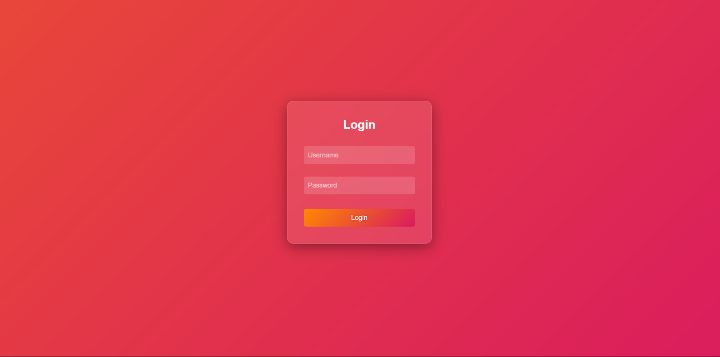
在本文中,我们学习并了解了如何使用HTML和CSS设计玻璃质感登录表单。我们设计了一个基本的玻璃质感登录表单,它具有统一的背景。该表单具有磨砂玻璃外观,使其在视觉上脱颖而出。

更新于:2024年11月6日
39 次浏览

广告