
 数据结构
数据结构 网络
网络 关系数据库管理系统
 操作系统
操作系统 Java
Java MS Excel
 iOS
iOS HTML
HTML CSS
CSS Android
 Python
 C 编程
C 编程 C++
C++ C#
C# MongoDB
 MySQL
MySQL Javascript
 PHP
PHP 物理学
物理学 化学
化学 生物学
生物学 数学
数学 英语
英语 经济学
经济学 心理学
心理学 社会学
社会学 服装设计
服装设计 法律研究
法律研究HTML & CSS 中的输入标签动画
在本文中,我们将使用 HTML 和 CSS 创建基本的输入标签动画。我们将借助 HTML 创建输入标签的结构,并借助 CSS 设计该 HTML 结构。
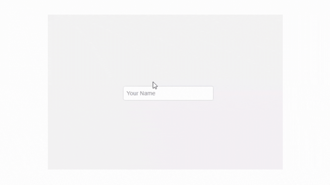
什么是输入标签动画?
本文将创建的输入标签动画。当用户点击输入字段进行输入时,输入标签名称会移动到输入字段的边框上。看起来很酷。您可以在下面给出的图像中看到它。
创建输入标签动画的方法
要创建输入标签动画,我们将创建两个文件。
用于结构的 HTML 代码
在此文件中,我们将准备 HTML 的基本结构。我们将使用div 标签、input 标签、label 标签等。您可以在下面给出的示例中看到这一点。
HTML 代码
<!DOCTYPE html>
<html lang="en">

<head>
    <meta charset="UTF-8">
    <meta name="viewport"
          content="width=device-width, initial-scale=1.0">
    <title>Input Label Animation</title>
    <link rel="stylesheet" href="mystyle.css">
</head>

<body>

    <div class="input-container">
        <input type="text" id="name" placeholder=" " required>
        <label for="name">Your Name</label>
    </div>

</body>
</html>
用于样式的 CSS 代码
在此文件中,我们使用了 CSS 的基本属性。 CSS 文件链接在 HTML 的头部选择中。您可以在下面给出的示例中看到 CSS 代码。
CSS 代码
* {
    box-sizing: border-box;
  }

 body {
   display: flex;
   justify-content: center;
   align-items: center;
   height: 100vh;
   margin: 0;
   font-family: Arial, sans-serif;
   background-color: #f0f0f0;
 }

 .input-container {
   position: relative;
   width: 250px;
 }

 input {
   width: 100%;
   padding: 10px;
   font-size: 16px;
   border: 2px solid #ccc;
   border-radius: 5px;
   outline: none;
 }

 input:focus {
   border-color: #4a90e2;
 }

 label {
   position: absolute;
   top: 50%;
   left: 10px;
   transform: translateY(-50%);
   color: #888;
   font-size: 16px;
   pointer-events: none;
   transition: 0.3s ease all;
 }

 /* Animation for focused input */
 input:focus + label,
 input:not(:placeholder-shown) + label {
   top: 0;
   left: 10px;
   font-size: 12px;
   color: #4a90e2;
   background-color: #f0f0f0;
   padding: 0 5px;
 }
输入标签动画的完整代码
<!DOCTYPE html>
<html lang="en">

<head>
    <meta charset="UTF-8">
    <meta name="viewport"
          content="width=device-width, initial-scale=1.0">
    <title>Input Label Animation</title>
    <style>
        * {
            box-sizing: border-box;
        }

        body {
            display: flex;
            justify-content: center;
            align-items: center;
            height: 100vh;
            margin: 0;
            font-family: Arial, sans-serif;
            background-color: #f0f0f0;
        }

        .input-container {
            position: relative;
            width: 250px;
        }

        input {
            width: 100%;
            padding: 10px;
            font-size: 16px;
            border: 2px solid #ccc;
            border-radius: 5px;
            outline: none;
        }

        input:focus {
            border-color: #4a90e2;
        }

        label {
            position: absolute;
            top: 50%;
            left: 10px;
            transform: translateY(-50%);
            color: #888;
            font-size: 16px;
            pointer-events: none;
            transition: 0.3s ease all;
        }

        /* Animation for focused input */

        input:focus+label,
        input:not(:placeholder-shown)+label {
            top: 0;
            left: 10px;
            font-size: 12px;
            color: #4a90e2;
            background-color: #f0f0f0;
            padding: 0 5px;
        }
    </style>
</head>
<body>
    <div class="input-container">
        <input type="text" id="name" placeholder=" " required>
        <label for="name">Your Name</label>
    </div>
</body>
</html>
输出
如您所见,我们通过使用 HTML 和 CSS 创建了一个基本的输入标签动画。

更新于: 2024年11月8日
34 次查看

广告