
 数据结构
数据结构 网络
网络 RDBMS
RDBMS 操作系统
操作系统 Java
Java MS Excel
 iOS
iOS HTML
HTML CSS
CSS Android
 Python
 C 编程
C 编程 C++
C++ C#
C# MongoDB
 MySQL
MySQL Javascript
 PHP
PHP 物理学
物理学 化学
化学 生物学
生物学 数学
数学 英语
英语 经济学
经济学 心理学
心理学 社会学
社会学 时尚研究
时尚研究 法律研究
法律研究JavaScript:如何检测网站是在移动设备还是桌面设备上打开的?
我们可以使用CSS媒体查询来检查网站是打开在 Web 浏览器中还是移动浏览器中。此信息可以使用网页的最小宽度和最大宽度获取。
CSS媒体查询仅限于对网页进行样式设置,但我们可以使用 JavaScript 中的 navigator 属性来根据用户的设备控制网站的功能。
Navigator 返回一组值,其中包括用户浏览器、版本、操作系统等等。
语法
navigator.userAgent
示例
在下面的示例中,我们将使用 Navigator 获取用户的设备详细信息。这将获得主要信息,其中包括用户浏览器、版本、操作系统等。
# index.html
<!DOCTYPE html>
<html>
<head>
   <title>Filtering the Non-unique characters</title>
</head>
<body>
   <h1 style="color: green;">
      Welcome To Tutorials Point
   </h1>
   <script>
      /* Storing user's device details in a variable*/
      let details = navigator.userAgent;

      /* Creating a regular expression
      containing some mobile devices keywords
      to search it in details string*/
      let regexp = /android|iphone|kindle|ipad/i;

      /* Using test() method to search regexp in details
      it returns boolean value*/
      let isMobileDevice = regexp.test(details);

      if (isMobileDevice) {
         document.write("<h3>Its a Mobile Device !</h3>");
      } else {
         document.write("<h3>Its a Desktop !</h3>");
      }
   </script>
</body>
</html>
输出
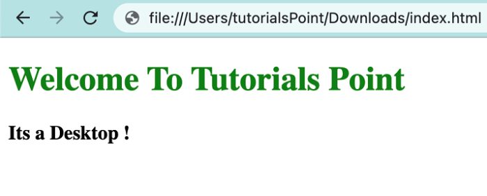
当该网页在桌面上打开时 −
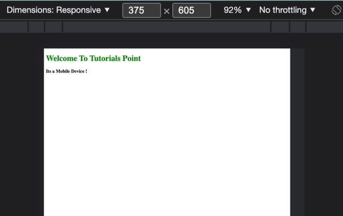
当该网页在移动设备上打开时 −

更新日期:2022 年 4 月 26 日
8,000+ 次查看

广告