
 数据结构
数据结构 网络
网络 RDBMS
RDBMS 操作系统
操作系统 Java
Java MS Excel
 iOS
iOS HTML
HTML CSS
CSS Android
 Python
 C 编程
C 编程 C++
C++ C#
C# MongoDB
 MySQL
MySQL Javascript
 PHP
PHP 物理学
物理学 化学
化学 生物学
生物学 数学
数学 英语
英语 经济学
经济学 心理学
心理学 社会学
社会学 时尚研究
时尚研究 法学研究
法学研究嵌套 flex 容器时正确使用 flex 属性
Flex 容器始终是父级,而 flex 项始终是子级。flex 格式化上下文的范围仅限于父级/子级关系。
flex 容器的后代(子级除外)不属于 flex 布局,不会接受 flex 属性。有些 flex 属性仅适用于 flex 容器 −
- justify-content,
- flex-wrap 和
- flex-direction
有些 flex 属性仅适用于 flex 项”
- align-self
- flex-grow
- flex
始终对父级应用 display: flex 或 display: inline-flex,以便对子级应用 flex 属性。
接下来,我们举一个例子。在父级 div parentBox 内,我们有两个 div −
<div class='parentBox'>
   <div class='childBox'>
      <div class='babyChildBox'>Parent's Child</div>
      <div class='babyChildBox'>Parent's Child</div>
   </div>
      <! - - -

      !-->
</div>
父容器的样式。我们已使用 CSS Flex 简写属性 −
.parentBox {
   display: flex;
   flex: 1 0 100%;
   background-color:yellow;
   border: 3px solid skyblue;
}
对于子级,即 childBox,我们再次使用简写属性为灵活项设置灵活长度 −
.childBox {
   flex: 1 1 50%
   background-color: green;
   color: white;
   border: 1px solid blue;
}
上面 .childBox 中的嵌套子级设置为 Flex。这与上面嵌套 flex 容器相关 −
.babyChildBox {
   flex: 1 1 50%;
   background-color: orange;
}
示例
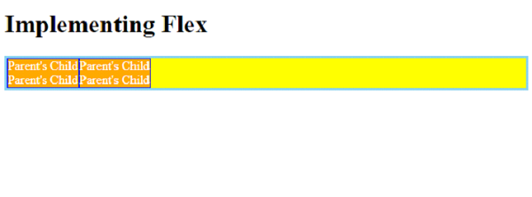
现在,让我们看一个完整示例,以正确嵌套 flex 容器 −
<!DOCTYPE html>
<html>
<head>
   <style>
      .parentBox {
         display: flex;
         flex: 1 0 100%;
         background-color:yellow;
         border: 3px solid skyblue;
      }
      .childBox {
         flex: 1 1 50%
         background-color: green;
         color: white;
         border: 1px solid blue;
      }
      .babyChildBox {
         flex: 1 1 50%;
         background-color: orange;
      }
   </style>
</head>
<body>
   <h1>Implementing Flex</h1>
   <div class='parentBox'>
      <div class='childBox'>
         <div class='babyChildBox'>Parent's Child</div>
         <div class='babyChildBox'>Parent's Child</div>
      </div>
      <div class='childBox'>
         <div class='babyChildBox'>Parent's Child</div>
         <div class='babyChildBox'>Parent's Child</div>
      </div>
   </div>
</body>
</html>
输出

更新于: 2022 年 12 月 6 日
1K次浏览

广告