
 数据结构
数据结构 网络
网络 关系型数据库管理系统
 操作系统
操作系统 Java
Java MS Excel
 iOS
iOS HTML
HTML CSS
CSS 安卓
安卓 Python
 C 语言编程
 C++
C++ C#
C# MongoDB
 MySQL
MySQL JavaScript
 PHP
PHP 物理
物理 化学
化学 生物
生物 数学
数学 英语
英语 经济学
经济学 心理学
心理学 社会研究
社会研究 时尚研究
时尚研究 法律研究
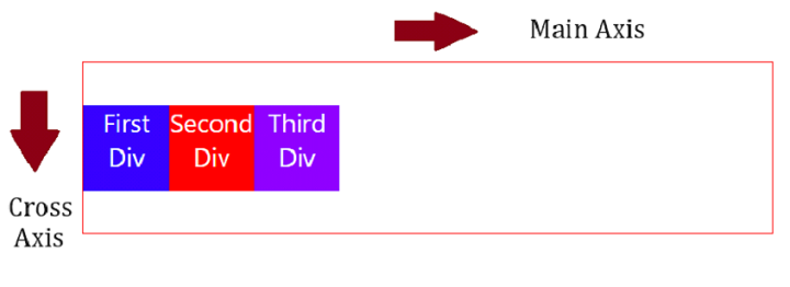
法律研究使用 CSS3 沿交叉轴对齐弹性项目
我们可以很容易地沿交叉轴对齐弹性项目,但首先让我们了解什么是交叉轴。交叉轴垂直于主轴。主轴类似于 flex direction -
创建容器 div
首先,将 div 设置在容器(flex 容器)中 -
<div class="container">
   <div class="first">First Div</div>
   <div class="second">Second Div</div>
   <div class="third">Third Div</div>
</div>
设置容器样式并使其灵活
通过将 display 设置为flex 来使 flex 容器变得灵活。使用 align-items 属性对齐 flex 项目 -
.container {
   height: 200px;
   display: flex;
   width: 100%;
   align-items: center;
   border: 2px solid red;
}
设置 flex 项目样式
用不同的背景色设置各个 flex 项目的样式 -
.first {
   background-color: rgb(55, 0, 255);
}
.second {
   background-color: red;
}
.third {
   background-color: rgb(140, 0, 255);
}
沿交叉轴对齐 flex 项目
示例
使用 CSS3 沿交叉轴对齐 flex 项目的代码如下 -
<!DOCTYPE html>
<html>
<head>
   <style>
      body {
         font-family: "Segoe UI", Tahoma, Geneva, Verdana, sans-serif;
      }
      .container {
         height: 200px;
         display: flex;
         width: 100%;
         align-items: center;
         border: 2px solid red;
      }
      div {
         width: 100px;
         height: 100px;
         color: white;
         text-align: center;
         font-size: 30px;
      }
      .first {
         background-color: rgb(55, 0, 255);
      }
      .second {
         background-color: red;
      }
      .third {
         background-color: rgb(140, 0, 255);
      }
   </style>
</head>
<body>
   <h1>Align flex items along cross axis</h1>
   <div class="container">
      <div class="first">First Div</div>
      <div class="second">Second Div</div>
      <div class="third">Third Div</div>
   </div>
</body>
</html>

更新日期: 2023-10-27
107 次浏览

广告