
 Data Structure
 Networking
 RDBMS
RDBMS Operating System
 Java
Java MS Excel
 iOS
iOS HTML
HTML CSS
CSS Android
 Python
 C Programming
 C++
C++ C#
C# MongoDB
 MySQL
MySQL Javascript
 PHP
PHP Physics
 Chemistry
 Biology
 Mathematics
 English
 Economics
 Psychology
 Social Studies
 Fashion Studies
 Legal Studies
使用 CSS3 向图像应用复古效果
filter 属性用于设置视觉效果,例如阴影、对比度、亮度、饱和度和图像的阴影。以下是语法:
语法
filter: none | drop-shadow() | blur() | brightness() | contrast() | grayscale() | hue-rotate() | invert() | opacity() | saturate() | sepia() | url();
如您在上面看到的,使用 filter 属性,我们可以设置以下效果:对比度、阴影、模糊、亮度、灰度、色相,反转、不透明度、饱和度、复古、URL。
sepia 将复古效果设置为图像。要在 CSS3 中设置复古效果,请针对 filter 属性使用 sepia 值,例如,
实际图像:0%
完全复古:100%
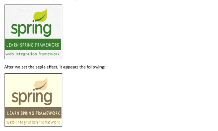
例如,下面是我们的图像:

在设置了复古效果后,显示效果如下:
对图像应用复古效果
示例
在此,我们针对完全效果将复古效果设置为 100%:
<!DOCTYPE html>
<html>
<head>
   <style>
      img.demo {
         filter: sepia(100%);
      }
   </style>
</head>
<body>
   <h1>Learn Spring Framework</h1>
   <img src="https://tutorialspoint.com/spring/images/spring-mini-logo.jpg" alt="Spring Framework" width="160" height="150">
   <h1>Learn Spring Framework</h1>
   <img class="demo" src="https://tutorialspoint.com/spring/images/spring-mini-logo.jpg" alt="Spring Framework" width="160" height="150">
</body>
</html>
对图像应用 50% 的复古效果
示例
我们来看另一个示例,其中我们将复古效果设置为 50%:
<!DOCTYPE html>
<html>
<head>
   <style>
      img.demo {
         filter: sepia(50%);
      }
   </style>
</head>
<body>
   <h1>Learn Spring Framework</h1>
   <img src="https://tutorialspoint.com/spring/images/spring-mini-logo.jpg" alt="Spring Framework" width="160" height="150">
   <h1>Learn Spring Framework</h1>
   <img class="demo" src="https://tutorialspoint.com/spring/images/spring-mini-logo.jpg" alt="Spring Framework" width="160" height="150">
</body>
</html>
对图像应用 0% 的复古效果
示例
我们来看另一个示例,其中我们将复古效果设置为 0%:
<!DOCTYPE html>
<html>
<head>
   <style>
      img.demo {
         filter: sepia(0%);
      }
   </style>
</head>
<body>
   <h1>Learn Spring Framework</h1>
   <img src="https://tutorialspoint.com/spring/images/spring-mini-logo.jpg" alt="Spring Framework" width="160" height="150">
   <h1>Learn Spring Framework</h1>
   <img class="demo" src="https://tutorialspoint.com/spring/images/spring-mini-logo.jpg" alt="Spring Framework" width="160" height="150">
</body>
</html>

更新于:2023 年 10 月 27 日
263 次浏览

广告