
 数据结构
数据结构 网络
网络 关系型数据库管理系统
 操作系统
操作系统 Java
Java MS Excel
 iOS
iOS HTML
HTML CSS
CSS Android
 Python
 C 编程
C 编程 C++
C++ C#
C# MongoDB
 MySQL
MySQL Javascript
 PHP
PHP 物理
物理 化学
化学 生物
生物 数学
数学 英语
英语 经济
经济 心理
心理 社会学
社会学 时尚学
时尚学 法律研究
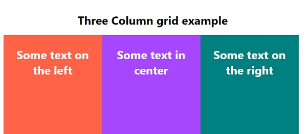
法律研究如何使用 CSS 创建 3 列布局网格?
若要使用 CSS 创建 3 列布局网格,代码如下 −
示例
<!DOCTYPE html>
<html>
<head>
<meta name="viewport" content="width=device-width, initial-scale=1" />
<style>
   body {
      padding: 1%;
      font-family: "Segoe UI", Tahoma, Geneva, Verdana, sans-serif;
   }
   * {
      box-sizing: border-box;
   }
   .left, .right, .center {
      float: left;
      width: 33%;
      color: white;
      padding: 10px;
      height: 500px;
      text-align: center;
   }
   .left {
      background-color: tomato;
   }
   .right {
      background-color: teal;
   }
   .center {
      background-color: rgb(166, 71, 255);
   }
   .container:after {
      clear: both;
   }
</style>
</head>
<body>
<h1 style="text-align: center;">Three Column grid example</h1>
<div class="container">
<div class="left">
<h1>Some text on the left</h1>
</div>
<div class="center">
<h1>Some text in center</h1>
</div>
<div class="right">
<h1>Some text on the right</h1>
</div>
</div>
</body>
</html>
输出
以上代码将生成以下输出 −

更新于:2020 年 5 月 12 日
3K+ 次浏览

广告