
 数据结构
数据结构 网络
网络 关系数据库管理系统 (RDBMS)
 操作系统
操作系统 Java
Java MS Excel
 iOS
iOS HTML
HTML CSS
CSS Android
 Python
 C语言编程
C语言编程 C++
C++ C#
C# MongoDB
 MySQL
MySQL Javascript
 PHP
PHP 物理学
物理学 化学
化学 生物学
生物学 数学
数学 英语
英语 经济学
经济学 心理学
心理学 社会学
社会学 服装设计
服装设计 法学
法学如何设置单选按钮选中标签的样式?
在这篇文章中,我们将为当前选中的单选按钮设置标签样式。CSS 还允许您消除默认的单选按钮,并设置标签的选中和未选中状态的样式。这将借助 :checked伪类来实现。此外,还将使用相邻兄弟选择器来实现此效果。
设置单选按钮选中标签的样式
首先,我们将原始圆形单选按钮的display 属性设置为 none,使其从视图中消失。接下来,我们将为未选中状态的标签元素应用默认样式。我们将标签的 display 属性设置为inline-block,并应用其他样式,如背景、内边距、字体和光标。
现在,使用:checked 伪类以及相邻兄弟选择器 (+)。此选择器特别有助于确保样式仅应用于选中单选输入后的标签。
示例代码
在代码示例中,您可以看到我们稍微调整了样式,使单选按钮更具吸引力。您可以尝试自己的样式使其更具吸引力。
<!DOCTYPE html>
<html>
<head>
    <title>Styled Radio Button Labels</title>
    <style>
        body,
        html {
            display: flex;
            align-items: center;
            justify-content: center;
            height: 100vh;
            margin: 0;
            background-color: #f5f5f5;
            font-family: Arial, sans-serif;
        }

        .radio-container {
            background: white;
            padding: 20px;
            border-radius: 8px;
            box-shadow: 0 2px 4px rgba(0,0,0,0.1);
        }

        .radio-container input[type="radio"] {
            opacity: 0;
            width: 0;
            position: fixed;
        }

        .radio-container label {
            display: inline-block;
            background-color: #e0e0e0;
            padding: 8px 16px;
            font-size: 16px;
            cursor: pointer;
            margin-right: 8px;
            border-radius: 4px;
            transition: all 0.3s ease;
        }

        .radio-container input[type="radio"]:checked + label {
            background-color: #4caf50;
            color: #fff;
            box-shadow: 0 2px 4px rgba(76, 175, 80, 0.3);
        }

        .radio-container label:hover {
            background-color: #dcdcdc;
            transform: translateY(-1px);
        }

        .radio-container input[type="radio"]:focus + label {
            outline: 2px solid #4caf50;
            outline-offset: 2px;
        }

        /* Adding responsive design */
        @media (max-width: 480px) {
            .radio-container {
                display: flex;
                flex-direction: column;
                gap: 10px;
            }

            .radio-container label {
                margin-right: 0;
                text-align: center;
            }
        }
    </style>
</head>
<body>
    <div class="radio-container">
        <input type="radio" id="option1" name="options" checked>
        <label for="option1">Full Stack</label>
        <input type="radio" id="option2" name="options">
        <label for="option2">Front-End</label>
        <input type="radio" id="option3" name="options">
        <label for="option3">Back-End</label>
    </div>
</body>
</html>
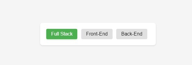
输出

更新于:2024年11月12日
26 次浏览

广告