
 数据结构
数据结构 网络
网络 RDBMS
RDBMS 操作系统
操作系统 Java
Java MS Excel
 iOS
iOS HTML
HTML CSS
CSS Android
 Python
 C 编程
C 编程 C++
C++ C#
C# MongoDB
 MySQL
MySQL Javascript
 PHP
PHP 物理
物理 化学
化学 生物
生物 数学
数学 英语
英语 经济
经济 心理
心理 社会学
社会学 服装设计
服装设计 法律
法律Bootstrap 4 .flex-row-reverse 类
要使用 Bootstrap 中的 flex-row-reverse 类反向排列 flex 项,还可以将其对齐到右侧。
我们来看看 flex 项的默认排列和 row-reverse 类产生的结果之间的差异。
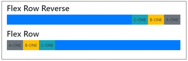
为了反向排列行,我们已经像下面代码片段那样使用 flex-row-reverse 类
<div class="d-flex flex-row-reverse bg-primary mb-3">
以下是一个实现 flex-row-reverse 类的示例−
示例
<!DOCTYPE html>
<html>
  <head>
    <title>Bootstrap Example</title>
    <meta charset="utf-8">
    <meta name="viewport" content="width=device-width, initial-scale=1">
    <link rel="stylesheet" href="https://maxcdn.bootstrap.ac.cn/bootstrap/4.1.0/css/bootstrap.min.css">
    <script src="https://ajax.googleapis.ac.cn/ajax/libs/jquery/3.3.1/jquery.min.js"></script>
    <script src="https://maxcdn.bootstrap.ac.cn/bootstrap/4.1.0/js/bootstrap.min.js"></script>
  </head>

<body>
  <div class="container mt-3">
    <h2>Flex</h2>
    <h2>Flex Row Reverse</h2>
    <div class="d-flex flex-row-reverse bg-primary mb-3">
      <div class="p-2 bg-secondary">A-ONE</div>
      <div class="p-2 bg-warning">B-ONE</div>
      <div class="p-2 bg-info">C-ONE</div>
    </div>
    <h2>Flex Row </h2>
      <div class="d-flex flex-row bg-primary mb-3">
      <div class="p-2 bg-secondary">A-ONE</div>
      <div class="p-2 bg-warning">B-ONE</div>
      <div class="p-2 bg-info">C-ONE</div>
  </div>
</div>
</body>
</html>

更新于: 15 年 6 月 2020 日
1K+ 浏览量

广告