
 数据结构
数据结构 网络
网络 RDBMS
RDBMS 操作系统
操作系统 Java
Java MS Excel
 iOS
iOS HTML
HTML CSS
CSS Android
 Python
 C 编程
C 编程 C++
C++ C#
C# MongoDB
 MySQL
MySQL Javascript
 PHP
PHP 物理学
物理学 化学
化学 生物学
生物学 数学
数学 英语
英语 经济学
经济学 心理学
心理学 社会学
社会学 时尚研究
时尚研究 法律研究
法律研究CSS 中心、水平和垂直对齐
我们可以使用 CSS 对齐元素或其内部内容,CSS 提供了各种选项来水平、垂直或居中对齐元素及其内容。
水平对齐
- 内联元素
内联元素或内联块元素,例如文本、锚点、span 等,可以使用 CSS text-align 属性进行水平对齐。
- 块级元素
块级元素,例如 div、p 等,可以使用 CSS margin 属性进行水平对齐,但元素的宽度不应相对于父元素为 100%,因为那样就不需要对齐了。
- 使用浮动或定位方案的块级元素
可以使用 CSS float 属性水平对齐元素,该属性将多个元素对齐到左侧/右侧,而不是居中,或者使用 CSS 定位方案的 absolute 方法。
示例
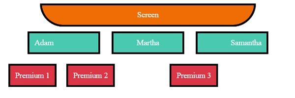
让我们看一个 CSS 水平对齐的示例:
<!DOCTYPE html>
<html>
<head>
<title>CSS Horizontal Alignment</title>
<style>
.screen {
   padding: 10px;
   width: 70%;
   margin: 0 auto;
   background-color: #f06d06;
   text-align: center;
   color: white;
   border-radius: 0 0 50px 50px;
   border: 4px solid #000;
}
.seats span, .backSeats div{
   margin: 10px;
   padding: 10px;
   color: white;
   border: 4px solid #000;
}
.seats span{
   width: 120px;
   display: inline-block;
   background-color: #48C9B0;
}
.left{
   text-align: left;
}
.right{
   text-align: right;
}
.center{
   text-align: center;
}
.seats{
   text-align: center;
}
.backSeats div {
   background-color: #dc3545;
}
.leftFloat{
   float: left;
}
.rightAbsolute{
   position: absolute;
   right: 150px;
}
</style>
</head>
<body>
<div class="screen">Screen</div>
<div class="seats">
<span class="left">Adam</span>
<span class="center">Martha</span>
<span class="right">Samantha</span>
<div class="backSeats">
<div class="leftFloat">Premium 1</div>
<div class="leftFloat">Premium 2</div>
<div class="rightAbsolute">Premium 3</div>
</div>
</div>
</body>
</html>
输出
这将产生以下输出:
垂直对齐
- 内联元素
内联元素或内联块元素,例如文本、锚点等,可以使用 CSS padding、CSS line-height 或 CSS vertical-align 属性进行垂直对齐。
- 块级元素
块级元素,例如 div、p 等,可以使用 CSS margin 属性、CSS flex 属性以及 CSS align-items,或使用定位方案的 absolute 方法和 CSS transform 属性进行垂直对齐。
示例
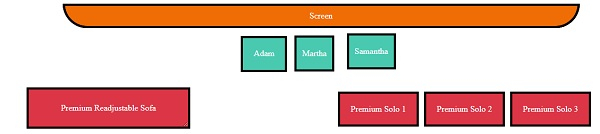
让我们看一个 CSS 垂直对齐的示例:
<!DOCTYPE html>
<html>
<head>
<title>CSS Horizontal Alignment</title>
<style>
.screen {
   padding: 10px;
   width: 70%;
   margin: 0 auto;
   background-color: #f06d06;
   text-align: center;
   color: white;
   border-radius: 0 0 50px 50px;
   border: 4px solid #000;
}
.seats span:not(.withPadding){
   margin: 10px;
   padding: 10px;
   color: white;
   border: 4px solid #000;
}
.seats span:not(.vertical){
   height: 40px;
   display: inline-block;
   background-color: #48C9B0;
}
.withPadding{
   padding: 20px 20px 0px;
   height: 20px;
   color: white;
   border: 4px solid #000;
}
.vertical{
   display: inline-table;
   background-color: #48C9B0;
   height: 40px;
}
.verticalText {
   display: table-cell;
   vertical-align: middle;
}
.withLineHeight{
   line-height: 40px;
}
.seats{
   text-align: center;
}
.backLeftSeat{
   background-color: #dc3545;
   max-height: 100px;
   height: 70px;
   margin: 20px;
   width: 300px;
   display: inline-block;
   position: relative;
   resize: vertical;
   overflow: auto;
   border: 4px solid #000;
}
.withPosition{
   position: absolute;
   top: 50%;
   left: 2px;
   right: 2px;
   color: white;
   padding: 20px;
   transform: translateY(-50%);
}
.backRightSeats{
   height: 122px;
   width: 800px;
   float: right;
   display: inline-flex;
   flex-direction: row;
   justify-content: center;
   align-items: center;
}
.withFlex {
   background-color: #dc3545;
   border: 4px solid #000;
   margin-right: 10px;
   color: white;
   padding: 20px;
}
</style></head>
<body>
<div class="screen">Screen</div>
<div class="seats">
<span class="withPadding">Adam</span>
<span class="withLineHeight">Martha</span>
<span class="vertical"><p class="verticalText">Samantha</p></span>
<div>
<div class="backLeftSeat">
<div class="withPosition">Premium Readjustable Sofa</div>
</div>
<div class="backRightSeats">
<div class="withFlex">Premium Solo 1</div>
<div class="withFlex">Premium Solo 2</div>
<div class="withFlex">Premium Solo 3</div>
</div>
</div>
</body>
</html>
输出
这将产生以下输出:
当 div 未调整时
当 div 已调整时

居中对齐
我们可以使用上面在水平和垂直对齐中提到的方法将元素居中对齐。

更新于:2020年1月8日
3K+ 浏览量

广告