
 数据结构
数据结构 网络
网络 RDBMS
RDBMS 操作系统
操作系统 Java
Java iOS
iOS HTML
HTML CSS
CSS Android
 Python
 C语言
C语言 C++
C++ C#
C# MongoDB
 MySQL
MySQL Javascript
 PHP
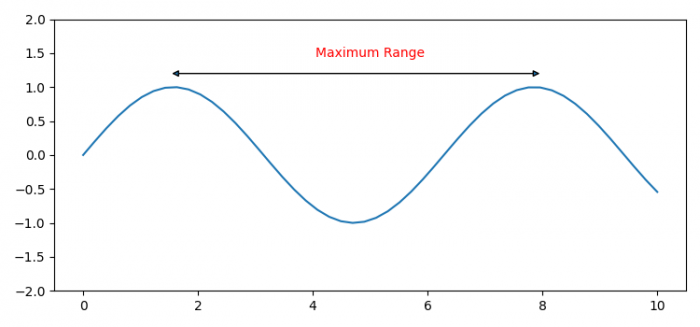
PHP如何在Matplotlib中注释X轴的范围?
若要在 Matplotlib 中注释 X 轴的范围,我们可以采取以下步骤:
- 设置图形大小并调整子图之间和周围的边距。
- 使用 Numpy 创建 xx 和 yy 数据点。
- 创建一个图形和一组子图。
- 使用 plot() 方法绘制 xx 和 yy 数据点。
- 设置轴的 ylim。
- 使用 annotate 方法放置箭头和范围标签名称。
- 若要显示图形,请使用 show() 方法。
示例
import matplotlib.pyplot as plt
import numpy as np

plt.rcParams["figure.figsize"] = [7.50, 3.50]
plt.rcParams["figure.autolayout"] = True

xx = np.linspace(0, 10)
yy = np.sin(xx)

fig, ax = plt.subplots(1, 1)

ax.plot(xx, yy)
ax.set_ylim([-2, 2])

ax.annotate('', xy=(5,2), xytext=(8,2),
            xycoords='data', textcoords='data',
            arrowprops={'arrowstyle': '<|-|>'}, color='yellow')

ax.annotate('Maximum Range', xy=(5,5), ha='center', va='center', color='red')

plt.show()
输出


更新于:2021 年 8 月 4 日
1K+ 浏览量

广告