
 数据结构
数据结构 网络
网络 关系数据库管理系统
 操作系统
操作系统 Java
Java MS Excel
 iOS
iOS HTML
HTML CSS
CSS Android
 Python
 C 编程
C 编程 C++
C++ C#
C# MongoDB
 MySQL
MySQL Javascript
 PHP
PHP 物理学
物理学 化学
化学 生物学
生物学 数学
数学 英语
英语 经济学
经济学 心理学
心理学 社会学
社会学 服装设计
服装设计 法律学
法律学如何在 div 内居中背景图片?
在创建网页时,一种常见的页面设计做法是在 div 中居中背景图片。有几种可用的方法,每种方法在其领域都很有用。无论屏幕大小或 div 的大小如何,文章中的 div 盒子内都会居中背景图片。每当窗口大小调整时,背景中的图片都应保持在正中央。
在 div 内居中背景图片
以下是一些在 div 内居中背景图片的最有效方法。
使用 CSS 背景位置
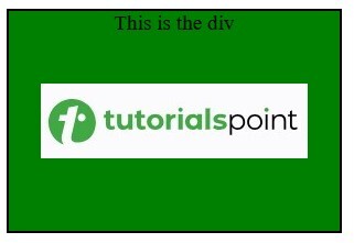
最简单的方法是使用background-position 属性。这非常适合将图片用作背景图片的情况。
示例代码
<!DOCTYPE html>
<html lang="en">

<head>
    <title>Center a Background Image Inside a div</title>
    <style>
        .background-center-1 {
            width: 300px;
            height: 200px;
            border: 2px solid black;
            text-align: center;
            background-color: green;
            background-image: url(
'https://tutorialspoint.com/assets/questions/media/1039321-1731475345.jpg');
            background-position: center;
            background-repeat: no-repeat;
            font-size: larger;
        }
    </style>
</head>

<body>
    <div class="background-center-1">This is the div</div>
</body>

</html>
输出
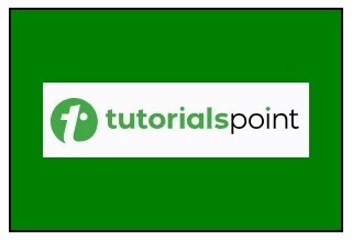
使用 Flexbox 和图片元素
要使用flexbox 在 div 中居中图片元素,请使用在 div 中直接居中图片可以作为预期的子节点(例如,出于严格的可访问性目的或 SEO)。
示例代码
<!DOCTYPE html>
<html lang="en">

<head>
    <title>Center a Background Image Inside a div</title>
    <style>
        .flex-center {
            display: flex;
            justify-content: center;
            align-items: center;
            width: 300px;
            height: 200px;
            overflow: hidden;
            background-color: green;
            border: 2px solid black;
        }

        .centered-img {
            max-width: 100%;
            max-height: 100%;
        }
    </style>
</head>

<body>
    <div class="flex-center">
        <img src=
"https://tutorialspoint.com/assets/questions/media/1039321-1731475345.jpg"
             alt="Centered Image"
             class="centered-img">
    </div>
</body>

</html>
输出

使用 Grid 和图片元素
也可以使用 CSS Grid 在 div 内居中图片。
示例代码
<!DOCTYPE html>
<html lang="en">

<head>
    <title>Center a Background Image Inside a div</title>
    <style>
        .flex-center {
            display: grid;
            place-items: center;
            width: 300px;
            height: 200px;
            overflow: hidden;
            background-color: green;
            border: 2px solid black;
        }

        .centered-img {
            max-width: 100%;
            max-height: 100%;
        }
    </style>
</head>

<body>
    <div class="flex-center">
        <img src=
"https://tutorialspoint.com/assets/questions/media/1039321-1731475345.jpg"
             alt="Centered Image"
             class="centered-img">
    </div>
</body>

</html>
输出

使用 CSS 定位和绝对居中
因此,为了居中图片,您可以通过将顶部和左侧对话框设置为 div 宽度的 50% 来绝对居中,然后应用变换以精确设置中心。
示例代码
<!DOCTYPE html>
<html lang="en">

<head>
    <title>Center a Background Image Inside a div</title>
    <style>
    .position-center {
      position: relative;
      width: 300px;
      height: 200px;
      overflow: hidden;
      background-color: green;
      border: 2px solid black;
    }

    .positioned-img {
      position: absolute;
      top: 50%;
      left: 50%;
      transform: translate(-50%, -50%);
      max-width: 100%;
      max-height: 100%;
    }
  </style>
</head>

<body>

  <div class="position-center">
    <img src=
"https://tutorialspoint.com/assets/questions/media/1039321-1731475345.jpg"
         alt="Centered Image"
         class="positioned-img">
  </div>

</body>

</html>
输出
对包含的图片使用 Object-Fit
如果希望图片理想地适合 div 的范围,请使用 object-fit: contain; 以避免容器中图片元素被裁剪。
示例代码
<!DOCTYPE html>
<html lang="en">

<head>
    <title>Center a Background Image Inside a div</title>
    <style>
        .object-fit-center {
            width: 300px;
            height: 200px;
            overflow: hidden;
            background-color: green;
            border: 2px solid black;
        }

        .object-img {
            width: 100%;
            height: 100%;
            object-fit: contain;
        }
    </style>
</head>

<body>

    <div class="object-fit-center">
        <img src=
"https://tutorialspoint.com/assets/questions/media/1039321-1731475345.jpg"
             alt="Centered Image"
             class="object-img">
    </div>

</body>

</html>
输出

更新于: 2024年11月13日
13 次查看

广告