
 数据结构
数据结构 网络
网络 RDBMS
RDBMS 操作系统
操作系统 Java
Java iOS
iOS HTML
HTML CSS
CSS Android
 Python
 C 编程
C 编程 C++
C++ C#
C# MongoDB
 MySQL
MySQL Javascript
 PHP
PHP如何在 R 中使用 ggplot2 为组级别创建不同的 Y 轴?
如果有一个分类变量或组变量,那么我们可能需要为每个类别或级别创建一个折线图,这将有助于我们理解单个图表中多级范围。为此,我们可以使用 ggplot2 包的 facet_grid 函数,如下例所示。
示例
考虑下列数据框
> x<-sample(LETTERS[1:4],20,replace=TRUE)
> y<-rnorm(20)
> df<-data.frame(x,y)
> df
输出
   x     y
1 C  -1.55668689
2 A   2.41399136
3 D  -0.78520253
4 A  -0.43092594
5 C   1.94379390
6 A   0.17494763
7 C  -1.61170476
8 A  -1.55362764
9 C  -0.53384492
10 A -0.66698812
11 D  1.44100518
12 D  1.10126743
13 D -1.54194367
14 B -0.03254252
15 A -0.63927406
16 A  1.72924629
17 A -0.10003278
18 B -0.08262660
19 C  1.29335456
20 A -1.50531507
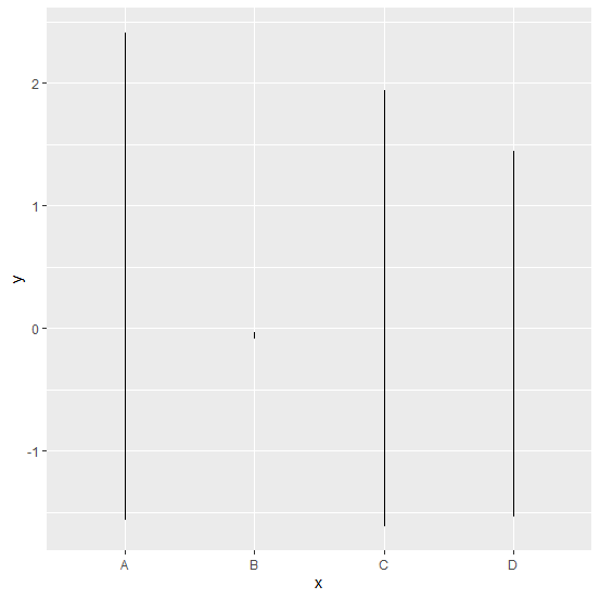
加载 ggplot2 包并为 x 中的每个级别创建一个折线图
示例
> library(ggplot2)
> ggplot(df,aes(x,y))+geom_line()
输出
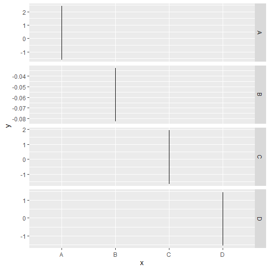
为 x 的每个级别创建一个折线图,但其 Y 轴的刻度不同,R 将基于给定数据自由选择
示例
> ggplot(df,aes(x,y))+geom_line()+facet_grid(x~.,scales="free")
输出

更新于: 06-Nov-2020
802 次浏览

广告