
 数据结构
数据结构 网络
网络 关系数据库管理系统 (RDBMS)
 操作系统
操作系统 Java
Java iOS
iOS HTML
HTML CSS
CSS Android
 Python
 C语言编程
C语言编程 C++
C++ C#
C# MongoDB
 MySQL
MySQL Javascript
 PHP
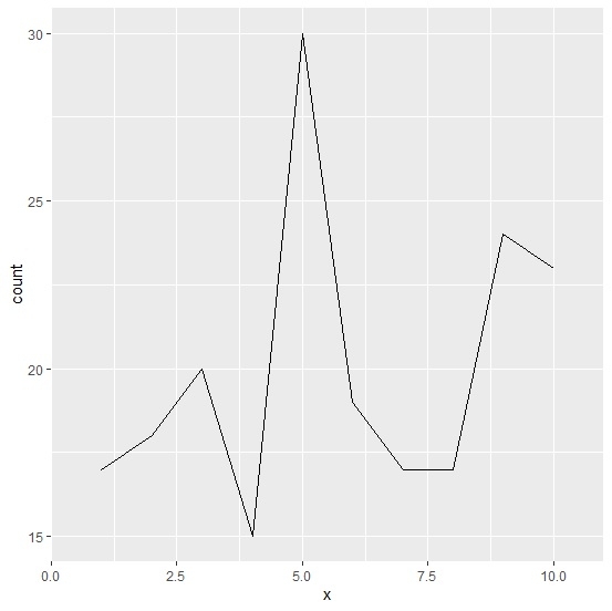
PHP如何在R的ggplot2中使用Y轴显示折线图的计数?
要在R的ggplot2中使用Y轴显示折线图的计数,我们可以按照以下步骤操作:
首先,创建一个数据框。
然后,使用ggplot2包的geom_line函数创建折线图,使用fill参数计算使用count函数的值,并将binwidth设置为1。
创建数据框
让我们创建一个如下所示的数据框:
x<-sample(1:10,200,replace=TRUE)
df<-data.frame(x)
head(df,25)
执行上述脚本后,将生成以下输出(由于随机化,此输出会在您的系统上有所不同):
输出
  x
1 6
2 5
3 4
4 3
5 2
6 6
7 7
8 4
9 5
10 5
11 1
12 2
13 10
14 7
15 7
16 8
17 3
18 8
19 3
20 1
21 8
22 9
23 5
24 6
25 5
创建在Y轴上显示计数的折线图
加载ggplot2包,并在geom_line的aes中使用fill=..count..,以及binwidth为1来创建在Y轴上显示计数的折线图:
x<-sample(1:10,200,replace=TRUE)
df<-data.frame(x)
library(ggplot2)
ggplot(df,aes(x))+geom_line(aes(fill=..count..),stat="bin",binwidth=1)
Warning message:
Ignoring unknown aesthetics: fill
输出

更新于:2021年8月11日
4K+ 次浏览

广告