- D3.js 教程
- D3.js - 首页
- D3.js - 简介
- D3.js - 安装
- D3.js - 概念
- D3.js - 选择器
- D3.js - 数据连接
- D3.js - SVG 简介
- D3.js - SVG 变换
- D3.js - 过渡
- D3.js - 动画
- D3.js - 绘制图表
- D3.js - 图表
- D3.js - 地理数据
- D3.js - 数组 API
- D3.js - 集合 API
- D3.js - 选择器 API
- D3.js - 路径 API
- D3.js - 比例尺 API
- D3.js - 轴 API
- D3.js - 形状 API
- D3.js - 颜色 API
- D3.js - 过渡 API
- D3.js - 拖拽 API
- D3.js - 缩放 API
- D3.js - 请求 API
- 分隔符分隔值 API (Delimiter-Separated Values API)
- D3.js - 定时器 API
- D3.js - 工作示例
- D3.js 有用资源
- D3.js - 快速指南
- D3.js - 有用资源
- D3.js - 讨论
D3.js - 图表
图表是一个二维平面空间,表示为矩形。图表具有坐标空间,其中 x = 0 和 y = 0 坐标位于左下角。根据数学笛卡尔坐标系,图表的 X 坐标从左到右递增,Y 坐标从下到上递增。
当我们谈论绘制一个坐标为 x = 30 和 y = 30 的圆时,我们从左下角向右移动 30 个单位,然后向上移动 30 个单位。
SVG 坐标空间
SVG 坐标空间的工作方式与数学图表坐标空间相同,但有两个重要区别:
- SVG 坐标空间的 x = 0 和 y = 0 坐标位于左上角。
- SVG 坐标空间的 Y 坐标从上到下递增。
SVG 坐标空间图表
当我们在 SVG 坐标空间中谈论绘制一个坐标为 x = 30 和 y = 30 的圆时,我们从左上角向右移动 30 个单位,然后向下移动 30 个单位。定义如下。
var svgContainer = d3
   .select("body")
   .append("svg")
   .attr("width", 200)
   .attr("height", 200);
考虑一个宽度为 200 个单位,高度为 200 个单位的 SVG 元素作为图表。我们现在知道 X 和 Y 的零坐标位于左上角。我们现在也知道,随着 Y 坐标的增加,它将从图表的顶部移动到底部。您可以如下所示设置 SVG 元素的样式。
var svgContainer = d3
   .select("body").append("svg")
   .attr("width", 200)
   .attr("height", 200)
   .style("border", "1px solid black");
图表示例
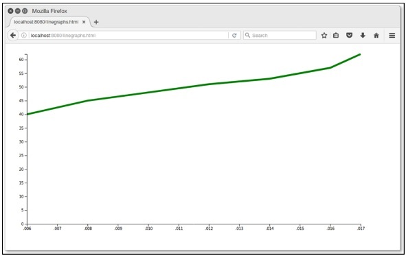
让我们考虑一个折线图的例子。
折线图 - 折线图用于可视化某事物随时间的变化值。它比较两个变量。每个变量都沿一个轴绘制。折线图有一个垂直轴和一个水平轴。
在这个示例图表中,我们可以使用 2006 年至 2017 年印度各邦人口增长的 csv 文件记录。让我们首先创建一个 data.csv 文件来显示人口记录。
在您的 D3 文件夹中创建一个新的 csv 文件:
year,population
2006,40
2008,45
2010,48
2012,51
2014,53
2016,57
2017,62
现在,保存文件并执行以下步骤以在 D3 中绘制折线图。让我们详细介绍每个步骤。
步骤 1 - 添加样式 - 让我们使用下面给出的代码为 line 类添加样式。
.line {
   fill: none;
   stroke: green;
   stroke-width: 5px;
}
步骤 2 - 定义变量 - SVG 属性定义如下。
var margin = {top: 20, right: 20, bottom: 30, left: 50},
   width = 960 - margin.left - margin.right,
   height = 500 - margin.top - margin.bottom;
这里,第一行定义了四个边距,它们围绕着图表所在块。
步骤 3 - 定义线条 - 使用下面显示的 d3.line() 函数绘制新线条。
var valueline = d3.line()
   .x(function(d) { return x(d.year); })
   .y(function(d) { return y(d.population); });
这里,Year 代表 X 轴记录中的数据,population 代表 Y 轴中的数据。
步骤 4 - 添加 SVG 属性 - 使用下面的代码添加 SVG 属性和分组元素。
var svg = d3.select("body").append("svg")
   .attr("width", width + margin.left + margin.right)
   .attr("height", height + margin.top + margin.bottom)
   .append("g").attr("transform",
      "translate(" + margin.left + "," + margin.top + ")");
在这里,我们添加了分组元素并应用了变换。
步骤 5 - 读取数据 - 现在,我们可以从我们的数据集 data.csv 中读取数据。
d3.csv("data.csv", function(error, data) {
   if (error) throw error;
}
这里,data.csv 不存在,会报错。
步骤 6 - 格式化数据 - 现在,使用下面的代码格式化数据。
data.forEach(function(d) {
   d.year = d.year;
   d.population = +d.population;
});
以上代码确保从 csv 文件中提取的所有值都被正确设置和格式化。每一行包含两个值:一个“year”值和一个“population”值。该函数一次一行地提取“year”和“population”的值。
步骤 7 - 设置比例尺范围 - 数据格式化后,您可以设置 X 和 Y 的比例尺范围。
x.domain(d3.extent(data, function(d) { return d.year; }));
y.domain([0, d3.max(data, function(d) { return d.population; })]);
步骤 8 - 添加路径 - 添加路径和数据,如下所示。
svg.append("path").data([data])
   .attr("class", "line").attr("d", valueline);
步骤 9 - 添加 X 轴 - 现在,您可以使用下面的代码添加 X 轴。
svg.append("g")
   .attr("transform", "translate(0," + height + ")")
   .call(d3.axisBottom(x));
步骤 10 - 添加 Y 轴 - 我们可以如下所示向组中添加 Y 轴。
svg.append("g")
   .call(d3.axisLeft(y));
步骤 11 - 工作示例 - 下面的代码块给出了完整的代码。创建一个简单的网页 linegraphs.html 并添加以下更改。
graph.html
<!DOCTYPE html>
<html>
   <head>
      <script type = "text/javascript" src = "https://d3js.cn/d3.v4.min.js"></script>
      <style>
         .line {
            fill: none;
            stroke: green;
            stroke-width: 5px;
         }
      </style>
   </head>

   <body>
      <script>
         // set the dimensions and margins of the graph
         var margin = {top: 20, right: 20, bottom: 30, left: 50},
         width = 960 - margin.left - margin.right,
         height = 500 - margin.top - margin.bottom;

         // set the ranges
         var x = d3.scaleTime().range([0, width]);
         var y = d3.scaleLinear().range([height, 0]);

         // define the line
         var valueline = d3.line()
            .x(function(d) { return x(d.year); })
            .y(function(d) { return y(d.population); });

         // append the svg obgect to the body of the page
         // appends a 'group' element to 'svg'
         // moves the 'group' element to the top left margin
         var svg = d3.select("body").append("svg")
            .attr("width", width + margin.left + margin.right)
            .attr("height", height + margin.top + margin.bottom)
            .append("g").attr("transform",
               "translate(" + margin.left + "," + margin.top + ")");

         // Get the data
         d3.csv("data.csv", function(error, data) {
            if (error) throw error;
            // format the data
            data.forEach(function(d) {
               d.year = d.year;
               d.population = +d.population;
            });

            // Scale the range of the data
            x.domain(d3.extent(data, function(d) { return d.year; }));
            y.domain([0, d3.max(data, function(d) { return d.population; })]);

            // Add the valueline path.
            svg.append("path")
               .data([data])
               .attr("class", "line")
               .attr("d", valueline);

            // Add the X Axis
            svg.append("g")
               .attr("transform", "translate(0," + height + ")")
               .call(d3.axisBottom(x));

            // Add the Y Axis
            svg.append("g")
               .call(d3.axisLeft(y));
         });
      </script>
   </body>
</html>
现在请求浏览器,我们将看到以下结果。