
 数据结构
数据结构 网络
网络 RDBMS
RDBMS 操作系统
操作系统 Java
Java iOS
iOS HTML
HTML CSS
CSS Android
 Python
 C 编程
C 编程 C++
C++ C#
C# MongoDB
 MySQL
MySQL JavaScript
 PHP
PHP在 Matplotlib 中绘制作图中的平均线
我们可以使用 hist 方法绘制一些表达式。然后,我们将使用 plot 方法和在创建 hist 时返回的 bin 来绘制表达式的平均图。
步骤
使用一些方程式获取 x 的数据,设置 num_bins = 50。
使用 subplots 方法创建 fig 和 ax 变量,其中默认 nrows 和 ncols 为 1。
使用 ax.hist() 方法获取 n、bin、patches 值。
使用 bin 和通过一些方程式获得的 y 数据绘制平均线。
使用 plt.xlabel() 方法设置 X 轴标签。
使用 plt.ylabel() 方法设置 Y 轴标签。
设置轴标题。
使用 tight_layout(),我们可以调整子图之间以及周围的留白。
要显示图片,请使用 plt.show() 方法。
示例
import numpy as np
import matplotlib.pyplot as plt

np.random.seed(19680801)

# example data
mu = 100 # mean of distribution
sigma = 15 # standard deviation of distribution
x = mu + sigma * np.random.randn(437)

num_bins = 50

fig, ax = plt.subplots()

# the histogram of the data
n, bins, patches = ax.hist(x, num_bins, density=True)

# add a 'best fit' line
y = ((1 / (np.sqrt(2 * np.pi) * sigma)) *
np.exp(-0.5 * (1 / sigma * (bins - mu))**2))
ax.plot(bins, y, '--')
ax.set_xlabel('Smarts')
ax.set_ylabel('Probability density')
ax.set_title(r'Histogram of IQ: $\mu=100$, $\sigma=15$')

fig.tight_layout()
plt.show()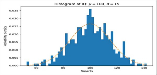

更新时间:17-Mar-2021
2K+ 浏览量

广告