
 数据结构
数据结构 网络
网络 关系型数据库管理系统
 操作系统
操作系统 Java
Java iOS
iOS HTML
HTML CSS
CSS Android
 Python
 C 编程
C 编程 C++
C++ C#
C# MongoDB
 MySQL
MySQL Javascript
 PHP
PHPPython-Matplotlib 中的坐标轴格式化
Matplotlib 是 Python 中一个流行的数据可视化库,它提供了各种绘图和图表来以有意义的方式表示数据。数据可视化的一个重要方面是格式化坐标轴以有效地传达信息。在本博文中,我们将讨论在 Matplotlib 中格式化坐标轴的不同方法以及 Python 代码的使用。
Matplotlib 坐标轴
它们是 Matplotlib 图形中可以绘制数据的区域。一个图形可以有多个坐标轴,可以以网格状排列。每个坐标轴都可以有标签、刻度标记、刻度标签和其他可以自定义以满足可视化需求的视觉元素。
格式化坐标轴
Matplotlib 提供了许多选项来自定义坐标轴的外观,例如更改坐标轴限制、添加网格线、更改刻度标记和标签以及旋转刻度标签。我们将逐一讨论这些选项。
更改坐标轴限制
添加网格线
更改刻度标记和标签
语法
for x-axis
Axes.set_xlabel(self, xlabel, fontdict=None, labelpad=None, \*\*kwargs)
for y-axis
Axes.set_ylabel(self, ylabel, fontdict=None, labelpad=None, \*\*kwargs)
示例 1
这是一个在 Python 的 Matplotlib 库中为 x 轴和 y 轴添加标签的示例代码。
算法
导入必要的库:matplotlib.pyplot 和 numpy。
使用 numpy 创建一个示例数据集。
使用 subplots() 方法创建图形和坐标轴。
分别使用 set_xlabel() 和 set_ylabel() 方法设置 x 和 y 标签。
分别使用 set_xlim() 和 set_ylim() 方法设置 x 和 y 限制。
分别使用 set_xticks() 和 set_yticks() 方法设置 x 和 y 刻度。
分别使用 set_xticklabels() 和 set_yticklabels() 方法设置刻度标签。
使用 set_title() 方法设置标题。
使用 grid() 方法设置网格线。
使用 savefig() 方法保存图形。
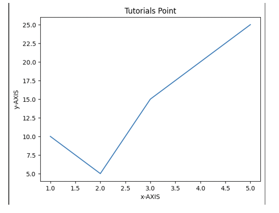
# importing matplotlib module
import matplotlib.pyplot as plt
import numpy as np

# x-axis & y-axis values
x = [1, 2, 3, 4, 5]
y = [10, 5, 15, 20, 25]

# create a figure and axes
fig, ax = plt.subplots()

# setting title to graph
ax.set_title('Tutorials Point')

# label x-axis and y-axis
ax.set_ylabel('y-AXIS')
ax.set_xlabel('x-AXIS')

# function to plot and show graph
ax.plot(x, y)
plt.show()
输出
示例 2
Python-matplotlib 中的坐标轴格式化 - x 轴和 y 轴的限制,在本例中分别为 (10,0) 和 (0,40)。坐标轴的限制设置了图中覆盖的最高点。默认情况下,将指向给定点的 x 轴最大值和 y 轴最大值。
算法
导入必要的库,包括 Matplotlib。
使用 plt.figure() 函数创建图形对象。
使用 plt.axes() 函数创建一组坐标轴。
使用 plt.plot() 功能创建您的绘图。
要标记坐标轴,请使用 plt.xlabel() 和 plt.ylabel() 函数,并将首选标签作为字符串提供。
要为绘图提供标题,请使用 plt.identify() 函数。
根据需要利用 plt.xticks()、plt.yticks()、plt.grid() 和 plt.tick_params() 等函数调整刻度标签和网格线。
使用 plt.savefig() 函数保存绘图。
使用 plt.show() 函数显示绘图。
import matplotlib.pyplot as plt
import numpy as np

x = [1, 2, 3, 4, 5]
y = [10, 5, 15, 20, 25]

# create a figure and axes
fig, ax = plt.subplots()

ax.set_title('Tutorials Point')

ax.set_ylabel('y-AXIS')
ax.set_xlabel('x-AXIS')

# sets x, y-axis limits on the graph
ax.set_xlim(0, 10)
ax.set_ylim(0, 40)

# function to plot and show graph
ax.plot(x, y)
plt.show()
输出

结论
在 Python 的 Matplotlib 中格式化坐标轴是每个数据分析师或科学家都应该掌握的一项基本技能。通过调整坐标轴的属性(例如标签、刻度、限制、比例和网格),我们可以创建清晰且信息丰富的可视化效果,有效地传达我们的见解。

1K+ 次查看
