
 数据结构
数据结构 网络
网络 关系数据库管理系统
 操作系统
操作系统 Java
Java iOS
iOS HTML
HTML CSS
CSS Android
 Python
 C 编程
C 编程 C++
C++ C#
C# MongoDB
 MySQL
MySQL Javascript
 PHP
PHPPython-Plotly 中的悬停文本和格式化
Python-Plotly 是一个广泛使用的 数据可视化 库,它提供了各种增强可视化的功能,其中一项功能是悬停文本和格式化,它允许用户在悬停在数据点上时提供其他信息并自定义工具提示的外观。数据可视化是理解和呈现复杂信息的强大工具。在本文中,我们将探讨如何在 Python-Plotly 中利用悬停文本和格式化来改进数据可视化并有效地传达见解。
如何在 Python-Plotly 中进行悬停文本和格式化?
以下是使用不同 hovermode 在 Python-Plotly 中进行悬停文本和格式化的示例。
默认 hovermode
按照以下步骤操作,即可使用默认 hovermode 和自定义 hovertemplate:
导入必要的库,包括 Plotly Express。
从 Plotly Express 加载内置数据集 iris,其中包含有关鸢尾花的信息。
使用 px.scatter 创建散点图。
指定数据集 (df) 并将 sepal_width 和 sepal_length 列分别映射到 x 和 y 轴。
使用 color 参数根据 species 列区分数据点。
要在悬停文本中包含其他信息,我们使用 hover_data 参数指定 petal_length 和 petal_width 列。
将 hover_name 参数设置为 "species",以便物种名称也显示在悬停文本中。
通过使用 fig.update_traces 更新轨迹来自定义悬停文本和格式。我们将 hovertemplate 属性设置为格式化悬停文本,使用占位符 %{x}、%{y}、%{text} 和 %{customdata[1]} 来显示来自相应列的值。
将 text 属性设置为提供 y 轴的悬停文本,使用列表推导式为每个数据点重复格式化的花瓣长度值。
使用 fig.show() 显示图形。
默认情况下,属性 hovermode 的值为“closest”。
示例
import plotly.express as px
# Load the inbuilt dataset
df = px.data.iris()

# Create the scatter plot
fig = px.scatter(df, x="sepal_width", y="sepal_length", color="species",
   hover_data=["petal_length", "petal_width"],
   hover_name="species",
   title="Hover Text and Formatting Example")

# Customize hover text and formatting for the y-axis
fig.update_traces(hovertemplate="Sepal Width: %{x}<br>Sepal Length: %{y}<br>%{text}<br>Petal Width: %{customdata[1]}",
   text=["Petal Length: %{customdata[0]}"] * len(df))
fig.update_layout(hovermode="closest")

# Show the plot
fig.show()
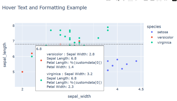
输出

运行此程序时,您应该会看到一个萼片宽度与萼片长度的散点图,其中点根据物种颜色区分。当您将鼠标悬停在某个点上时,悬停文本将显示该数据点的萼片宽度、萼片长度、花瓣长度和花瓣宽度。y 轴悬停文本将为每个数据点显示格式化的萼片长度值。
Y- 统一 hovermode
按照以下步骤操作,即可使用 Y-统一 hovermode 和自定义 hovertemplate:
导入必要的库,包括 Plotly Express。
从 Plotly Express 加载内置数据集 iris,其中包含有关鸢尾花的信息。
使用 px.scatter 创建散点图。
指定数据集 (df) 并将 sepal_width 和 sepal_length 列分别映射到 x 和 y 轴。
使用 color 参数根据 species 列区分数据点。
要在悬停文本中包含其他信息,我们使用 hover_data 参数指定 petal_length 和 petal_width 列。
将 hover_name 参数设置为 "species",以便物种名称也显示在悬停文本中。
通过使用 fig.update_traces 更新轨迹来自定义悬停文本和格式。我们将 hovertemplate 属性设置为格式化悬停文本,使用占位符 %{x}、%{y}、%{text} 和 %{customdata[1]} 来显示来自相应列的值。
将 text 属性设置为提供 y 轴的悬停文本,使用列表推导式为每个数据点重复格式化的花瓣长度值。
使用 fig.update_layout() 方法并将 hovermode 属性设置为 y 统一。
使用 fig.show() 显示图形。
示例
import plotly.express as px

# Load the inbuilt dataset
df = px.data.iris()

# Create the scatter plot
fig = px.scatter(df, x="sepal_width", y="sepal_length", color="species",
   hover_data=["petal_length", "petal_width"],
   hover_name="species",
   title="Hover Text and Formatting Example")

# Customize hover text and formatting for the y-axis
fig.update_traces(hovertemplate="Sepal Width: %{x}<br>Sepal Length: %{y}<br>%{text}<br>Petal Width: %{customdata[1]}",
                  text=["Petal Length: %{customdata[0]}"] * len(df))
fig.update_layout(hovermode="y unified")

# Show the plot
fig.show()
输出
X- 统一 hovermode
按照以下步骤操作,即可使用 X-统一 hovermode 和自定义 hovertemplate:
导入必要的库,包括 Plotly Express。
从 Plotly Express 加载内置数据集 iris,其中包含有关鸢尾花的信息。
使用 px.scatter 创建散点图。
指定数据集 (df) 并将 sepal_width 和 sepal_length 列分别映射到 x 和 y 轴。
使用 color 参数根据 species 列区分数据点。
要在悬停文本中包含其他信息,我们使用 hover_data 参数指定 petal_length 和 petal_width 列。
将 hover_name 参数设置为 "species",以便物种名称也显示在悬停文本中。
通过使用 fig.update_traces 更新轨迹来自定义悬停文本和格式。我们将 hovertemplate 属性设置为格式化悬停文本,使用占位符 %{x}、%{y}、%{text} 和 %{customdata[1]} 来显示来自相应列的值。
将 text 属性设置为提供 y 轴的悬停文本,使用列表推导式为每个数据点重复格式化的花瓣长度值。
使用 fig.update_layout() 方法并将 hovermode 属性设置为 x 统一。
使用 fig.show() 显示图形。
示例
import plotly.express as px

# Load the inbuilt dataset
df = px.data.iris()

# Create the scatter plot
fig = px.scatter(df, x="sepal_width", y="sepal_length", color="species",
   hover_data=["petal_length", "petal_width"],
   hover_name="species",
   title="Hover Text and Formatting Example")

# Customize hover text and formatting for the y-axis
fig.update_traces(hovertemplate="Sepal Width: %{x}<br>Sepal Length: %{y}<br>%{text}<br>Petal Width: %{customdata[1]}",
   text=["Petal Length: %{customdata[0]}"] * len(df))
fig.update_layout(hovermode="x unified")

# Show the plot
fig.show()
输出

结论
总之,Python-Plotly 中的悬停文本和格式化提供了一种无缝的方式来增强数据可视化。通过提供其他上下文并自定义工具提示的外观,用户可以有效地传达见解并提高数据理解。悬停文本的交互性为可视化增加了深度和参与度,使它们更具信息性和用户友好性。凭借 Python-Plotly 的强大功能,数据分析师和可视化设计师可以创建视觉上吸引人且交互式的图形,以有效地传达信息。

2K+ 浏览量
