
 数据结构
数据结构 网络
网络 RDBMS
RDBMS 操作系统
操作系统 Java
Java MS Excel
 iOS
iOS HTML
HTML CSS
CSS Android
 Python
 C 编程
C 编程 C++
C++ C#
C# MongoDB
 MySQL
MySQL Javascript
 PHP
PHP 物理
物理 化学
化学 生物
生物 数学
数学 英语
英语 经济学
经济学 心理学
心理学 社会学
社会学 时尚学
时尚学 法律学
法律学如何用 CSS 创建翻转框?
使用 CSS 创建翻转框的代码如下 −
示例
<!DOCTYPE html>
<html>
<head>
<meta name="viewport" content="width=device-width, initial-scale=1">
<style>
body {
font-family: 'Segoe UI', Tahoma, Geneva, Verdana, sans-serif;
margin:20px;
}
.flipCard {
background-color: transparent;
width: 300px;
height: 300px;
perspective: 1000px;
}
.innerCard {
position: relative;
width: 100%;
height: 100%;
text-align: center;
transition: transform 0.6s;
transform-style: preserve-3d;
box-shadow: 0 4px 8px 0 rgba(0,0,0,0.2);
}
.flipCard:hover .innerCard {
transform: rotateY(180deg);
}
.frontCard, .cardBack {
position: absolute;
width: 100%;
height: 100%;
-webkit-backface-visibility: hidden;
backface-visibility: hidden;
}
.frontCard {
background-color: rgb(124, 225, 243);
color: black;
}
.cardBack {
background-color: #3329b9;
color: white;
transform: rotateY(180deg);
font-size: 18px;
font-weight: bold;
}
</style>
</head>
<body>
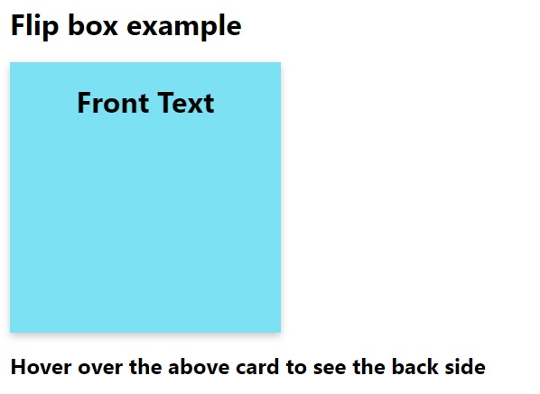
<h1>Flip box example</h1>
<div class="flipCard">
<div class="innerCard">
<div class="frontCard">
<h1>Front Text</h1>
</div>
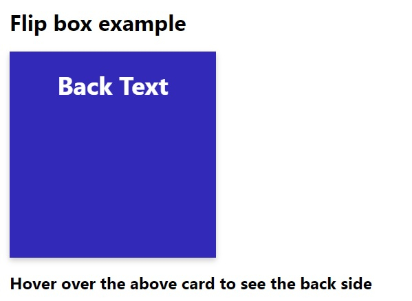
<div class="cardBack">
<h1>Back Text</h1>
</div>
</div>
</div>
<h2>Hover over the above card to see the back side</h2>
</body>
</html>输出
上述代码将产生以下输出 −
将鼠标悬停在元素上方时,元素将翻转,如下所示 −

更新于: 2020-05-08
706 次浏览

广告