
 数据结构
数据结构 网络
网络 关系型数据库管理系统
 操作系统
操作系统 Java
Java iOS
iOS HTML
HTML CSS
CSS Android
 Python
 C 编程
C 编程 C++
C++ C#
C# MongoDB
 MySQL
MySQL Javascript
 PHP
PHP如何使用 Python 中的 Plotly 创建人口金字塔?
人口金字塔是人口年龄和性别分布的图形表示。它由两个背靠背的条形图组成,一个显示男性的分布,另一个显示女性在不同年龄组中的分布。人口金字塔是一种强大的可视化工具,可以帮助我们了解人口的构成,并识别趋势和模式。
在本文中,我们将探讨如何使用 Python 中的 Plotly 创建人口金字塔。Plotly 是一个强大的可视化库,它允许我们在 Python 中创建交互式和动态图表。
我们将使用 Plotly 创建一个显示人口年龄和性别分布的人口金字塔。我们将首先将数据加载到 pandas DataFrame 中,然后使用 Plotly 创建人口金字塔。
使用 Plotly Express
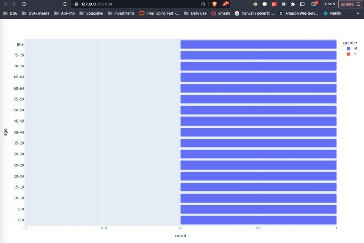
Plotly Express 是 Plotly 的高级 API,它可以轻松创建多种类型的图表,包括人口金字塔。我们可以使用 px.bar() 函数创建构成人口金字塔的两个背靠背的条形图。
请考虑以下代码。
示例
import plotly.express as px
import pandas as pd

# Load the data into a pandas DataFrame
df = pd.read_csv("population_data.csv")

# Create the population pyramid using Plotly Express
fig = px.bar(df, x="count", y="age", orientation="h", color="gender",
         	barmode="relative", range_x=[-1, 1])

# Show the plot
fig.show()
解释
我们首先导入库,包括用于创建图表的 plotly.express 和用于将数据加载到 DataFrame 中的 pandas。
接下来,我们使用 read_csv() 函数将人口数据从 CSV 文件加载到 pandas DataFrame 中。
然后,我们创建 px.bar() 函数,它将 DataFrame 作为第一个参数,以及其他几个参数来指定图表的布局和样式。
x 参数指定用于条形长度的变量,即每个年龄组中的人数。
y 参数指定用于条形高度的变量,即年龄组。
orientation 参数指定条形应为水平方向。
color 参数指定条形应按性别着色。
barmode 参数指定条形应彼此堆叠。
range_x 参数指定 x 轴的范围,这决定了金字塔的大小。
最后,我们使用 show() 方法打印图表。
输出
使用 Plotly 图形对象
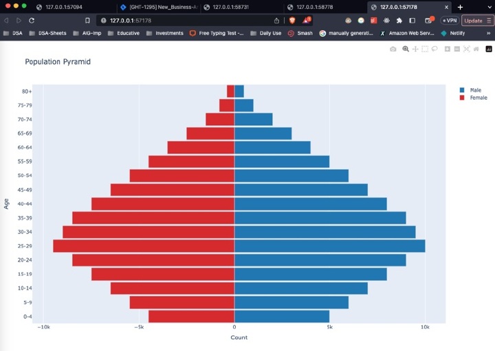
Plotly 图形对象是 Plotly 的低级 API,它提供了更多灵活性和对图表布局和样式的控制。我们可以使用 Plotly 图形对象通过创建两个条形轨迹(一个用于男性,另一个用于女性),然后将它们组合成一个图形来创建人口金字塔。
请考虑以下代码。
示例
import plotly.graph_objs as go
import pandas as pd

# Load the data into a pandas DataFrame
df = pd.read_csv("population_data.csv")

# Create the male and female bar traces
trace_male = go.Bar(x=df[df["gender"]=="M"]["count"],
                	y=df[df["gender"]=="M"]["age"],
                	orientation="h",
                	name="Male",
                	marker=dict(color="#1f77b4"))

trace_female = go.Bar(x=df[df["gender"]=="F"]["count"]*(-1),
                  	y=df[df["gender"]=="F"]["age"],
                  	orientation="h",
                  	name="Female",
                  	marker=dict(color="#d62728"))

# Create the layout
layout = go.Layout(title="Population Pyramid",
               	xaxis=dict(title="Count"),
               	yaxis=dict(title="Age"),
               	barmode="overlay",
               	bargap=0.1)

# Create the figure
fig = go.Figure(data=[trace_male, trace_female], layout=layout)

# Show the plot
fig.show()
解释
第一步是导入必要的模块:plotly.graph_objs 和 pandas。
数据使用 pd.read_csv 方法加载到 pandas DataFrame 中。
使用 go.Bar 方法为男性和女性人口创建两个条形图轨迹,分别使用计数和年龄组作为 x 和 y 值。方向设置为水平方向,每个轨迹使用 name 和 marker 参数分别指定名称和颜色。
为图表创建布局,包括标题以及 x 轴和 y 轴的标签。
使用 go.Figure 方法使用两个轨迹和布局创建图形。
最后,使用 fig.show() 方法显示图表。
输出
结论
在本文中,我们学习了如何使用 Python 中的 Plotly 创建人口金字塔。我们探索了两种不同的方法来实现这一点,一种使用 pandas 透视表,另一种使用 Plotly 图形对象。我们讨论了每种方法的优缺点,并提供了每种方法中使用的代码的详细解释。
通过遵循本文中提供的步骤和示例,您可以使用 Python 中的 Plotly 创建自己的金字塔,并探索各种自定义和分析数据的方法。

790 次查看
