
 数据结构
数据结构 网络
网络 关系数据库管理系统(RDBMS)
 操作系统
操作系统 Java
Java iOS
iOS HTML
HTML CSS
CSS Android
 Python
 C语言编程
C语言编程 C++
C++ C#
C# MongoDB
 MySQL
MySQL Javascript
 PHP
PHP如何在Python Matplotlib中绘制具有自定义颜色和自定义区域大小的4D散点图?
介绍..
散点图在用两个维度表示数据以验证两个变量之间是否存在任何关系时非常有用。散点图是一种图表,其中数据以具有 X 和 Y 值的点表示。
操作方法..
1. 使用以下命令安装 matplotlib。
pip install matplotlib
2. 导入 matplotlib
import matplotlib.pyplot as plt
tennis_stats = (('Federer', 20),('Nadal', 20),('Djokovic', 17),('Sampras', 14),('Emerson', 12),('laver', 11),('Murray', 3),('Wawrinka', 3),('Zverev', 0),('Theim', 1),('Medvedev',0),('Tsitsipas', 0),('Dimitrov', 0),('Rublev', 0))
3. 下一步是以任何数组格式准备数据。我们也可以从数据库或电子表格中读取数据,并将数据格式化为如下格式。
titles = [title for player, title in tennis_stats]
players = [player for player, title in tennis_stats]
4. 与 matplotlib 的其他方法一样,.scatter 的参数需要一个 X 和 Y 值数组。
*注意* - X 和 Y 值都需要大小相同,并且数据默认转换为浮点数。
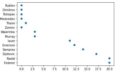
plt.scatter(titles, players)
<matplotlib.collections.PathCollection at 0x28df3684ac0>
5. 哦,我的大满贯冠军头衔绘制在 x 轴上是一个浮点数。我将把它们转换为整数,并在下面的函数中添加 x 轴和 y 轴的标题。轴格式化程序将被 .set_major_formatter 覆盖。
from matplotlib.ticker import FuncFormatter
def format_titles(title, pos):
return '{}'.format(int(title))

plt.gca().xaxis.set_major_formatter(FuncFormatter(format_titles))
plt.xlabel('Grandslam Titles')
plt.ylabel('Tennis Player')
plt.scatter(titles, players)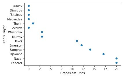
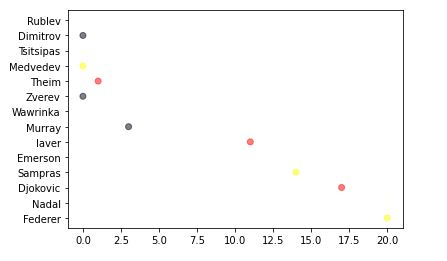
6. 不要将散点图仅仅视为二维图表,散点图还可以添加第三维(面积)甚至第四维(颜色)。让我稍微解释一下我下面将要做什么。
首先,我们将定义您选择的颜色,然后循环遍历它们,随机选择颜色并将其分配给您的值。
alpha 值使每个点都半透明,允许我们看到它们重叠的地方。此值越高,点的不透明度就越低。
import random

# define your own color scale.
random_colors = ['#FF0000', '#FFFF00', '#FFFFF0', '#FFFFFF', '#00000F']

# set the number of colors similar to our data values
color = [random.choice(random_colors) for _ in range(len(titles))]

plt.scatter(titles, players, c=color, alpha=0.5)
<matplotlib.collections.PathCollection at 0x28df2242d00>
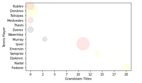
7. 现在,让我们使表示的大小/面积更大一些。
import random

# define your own color scale.
random_colors = ['#FF0000', '#FFFF00', '#FFFFF0', '#FFFFFF', '#00000F']

# set the number of colors similar to our data values
color = [random.choice(random_colors) for _ in range(len(titles))]

# set the size
size = [(50 * random.random()) ** 2 for _ in range(len(titles))]

plt.gca().xaxis.set_major_formatter(FuncFormatter(format_titles))
plt.xlabel('Grandslam Titles')
plt.ylabel('Tennis Player')

plt.scatter(titles, players, c=color, s=size, alpha=0.1)
<matplotlib.collections.PathCollection at 0x28df22e2430>
记住,图表的最终目标是使数据易于理解。
我已经展示了您可以使用散点图进行的基本操作。您可以做得更多,例如,使颜色取决于大小以使所有相同大小的点都具有相同的颜色,这可以帮助我们区分数据。
了解更多 - https://matplotlib.net.cn/。
最后,将所有内容放在一起。
示例
# imports
import matplotlib.pyplot as plt
import random

# preparing data..
tennis_stats = (('Federer', 20),('Nadal', 20),('Djokovic', 17),('Sampras', 14),('Emerson', 12),('laver', 11),('Murray', 3),('Wawrinka', 3),('Zverev', 0),('Theim', 1),('Medvedev',0),('Tsitsipas', 0),('Dimitrov', 0),('Rublev', 0))

titles = [title for player, title in tennis_stats]
players = [player for player, title in tennis_stats]

# custom function
from matplotlib.ticker import FuncFormatter
def format_titles(title, pos):
return '{}'.format(int(title))

# define your own color scale.
random_colors = ['#FF0000', '#FFFF00', '#FFFFF0', '#FFFFFF', '#00000F']

# set the number of colors similar to our data values
color = [random.choice(random_colors) for _ in range(len(titles))]

# set the size
size = [(50 * random.random()) ** 2 for _ in range(len(titles))]

plt.gca().xaxis.set_major_formatter(FuncFormatter(format_titles))
plt.xlabel('Grandslam Titles')
plt.ylabel('Tennis Player')

plt.scatter(titles, players, c=color, s=size, alpha=0.1)
<matplotlib.collections.PathCollection at 0x2aa7676b670>


更新于:2020年11月10日
742 次浏览

广告