
 数据结构
数据结构 网络
网络 关系数据库管理系统 (RDBMS)
 操作系统
操作系统 Java
Java iOS
iOS HTML
HTML CSS
CSS Android
 Python
 C语言编程
C语言编程 C++
C++ C#
C# MongoDB
 MySQL
MySQL Javascript
 PHP
PHP如何在Matplotlib中为所有子图设置单个主标题?
多个子图由一系列不同的绘图图表定义。Matplotlib是一个模块的名称,它提供Python中的动画和交互式可视化。在Python中,我们有一些名为`suptitle()`的内置函数,可用于在Matplotlib中为所有子图设置单个主标题。
语法
以下语法用于示例中:
array()
Python的数组方法通过返回具有特定值的元素数量来定义。
suptitle()
这是Python中的内置方法,可用于设置所有子图的主标题。
add_subplot()
此方法遵循包装器模块,即matplotlib.pyplot,并在使用图像窗口API时提供附加行为。
imshow()
这是Python中的一个内置函数,可用于在窗口中显示图像。
set_ylabel()
set_xlabel()
这两个内置函数遵循matplotlib模块,用于设置垂直和水平两侧的标签或文本。
show()
这是Python中的内置方法,用于在程序结束时以图形的形式获取结果。
figure()
figure是Python中的内置方法,用于创建一个新图形。
示例1
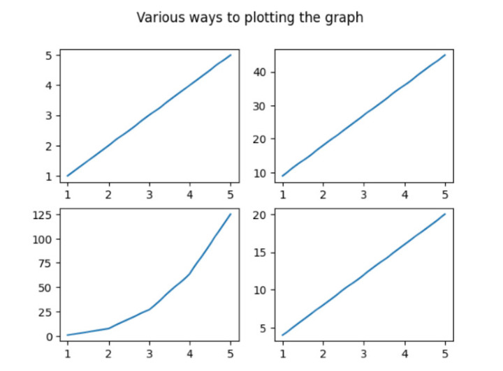
在下面的示例中,我们将从导入名为numpy和matplotlib.pyplot的模块开始程序。然后使用内置方法`array()`设置数组列表并将其存储在变量x中。然后初始化fig,ax(表示名为fig的类的对象)并通过创建遵循名为matplotlib.pyplot的包装器模块的子图来存储值。接下来,使用内置方法`subplot()`设置4个不同的子图。然后使用内置方法`suptitle()`设置主标题,该标题代表所有绘图图表的标题。接下来,使用`show()`方法获得所需的结果。
import numpy as np
import matplotlib.pyplot as plt
# create data
x=np.array([1, 2, 3, 4, 5])

# making subplots
fig, ax = plt.subplots(2, 2)

# Set data with subplots and plot
ax[0, 0].plot(x, x)
ax[0, 1].plot(x, x*9)
ax[1, 0].plot(x, x*x*x)
ax[1, 1].plot(x, x*4)
plt.suptitle('Various ways to plotting the graph')
plt.show()
输出
示例2
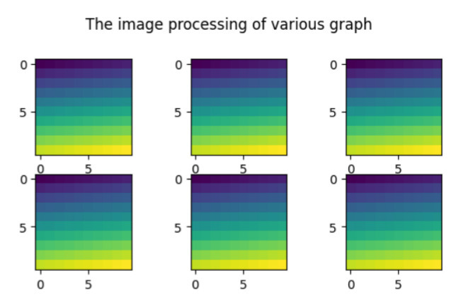
在下面的示例中,我们将显示所有不同绘图图表的标题。然后开始导入名为matplotlib.pyplot的包装器模块。然后使用名为`figure()`的方法创建新图形。接下来,使用`arange()`[定义数组中包含的区间值]和`reshape()`函数与numpy模块(即np)。开始迭代for循环以使用内置方法`add_subplot()`和`imshow()`基于图像处理设置6个图形。接下来使用内置方法`suptitle()`设置所有绘图图表的标题,并借助`show()`方法获得结果。
import matplotlib.pyplot as pl
import numpy as np
fig=pl.figure()
ax_range=np.arange(100).reshape((10,10))
for i in range(1,7):
   ax=fig.add_subplot(3,3,i)
   ax.imshow(ax_range)
# Set the main title of all the subplots
fig.suptitle('The image processing of various graph ')
pl.show()
输出
示例3
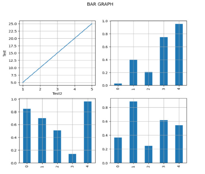
在下面的示例中,我们将开始实现必要的库pandas、numpy和matplotlib.pyplot,并将对象引用分别作为pd、np和plt。然后创建遵循pandas模块的DataFrame并接受参数-`np.random.rand()`[为特定形状创建数组并填充其值]和`columns`[以列表的形式设置列的总数]。接下来,在变量x和y中设置x轴和y轴的数据。然后使用`subplot()`将子图分成两行两列,具有相同的宽度和高度,即`figsize(8,8)`。现在使用内置方法`plot()`绘制轴,并使用内置方法`grid()`在图形上设置网格线。为了在图形上显示一些独特性,它将在图形的第一行和第一列上使用x轴和y轴上的标签。接下来设置主要任务,即设置所有绘图条形图的主标题。最后,我们借助`show()`打印结果。
import pandas as pd
import numpy as np
import matplotlib.pyplot as plt

# create the data
df=pd.DataFrame(np.random.rand(5, 5), columns=['a', 'b', 'c', 'd','e'])

# create the data
x=[1,2,3,4,5]
y=[5,10,15,20,25]

fig, axes = plt.subplots(figsize=(8,8),nrows=2, ncols=2)
ax1=plt.subplot(2,2,1)
plt.plot(x,y)

# plot the axes
df["b"].plot(ax=axes[1,0], kind='bar', grid=True)
df["c"].plot(ax=axes[1,1], kind='bar', grid=True)
df["d"].plot(ax=axes[0,1], kind='bar', grid=True)

# Set the gridlines on all the plotting graph
ax1.grid(True)

# Set the horizontal and vertical text
ax1.set_ylabel('Test')
ax1.set_xlabel('Test2')
fig.suptitle('BAR GRAPH')
plt.show()
输出
示例4
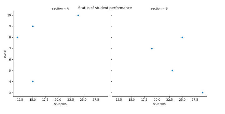
在下面的示例中,我们通过使用Seaborn模块创建散点图来启动程序,以可视化两个不同部分(A和B)中学生人数和分数之间的关系。然后我们使用`replot()`通过设置一些参数来创建散点图- data、x、y和col。接下来,使用名为`rel.fig.suptitle()`的内置方法设置主标题并获得最终结果。
import pandas as pd
import seaborn as sns
import matplotlib.pyplot as plt

#create the fake data
df = pd.DataFrame({'students': [15, 12, 15, 24, 19, 23, 25, 29],
   'score': [4, 8, 9, 10, 7, 5, 8, 3],
   'section': ['A', 'A', 'A', 'A', 'B', 'B', 'B', 'B']})

#create relplot
rel = sns.relplot(data=df, x='students', y='score', col='section')

#add the main title
rel.fig.suptitle('Status of student performance')
输出
结论
我们讨论了在单个框架内绘制不同图形的不同方法。`suptitle()`是Python中重要的一个方法,它为Matplotlib中的所有子图设置单个主标题。我们看到了新的概念,即图形上的图像处理,而其他示例则显示了条形图、散点图和线图等图形。

4K+浏览量
