
 数据结构
数据结构 网络
网络 关系数据库管理系统
 操作系统
操作系统 Java
Java iOS
iOS HTML
HTML CSS
CSS Android
 Python
 C 语言编程
 C++
C++ C#
C# MongoDB
 MySQL
MySQL Javascript
 PHP
PHP如何在 Seaborn 图表中设置坐标轴标签和限制?
使用 Seaborn 创建图表将调整标签和坐标轴限制,使图表更易于理解。坐标轴标签是我们可以为 x 轴和 y 轴提供的名称,以便其他人理解图表显示的内容。我们可以通过更改坐标轴的限制来关注数据中重要的特定区域。Seaborn 包含用于设置坐标轴标签和限制的简单方法,使我们能够使图表更具信息量。在 Python 中,我们有一些内置函数,如 xlabel()、ylabel()、xlim() 和 ylim(),可用于在 Seaborn 图表中设置坐标轴标签和限制。
语法
以下语法在示例中使用:
xlabel()
ylabel()
xlabel() 和 ylabel() 是 Python 中的内置函数,用于设置 x 轴(水平)和 y 轴(垂直)上的文本。
xlim()
ylim()
xlim() 和 ylim() 是内置函数,分别用于设置 x 轴和 y 轴上的指定范围。
scatterplot()
scatterplot() 是 Python 中的内置方法,它根据数据集帮助设置图形的点图。
lineplot()
lineplot() 方法用于显示图表的区间。这是一种基本图表,主要用于机器学习数据集中。
barplot()
这是一种 Python 中的内置方法,将用于创建数据集的条形图。
histplot()
histplot() 根据数据集创建基于直方图的图表。
boxplot()
boxplot() 方法以标准化方式显示高级摘要,以根据数据集汇总数据。
算法
以下步骤为:
步骤 1 - 导入 seaborn 模块并获取对象引用为 sns
步骤 2 - 导入名为 matplotlib.pyplot 的模块并获取引用为 plt,这有助于设置 Seaborn 图表的坐标轴标签和限制。
步骤 3 - 使用随机数据创建两个列表,并分别将其存储在变量 x 和 y 中。
步骤 4 - 然后根据用户选择创建图表图形,例如 scatterplot()、lineplot()、boxplot() 和 histplot(),它们接受两个参数 - x(这将值存储为变量 x)和 y(这将值存储为变量 y)以及对象引用 sns。
步骤 5 - 接下来,使用内置方法 xlabel() 和 ylabel() 分别在水平(x 轴)和垂直轴(y 轴)上创建文本表示。
步骤 6 - 要设置图形的范围,它将使用内置方法 xlim() 用于水平轴,ylim() 用于垂直轴。
步骤 7 - 最后使用名为 show() 的方法,它将生成程序的输出。
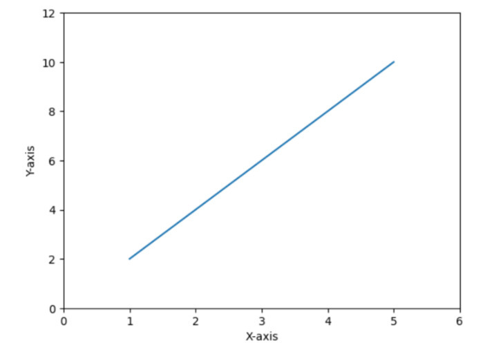
示例 1
在以下示例中,我们将展示如何通过设置标签和限制来绘制散点图。众所周知,Seaborn 库可以方便地与 matplotlib 模块一起使用,它将根据给定的数据集生成图表。
# Scatter plot
import seaborn as sns
import matplotlib.pyplot as plt

# Generate some random data
x = [1, 2, 3, 4, 5]
y = [2, 4, 6, 8, 10]

# Create a scatter plot
sns.scatterplot(x=x, y=y)

# Set labels and limits
plt.xlabel('X-axis')
plt.ylabel('Y-axis')
plt.xlim(0, 6)
plt.ylim(0, 12)

# Show the plot
plt.show()
输出

示例 2
在以下示例中,我们将展示如何使用 Seaborn 图表设置标签和限制来绘制线形图。它还使用 matplotlib 子模块,即 pyplot,它有助于绘制图形并通过向其提供特定的内置方法来生成输出。
import seaborn as sns
import matplotlib.pyplot as plt

# Generate some random data
x = [1, 2, 3, 4, 5]
y = [2, 4, 6, 8, 10]

# Create a line plot
sns.lineplot(x=x, y=y)

# Set labels and limits
plt.xlabel('X-axis')
plt.ylabel('Y-axis')
plt.xlim(0, 6)
plt.ylim(0, 12)

# Show the plot
plt.show()
输出
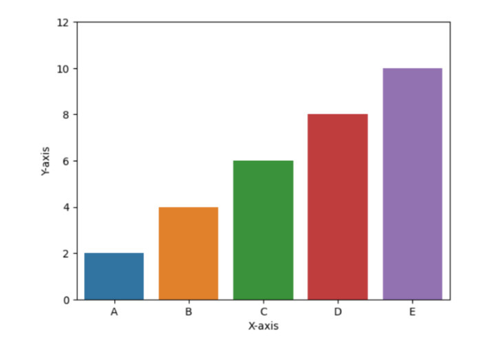
示例 3
在以下示例中,我们将展示条形图barplots(),并且要设置标签和坐标轴,它必须使用以下方法:xlabel()、ylabel()、ylim()。接下来,使用 show() 方法获取结果。
# Bar plot
import seaborn as sns
import matplotlib.pyplot as plt

# Generate some random data
x = ['A', 'B', 'C', 'D', 'E']
y = [2, 4, 6, 8, 10]

# Create a bar plot
sns.barplot(x=x, y=y)

# Set labels and limits
plt.xlabel('X-axis')
plt.ylabel('Y-axis')
plt.ylim(0, 12)

# Show the plot
plt.show()
输出
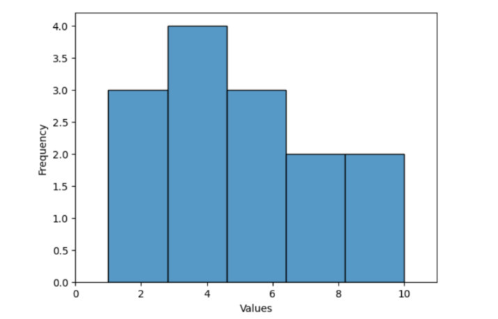
示例 4
在以下示例中,我们将展示如何使用内置方法 histplot() 绘制直方图,该方法接受名为 data 的变量作为参数,该变量包含随机数据,并使用 xlabel() 和 ylabel() 等内置函数分别在水平和垂直轴上设置文本名称。然后使用 xlim() 和 ylim() 分别获取 x 轴和 y 轴上整数的范围限制。最后,它将使用 show() 方法获取程序的输出。
import seaborn as sns
import matplotlib.pyplot as plt

# Generate some random data
data = [1, 2, 3, 4, 5, 2, 3, 4, 5, 6, 7, 8, 9, 10]

# Create a histogram
sns.histplot(data)

# Set labels and limits
plt.xlabel('Values')
plt.ylabel('Frequency')
plt.xlim(0, 11)

# Show the plot
plt.show()
输出
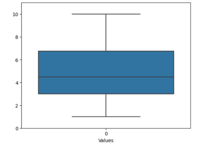
示例 5
在以下示例中,我们将通过导入模块 seaborn 和 matplotlib.pyplot 开始程序,这有助于绘制图形图表。然后它使用列表中的随机数据来描绘虚假数据。接下来,使用名为 boxplot() 的方法以及对象引用 sns 创建箱线图。然后仅使用 ylim() [设置图形范围] 在垂直轴上设置限制,并仅使用 xlabel() [填写文本以在水平轴上显示某些内容] 在 x 轴上设置标签。最后,使用 show() 方法获取输出。
import seaborn as sns
import matplotlib.pyplot as plt

# Generate some random data
data = [1, 2, 3, 4, 5, 2, 3, 4, 5, 6, 7, 8, 9, 10]

# Create a box plot
sns.boxplot(data)

# Set labels and limits
plt.xlabel('Values')
plt.ylim(0, 11)

# Show the plot
plt.show()
输出
结论
我们讨论了绘制不同类型图形的各种方法,以及使用 xlim()、ylim()、xlabel() 和 ylabel() 等相同内置函数可以设置图形的名称和范围。Seaborn 图表通常用于分析各种数据可视化模式。

10K+ 次查看
