
 数据结构
数据结构 网络
网络 关系数据库管理系统
 操作系统
操作系统 Java
Java iOS
iOS HTML
HTML CSS
CSS Android
 Python
 C 编程
C 编程 C++
C++ C#
C# MongoDB
 MySQL
MySQL Javascript
 PHP
PHP使用 Python 中的 Seaborn 绘制图形。
Plotly 的 Python 制图库可以在线制作交互式出版级图表。此图表主要用于绘制折线图、散点图、面积图、条形图、误差棒图、箱线图、直方图、热力图、子图、多轴、极坐标图和气泡图。
Seaborn 是一个用于在 Python 中制作统计图形的库。它建立在 matplotlib 之上且集成到 Pandas 数据结构中。
1. 我们导入 Seaborn,这是此简单示例所必需的唯一库。
import seaborn as sns
2. 我们应用默认的 Seaborn 主题、缩放和调色板。
sns.set()
3. 我们加载其中一个示例数据集。
tips = sns.load_dataset("tips")
4. 我们绘制一个分面散点图,其中包含多个语义变量。
示例代码
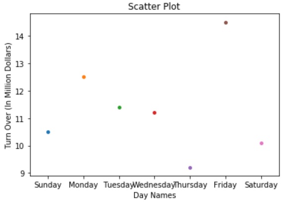
# This Python program will illustrate scatter plot with Seaborn
# importing modules
import matplotlib.pyplot as plt
import seaborn as sns
# values for x-axis
x=['Sunday', 'Monday', 'Tuesday', 'Wednesday', 'Thursday', 'Friday', 'Saturday']
# valueds for y-axis
y=[10.5, 12.5, 11.4, 11.2, 9.2, 14.5, 10.1]
# plotting with seaborn
my_plot = sns.stripplot(x, y);
# assigning x-axis and y-axis labels
my_plot.set(xlabel ='Day Names', ylabel ='Turn Over (In Million Dollars)')
# assigning plot title
plt.title('Scatter Plot');
# function to show plot
plt.show()
输出

更新时间:30-7-2019
578 次浏览

广告