- 聚合物的有用资源
- 聚合物 - 快速指南
- 聚合物 - 有用资源
- 聚合物 - 讨论
聚合物 - 抽屉面板
paper-drawer-panel 是抽屉面板,可通过滑动显示/隐藏主面板。抽屉的常规位置位于主面板的左侧。在窄布局中,抽屉将堆叠在主面板之上。
若要在目录中获取 paper-drawer-panel,您应在命令提示符中使用以下命令。
bower install --save PolymerElements/paper-drawer-panel
示例
以下示例指定了在 Polymer.js 中使用 paper-drawer-panel 元素。创建 index.html 文件,并在其中添加以下代码。
<!doctype html>
<html>
   <head>
      <link rel = 'import' href = 'my-app.html'>
   </head>

   <body>
      <my-app></my-app>
   </body>
</html>
现在,打开 my-app.html 文件,并在其中包含以下代码。
<link rel = 'import' href='bower_components/polymer/polymer.html'>
<link rel = "import" href="bower_components/paper-button/paper-button.html">
<link rel = "import" href = "bower_components/paper-styles/paper-styles.html">
<link rel = "import" href = "bower_components/paper-card/paper-card.html">
<link rel = "import" href = "bower_components/iron-icons/iron-icons.html">
<link rel = "import" href = "bower_components/iron-icons/communication-icons.html">
<link rel = "import" href = "bower_components/paper-checkbox/paper-checkbox.html">
<link rel = "import" href = "bower_components/paper-drawer-panel/paper-drawer-panel.html">

<dom-module id = 'my-app'>
   <template>
      <style is = "custom-style">
         paper-button {
            color: white;
            margin: 10px;
            background-color: green;
            white-space: nowrap;
         }
         button {
            display: block;
            line-height: 40px;
            background-color: transparent;
            border: none;
            font-size: 14px;
            margin: 20px;
         }
         #close {
            color: white;
            margin: 10px;
            background-color: red;
            white-space: nowrap;
         }
      </style>

      <paper-drawer-panel id = "paperDrawerPanel" force-narrow>
         <div drawer>
            <button id = "close" tabindex = "0" paper-drawer-toggle raised>Close Drawer</button>
            <h3>Welcome to Tutorials point</h3>
         </div>

         <div main>
            <div>
               <paper-button paper-drawer-toggle raised>Open Drawer</paper-button>
            </div>
         </div>
      </paper-drawer-panel>
   </template>

   <script>
      Polymer ({
         is: 'my-app',
         ready: function() {
            this.async(function() {
            });
         }
      });
   </script>
</dom-module>
输出
若要运行应用程序,请导航至已创建的项目目录,并运行以下命令。
polymer serve
现在,打开浏览器并导航至 http://127.0.0.1:8081/。以下为输出。
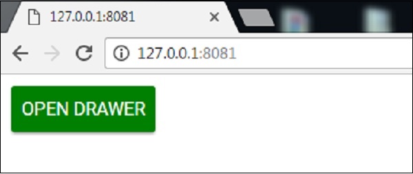
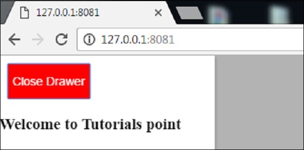
当您单击“打开抽屉”按钮时,以下为输出。
polymer_elements.htm
广告