- 聚合物的有用资源
- 聚合物 - 快速指南
- 聚合物 - 有用资源
- 聚合物 - 讨论
聚合物 - 纸张图标按钮
纸张图标按钮是一个动作按钮,可表示特定操作,例如设置。用户触摸该按钮时会产生波纹效果。你可以将这些按钮用作链接,或者可以对按钮进行一些样式化,如以下示例所示。为了使目录中出现纸张图标按钮和铁制图标,必须在工作状态下在命令提示符中运行以下命令。
bower install --save PolymerElements/paper-icon-button
示例
index.html 文件应如下所示。
<!doctype html>
<html>
   <head>
      <link rel = 'import' href = 'my-app.html'>
   </head>

   <body>
      <my-app></my-app>
   </body>
</html>
my-app.html 文件应如下所示。
<link rel = 'import' href = 'bower_components/polymer/polymer.html'>
<link rel = "import" href = "bower_components/iron-icons/iron-icons.html">
<link rel = "import" href = "bower_components/paper-icon-button/paper-icon-button.html">
<dom-module id = 'my-app'>
<template>
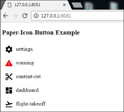
<h3>Paper-Icon-Button Example </h3>
<paper-icon-button icon = "settings" ></paper-icon-button>settings
<br>
<paper-icon-button icon = "warning" style = "color: red;" ></paper-icon-button>warning
<br>
<paper-icon-button icon = "content-cut" ></paper-icon-button>content-cut
<br>
<paper-icon-button icon = "dashboard" ></paper-icon-button>dashboard
<br>
<paper-icon-button icon = "flight-takeoff" ></paper-icon-button>flight-takeoff
<br>
</template>
<script>
Polymer ({
is: 'my-app',
ready: function() {
this.async(function() {
});
}
});
</script>
</dom-module>
输出
刷新聚合物服务器后,输出将如下。
polymer_elements.htm
广告