
 数据结构
数据结构 网络
网络 关系数据库管理系统 (RDBMS)
 操作系统
操作系统 Java
Java iOS
iOS HTML
HTML CSS
CSS Android
 Python
 C 编程
C 编程 C++
C++ C#
C# MongoDB
 MySQL
MySQL Javascript
 PHP
PHP如何在 Python Seaborn 库中使用 countplot 可视化数据?
Seaborn 是一个有助于数据可视化的库。它带有自定义主题和高级界面。
在之前的图表中,我们将整个数据集绘制在图表上。借助条形图,我们可以了解数据分布的中心趋势。
barplot 函数建立了分类变量和连续变量之间的关系。数据以矩形条的形式表示,其中条的长度表示该特定类别中数据的比例。
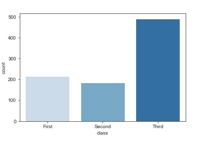
barplot 的一个特例是 countplot,它显示每个类别中的观察次数相对于数据,而不是计算第二个变量的统计值。
让我们借助“titanic”数据集来了解 countplot:
示例
import pandas as pd
import seaborn as sb
from matplotlib import pyplot as plt
my_df = sb.load_dataset('titanic')
sb.countplot(x = "class", data = my_df, palette = "Blues");
plt.show()
输出
解释
- 导入所需的包。
- 输入数据是“titanic”,它从 seaborn 库加载。
- 此数据存储在数据框中。
- 使用 'load_dataset' 函数加载 iris 数据。
- 使用 'countplot' 函数可视化此数据。
- 在此,数据框作为参数提供。
- 此外,还指定了 x 和 y 值。
- 此数据显示在控制台上。

更新于:2020年12月11日
215 次查看

广告