


如何用 Python 结合多张图表
导言
Matplotlib 允许在同一个图表中添加多个绘图。在本教程中,我将向你展示如何使用两个不同的轴线将数据显示在同一个绘图中。
如何操作
1. 安装 matplotlib,打开 Python 命令提示符并启动 pip install matplotlib。
import matplotlib.pyplot as plt
2. 准备要显示的数据。
import matplotlib.pyplot as plt

# data prep (I made up data no accuracy in these stats)
mobile = ['Iphone','Galaxy','Pixel']

# Data for the mobile units sold for 4 Quaters in Million
units_sold = (('2016',12,8,6),
('2017',14,10,7),
('2018',16,12,8),
('2019',18,14,10),
('2020',20,16,5),)
3. 将数据拆分为每个公司的手机单元的数组。
# data prep - splitting the data
Years, IPhone_Sales, Galaxy_Sales, Pixel_Sales = zip(*units_sold)

# set the position
Position = list(range(len(units_sold)))

# set the width
Width = 0.2
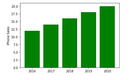
4. 创建第一个子绘图。
plt.subplot(2, 1, 1)
<matplotlib.axes._subplots.AxesSubplot at 0x214185d4e50>
5. 使用有关 IPhone_Sales 的信息创建一个条形图。
Iphone = plt.bar(Position, IPhone_Sales,color='green')
plt.ylabel('IPhone Sales')
plt.xticks(Position, Years)
([<matplotlib.axis.XTick at 0x214186115e0>, <matplotlib.axis.XTick at 0x21418611580>, <matplotlib.axis.XTick at 0x2141861fc40>, <matplotlib.axis.XTick at 0x21418654e20>, <matplotlib.axis.XTick at 0x2141865f370>], [Text(0, 0, '2016'), Text(0, 0, '2017'), Text(0, 0, '2018'), Text(0, 0, '2019'), Text(0, 0, '2020')])
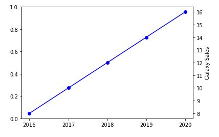
6. 现在创建另一个 y 轴以添加有关三星 Galaxy 销量的信息。
plt.twinx()
Galaxy = plt.plot(Position, Galaxy_Sales, 'o-', color='blue')
plt.ylabel('Galaxy Sales')
plt.xticks(Position, Years)
([<matplotlib.axis.XTick at 0x214186b4c40>, <matplotlib.axis.XTick at 0x214186b4c10>, <matplotlib.axis.XTick at 0x21418682ac0>, <matplotlib.axis.XTick at 0x214186dd8e0>, <matplotlib.axis.XTick at 0x214186dddf0>], [Text(0, 0, '2016'), Text(0, 0, '2017'), Text(0, 0, '2018'), Text(0, 0, '2019'), Text(0, 0, '2020')])
7. 我们现在将绘制最终的 Google Pixel 销量。
plt.subplot(2, 1, 2)
plt.plot(Position, Pixel_Sales, color='yellow')
plt.gca().set_ylim(ymin=0)
plt.xticks(Position, Years)
([<matplotlib.axis.XTick at 0x2141870f9a0>,
<matplotlib.axis.XTick at 0x2141870f580>,
<matplotlib.axis.XTick at 0x2141870a730>,
<matplotlib.axis.XTick at 0x2141873c9d0>,
<matplotlib.axis.XTick at 0x2141873cee0>],
[Text(0, 0, '2016'),
Text(0, 0, '2017'),
Text(0, 0, '2018'),
Text(0, 0, '2019'),
Text(0, 0, '2020')])
![]()
plt.show()
示例
8. 将所有内容放在一起并保存图表。
import matplotlib.pyplot as plt

# data prep (I made up data no accuracy in these stats)
mobile = ['Iphone','Galaxy','Pixel']

# Data for the mobile units sold for 4 Quaters in Million
units_sold = (('2016',12,8,6),
('2017',14,10,7),
('2018',16,12,8),
('2019',18,14,10),
('2020',20,16,5),)
# data prep - splitting the data
Years, IPhone_Sales, Galaxy_Sales, Pixel_Sales = zip(*units_sold)

# set the position
Position = list(range(len(units_sold)))

# set the width
Width = 0.2

plt.subplot(2, 1, 1)
Iphone = plt.bar(Position, IPhone_Sales,color='green')
plt.ylabel('IPhone Sales')
plt.xticks(Position, Years)

plt.twinx()
Galaxy = plt.plot(Position, Galaxy_Sales, 'o-', color='blue')
plt.ylabel('Galaxy Sales')
plt.xticks(Position, Years)

plt.subplot(2, 1, 2)
plt.plot(Position, Pixel_Sales, color='yellow')
plt.ylabel('Pixel Sales')
plt.gca().set_ylim(ymin=0)
plt.xticks(Position, Years)

# plt.show()
plt.savefig('CombiningGraphs.png', dpi=72)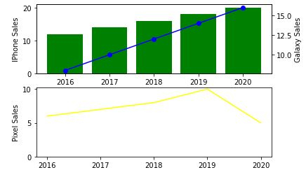

更新时间: 2020-11-10
18K+ 浏览量

广告