
 数据结构
数据结构 网络
网络 RDBMS
RDBMS 操作系统
操作系统 Java
Java iOS
iOS HTML
HTML CSS
CSS Android
 Python
 C 编程
C 编程 C++
C++ C#
C# MongoDB
 MySQL
MySQL Javascript
 PHP
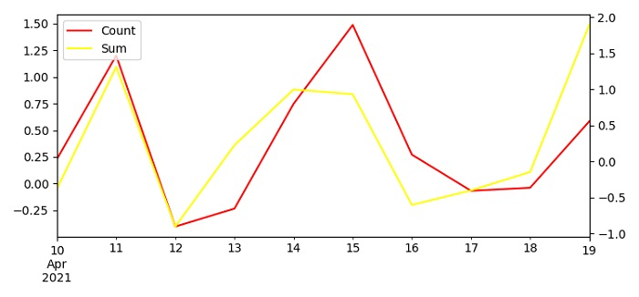
PHP如何使用图例和 Matplotlib 中的辅助 Y 轴在同一张图上绘制两个 Pandas 时间序列?
为了在同一个图上绘制带有图例和辅助 Y 轴的两个 Pandas 时间序列,我们可以采取以下步骤 −
设置图形大小并调整子图之间及周围的边距。
创建一个具有轴标签(包括时间序列)的一维 ndarray。
使用一些列清单创建一个数据框。
使用数据框 plot() 方法绘制列 A 和 B。
使用 get_legend_handles_labels() 方法返回图例的手柄和标签。
使用 legend() 方法将图例放在图形上。
要显示图,请使用 show() 方法。
示例
import pandas as pd
from matplotlib import pyplot as plt
import numpy as np

plt.rcParams["figure.figsize"] = [7.50, 3.50]
plt.rcParams["figure.autolayout"] = True

ts = pd.Series(np.random.randn(10), index=pd.date_range('2021-04-10', periods=10))

df = pd.DataFrame(np.random.randn(10, 4), index=ts.index, columns=list('ABCD'))

ax1 = df.A.plot(color='red', label='Count')
ax2 = df.B.plot(color='yellow', secondary_y=True, label='Sum')

h1, l1 = ax1.get_legend_handles_labels()
h2, l2 = ax2.get_legend_handles_labels()

plt.legend(h1+h2, l1+l2, loc=2)

plt.show()
输出

更新于: 04-6 月-2021
2K+ 次浏览

广告