
 数据结构
数据结构 网络
网络 关系数据库管理系统 (RDBMS)
 操作系统
操作系统 Java
Java iOS
iOS HTML
HTML CSS
CSS Android
 Python
 C语言编程
C语言编程 C++
C++ C#
C# MongoDB
 MySQL
MySQL Javascript
 PHP
PHP如何在Python Plotly中绘制到次坐标轴?
Plotly是一个开源的、交互式的、基于浏览器的Python图表库。Python用户可以使用Plotly生成不同类型的图表,包括科学图表、3D图形、统计图表、金融图表等。
在本教程中,我们将演示如何使用Plotly在次坐标轴上绘制数据。这里我们将使用plotly.graph_objects模块来生成图形。它包含许多方法来自定义图表并将它们渲染成HTML格式。我们将使用add_trace()方法绘制两个条形图,然后使用update_layout()方法设置具有dict参数的属性。
请按照以下步骤在次坐标轴上绘制图表。
步骤1
导入plotly.graphs_objs模块并将其别名为go。
import plotly.graphs_objs as go
步骤2
使用Figure()方法创建一个图形。
fig = go.Figure()
步骤3
使用add_trace()方法创建两个条形图。
fig.add_trace(go.Bar(
   x=[5,6,7],
   y=[1,2,3],
   name="yaxis1",
   yaxis='y1'
))

fig.add_trace(go.Bar(
   x=[1,2,3],
   y=[1,2,3],
   name="yaxis2",
   yaxis="y2"
))
步骤4
为第一和第二Y轴创建轴对象。
fig.update_layout(
   xaxis=dict(domain=[0.15, 0.15]),

   # create first Y-axis
   yaxis=dict(
      title="yaxis1 title",
      titlefont=dict(color="blue"),
      tickfont=dict(color="red")
   ),

   # create second Y-axis
   yaxis2=dict(
      title="yaxis2 title",
      overlaying="y",
      side="right", position=0.15)
)
步骤5
使用update_layout()方法设置布局并分配标题文本。
fig.update_layout(title_text="secondary y-axis")
示例
以下是绘制在次Y轴上的完整代码:
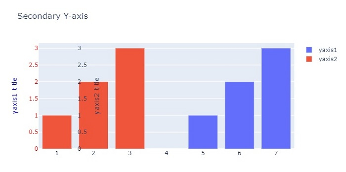
import plotly.graph_objects as go
fig = go.Figure()
fig.add_trace(go.Bar(
   x=[5, 6, 7], y=[1, 2, 3],
   name="yaxis1", yaxis='y1'))
   fig.add_trace(go.Bar(
   x=[1, 2, 3], y=[1, 2, 3],
   name="yaxis2", yaxis="y2"))

# Create axis objects
fig.update_layout(
   xaxis=dict(domain=[0.15, 0.15]),

# create first y axis
yaxis=dict(
   title="yaxis1 title",
   titlefont=dict(color="blue"),
   tickfont=dict(color="red")
),

# Create second y axis
yaxis2=dict(
   title="yaxis2 title",
   overlaying="y",
   side="right",
   position=0.15)
)

fig.update_layout(title_text="Secondary Y-axis",
width=716, height=400)
fig.show()
输出
它将在浏览器上显示以下输出:

更新于:2022年10月26日
7000+ 次浏览

广告