
 数据结构
数据结构 网络
网络 关系数据库管理系统
 操作系统
操作系统 Java
Java iOS
iOS HTML
HTML CSS
CSS Android
 Python
 C 编程
C 编程 C++
C++ C#
C# MongoDB
 MySQL
MySQL Javascript
 PHP
PHP如何在 Python Plotly 中设置 Y 轴的范围?
Plotly 支持在 X 轴和 Y 轴上设置范围。让我们了解如何在 Plotly 中设置 Y 轴的范围。
plotly.graph_objects 用于生成图形。它包含许多方法来自定义图表并在 HTML 格式中渲染图表。
创建一个 NumPy 模块 并为 X 轴和 Y 轴生成随机范围。
创建 Figure() 方法,以线条模式绘制 X 轴和 Y 轴
创建 update_layout() 方法并设置 Y 轴范围。
按照给定的步骤在 Plotly 中设置 Y 轴的范围。
步骤 1 - 导入 Plotly
导入 plotly.graphs_objs 模块并将其别名为 go
import plotly.graphs_objs as go
步骤 2 - 导入 NumPy
导入 numpy 模块并将其别名为 np,并设置随机 seed 值。
import numpy as np
np.random.seed(3)
步骤 3 - 在 X 轴上生成随机数
让我们在 X 轴上生成一个 随机数范围列表。
x = list(range(0,20,2))
步骤 4 - 在 Y 轴上生成随机数
如下在 Y 轴上生成随机数:
y = np.random.randn(10)
步骤 5 - 生成散点图
让我们使用以下坐标生成散点图:
fig = go.Figure(data=go.Scatter(x=x, y=y, mode='lines'))
步骤 6 - 设置 Y 轴范围
使用 update_layout() 方法设置 Y 轴范围。
fig.update_layout(yaxis_range=[-3,3])
步骤 7 - 显示图形
使用 show() 方法显示图形。
fig.show()
示例
在 Python Plotly 中设置 Y 轴范围的完整代码如下:
# Importing Libraries
import plotly.graph_objs as go
import numpy as np

np.random.seed(3)

# generating numbers ranging from 0 to 18 on X-axis
x = list(range(0,20,2))

# generating random numbers on y-axis
y = np.random.randn(10)

# plotting scatter plot on x and y data with
# 'lines' as mode
fig = go.Figure(data=go.Scatter(x=x, y=y, mode='lines'))

# setting the y-axis range from -3 to 3
fig.update_layout(yaxis_range=[-3,3])

# to display the figure in the output screen
fig.show()
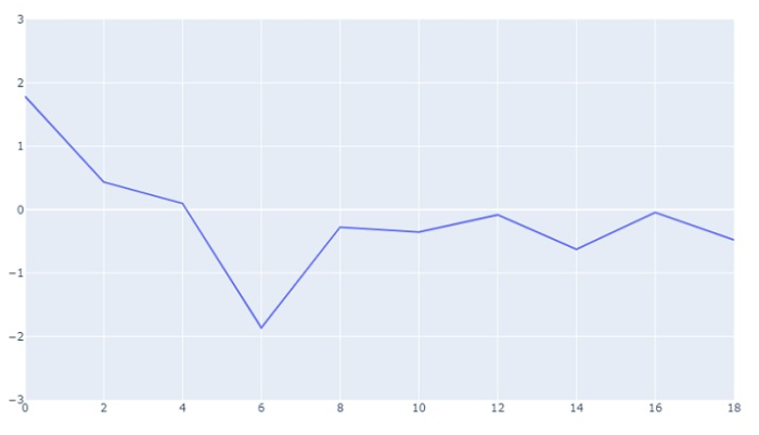
输出
它将在浏览器上显示以下输出:

更新于:2023-08-27
28K+ 浏览量

广告