
 数据结构
数据结构 网络
网络 关系数据库管理系统 (RDBMS)
 操作系统
操作系统 Java
Java MS Excel
 iOS
iOS HTML
HTML CSS
CSS Android
 Python
 C语言编程
C语言编程 C++
C++ C#
C# MongoDB
 MySQL
MySQL Javascript
 PHP
PHP 物理学
物理学 化学
化学 生物学
生物学 数学
数学 英语
英语 经济学
经济学 心理学
心理学 社会学
社会学 服装设计
服装设计 法学
法学Flutter中的圆形和线性进度指示器
Flutter中的进度指示器是什么?
进度指示器用于显示Android应用程序中正在执行的特定任务的当前进度。如果我们正在从互联网加载一些数据或进行API调用,在这种情况下,为了处理加载任务,我们在应用程序中显示进度指示器,以告知用户数据正在加载。我们可以在应用程序中显示两种类型的进度指示器。
线性进度指示器 - 此指示器用于显示线性进度条,该进度条显示任务的当前进度。
圆形进度指示器 - 此指示器类似于圆形进度条,用于显示Android应用程序中特定任务的进度。
圆形和线性进度指示器的实现
我们将创建一个简单的应用程序,用于在我们的Android应用程序中显示圆形和线性进度指示器。我们将遵循循序渐进的指南,在Android应用程序中实现吐司消息。
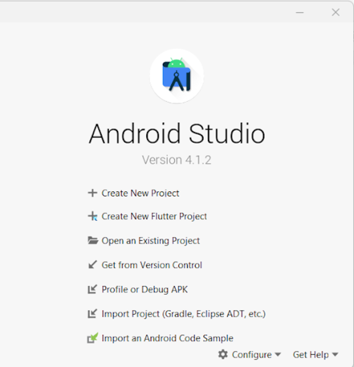
步骤1:在Android Studio中创建一个新的Flutter项目
导航到Android Studio,如下面的屏幕所示。在下面的屏幕中,单击“新建项目”以创建一个新的Flutter项目。
单击“新建项目”后,您将看到下面的屏幕。
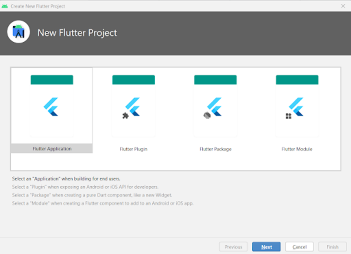
在此屏幕中,您必须选择Flutter Application,然后单击“下一步”,您将看到下面的屏幕。
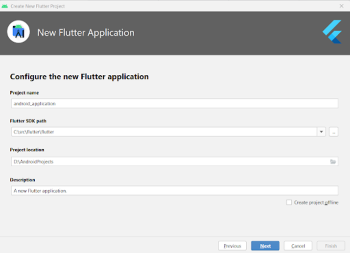
在此屏幕中,您必须指定项目名称,然后只需单击“下一步”。
步骤2:使用main.dart文件
导航到您的项目>lib>main.dart文件,并将以下代码添加到其中。代码中添加了注释以便详细了解。
import 'package:flutter/material.dart';

void main() {
   runApp(const MyApp());
}

class MyApp extends StatelessWidget {
   const MyApp({Key? key}) : super(key: key);

   @override
   Widget build(BuildContext context) {
      return MaterialApp(
         // on below line adding title for our application.
         title: 'Flutter Demo',
         // on below line specifying theme data for our application
         theme: ThemeData(
            primarySwatch: Colors.blue,
         ),
         // on below line calling our home page.
         home: MyHomePage(),
         // on below line disabling our debug check mode banner
         debugShowCheckedModeBanner: false,
      );
   }
}

class MyHomePage extends StatefulWidget {
   MyHomePage({Key? key}) : super(key: key);

   @override
   _MyHomePageState createState() => _MyHomePageState();
}

class _MyHomePageState extends State<MyHomePage>
with SingleTickerProviderStateMixin {

   @override
   Widget build(BuildContext context) {
      return Scaffold(
         // on below line creating app bar for our app
         appBar: AppBar(
            // specifying text in our app bar
            title: Text("Android Application"),
         ),
         // adding padding for it.
         body: Padding(
            padding: const EdgeInsets.all(16.0),
            // wrapping our column to center of screen.
            child: Center(
               child: Column(
                  // aligning column on below line.
                  crossAxisAlignment: CrossAxisAlignment.center,
                  mainAxisAlignment: MainAxisAlignment.center,
                  // specifying main axis size on below line.
                  mainAxisSize: MainAxisSize.min,
                  // creating childrens to be displayed on below line.
                  children: const <Widget>[
                     // creating a text for circular animation on below line.
                     Text(
                        "Progress Indicator in Flutter",
                        // specifying text alignment, max lines, style for our text
                        textAlign: TextAlign.center,
                        maxLines: 1,
                        style: TextStyle(
                           color: Colors.black,
                           fontSize: 20.0,
                           fontWeight: FontWeight.bold),
                     ),
                     // creating a sized box on below line.
                     SizedBox(
                        height: 30,
                     ),

                     Text(
                        "Linear Progress Indicator",
                        // specifying text alignment, max lines, style for our text
                        textAlign: TextAlign.center,
                        maxLines: 1,
                        style: TextStyle(
                           color: Colors.black,
                           fontSize: 20.0,
                           fontWeight: FontWeight.bold),
                     ),

                     SizedBox(
                        height: 20,
                     ),

                     // creating a linear progress bar on below line.
                     LinearProgressIndicator(),
                     // on below line creating a sized box
                     SizedBox(
                        height: 40,
                     ),
                     Text(
                        "Circular Progress Indicator",
                        // specifying text alignment, max lines, style for our text
                        textAlign: TextAlign.center,
                        maxLines: 1,
                        style: TextStyle(
                           color: Colors.black,
                           fontSize: 20.0,
                           fontWeight: FontWeight.bold),
                     ),
                     // on below line creating a sized box
                     SizedBox(
                        height: 20,
                     ),
                     // creating a circular progress bar on below line.
                     CircularProgressIndicator(),
                  ],
               ),
            ),
         ),
      );
   }
}
说明 - 在上面的代码中,我们可以看到main方法,在其中我们调用我们下面创建的MyApp类作为无状态小部件。在这个无状态小部件中,我们创建一个build方法,在其中我们返回我们的material app。在material app中,我们指定应用程序标题、应用程序主题、要显示的主页以及将调试检查模式横幅设置为false。
之后,我们创建一个HomePage状态方法,它将扩展HomePage的状态。之后,我们创建一个build方法,在其中我们指定我们的app bar并为其添加标题。之后,我们为屏幕的四面添加填充。然后,我们将应用程序中的所有子项添加到屏幕的中心。在其中,我们指定列。在此列中,我们创建不同的子项,这些子项将垂直对齐。在此列中,我们首先创建一个文本小部件来显示应用程序标题。
之后,我们创建一个sized box小部件来在两个小部件之间添加间隙。然后,我们再次创建一个文本小部件,在其中显示“线性进度指示器”文本。之后,我们指定一个sized box,然后创建我们的线性进度指示器。创建此线性进度指示器后,我们再次指定一个sized box,然后创建一个文本小部件来显示“圆形进度指示器”文本。在此小部件之后,我们创建一个sized box并显示一个圆形进度指示器。
添加上述代码后,现在我们只需单击顶栏中的绿色图标即可在移动设备上运行我们的应用程序。
注意 - 确保您已连接到您的真实设备或模拟器。

结论
在本教程中,我们学习了Flutter中的进度指示器是什么,以及如何在Flutter应用程序中使用圆形和线性进度指示器。

1K+ 次浏览
