
 数据结构
数据结构 网络
网络 关系数据库管理系统 (RDBMS)
 操作系统
操作系统 Java
Java iOS
iOS HTML
HTML CSS
CSS Android
 Python
 C语言编程
C语言编程 C++
C++ C#
C# MongoDB
 MySQL
MySQL Javascript
 PHP
PHP使用Plotly在Python中设置带有分组图例的多个子图
多个子图通过分配不同的图形图来定义。Plotly是一个强大的Python库,用于创建用于数据研究和演示的交互式可视化。它能够创建多个子图(即放置在一个图形中的独立图)是其主要特性之一。此功能允许我们并排比较和显示各种数据集或变量,从而简单地概述数据。在Python中,我们有一些内置函数——add_trace、update_layout和show,可用于使用Plotly在Python中设置带有分组图例的多个子图。
语法
以下语法用于示例:
add_trace()
这是Python的内置方法,遵循名为plotly的模块。它接受Scatter参数以创建新的轨迹到图形。例如,散点图可能有多个轨迹,每个轨迹代表一组不同的数据点。
update_layout()
update_layout() 方法用于更改 Plotly 图形的布局。
show()
show方法用于程序的结尾,以获得图形的所需图形作为输出。
示例1算法
步骤如下:
步骤1:使用名为plotly.graph_objects的模块创建子图数据点,并将对象引用作为go。
步骤2:从plotly.subplots模块中提及另一个对象引用make_subplots函数。
步骤3:然后使用对象引用make_subplots,通过使用subplot_titile设置每个图的标题名称。
步骤4:创建轨迹以设置分组图例和数据点。
步骤5:图形布局已使用内置函数update_layout更新,该函数接受参数——宽度和高度。
步骤6:最后,使用show()方法显示结果。
示例
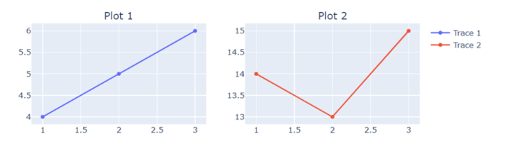
在以下示例中,我们将显示包含分组图例的两个子图的图形,方法是使用内置方法add_trace。
import plotly.graph_objects as go
from plotly.subplots import make_subplots
# Create subplots with the shared legend
fig = make_subplots(rows=2, cols=2, subplot_titles=("Plot 1", "Plot 2"))
# Add traces to subplots
fig.add_trace(go.Scatter(x=[1, 2, 3], y=[4, 5, 6], name="Trace 1"), row=1, col=1)
fig.add_trace(go.Scatter(x=[1, 2, 3], y=[14, 13, 15], name="Trace 2"), row=1, col=2)
# Update layout for legend grouping
fig.update_layout(width=800, height=600)
# Show the plot
fig.show()
输出
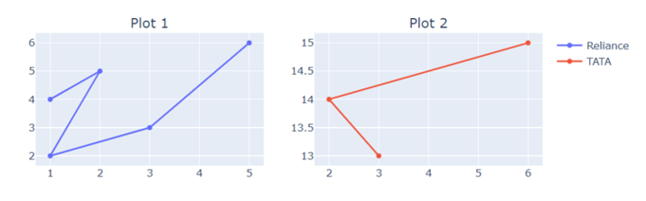
示例
在以下示例中,使用make_subplots,此代码生成一个2x2的子图网格,并将两个散点图添加到网格中。布局被更改以自定义图例分组并显示图形。
import plotly.graph_objects as go
from plotly.subplots import make_subplots
# Create subplots with the shared legend
fig = make_subplots(rows=2, cols=2, subplot_titles=("Plot 1", "Plot 2"))
# Add traces to subplots
fig.add_trace(go.Scatter(x=[1, 2, 1, 3, 5], y=[4, 5, 2, 3, 6], name="Reliance"), row=1, col=1)
fig.add_trace(go.Scatter(x=[3, 2, 6], y=[13, 14, 15], name="TATA"), row=1, col=2)
# Update layout for customized legend grouping
fig.update_layout(width=800, height=600)
# Show the plot
fig.show()
输出
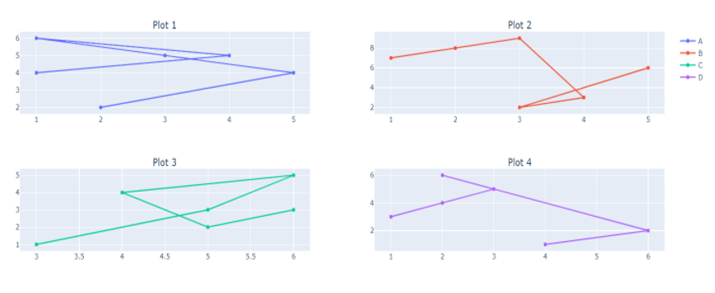
示例
在以下示例中,我们将显示四个不同子图的图形,这些子图包含指向数据、subplot_title和分别在内置函数add_trace和update_layout中的图例。这将帮助我们构建带有图例名称的多个子图。
import plotly.graph_objects as go
from plotly.subplots import make_subplots
# Create subplots with the shared legend
fig = make_subplots(rows=2, cols=2, subplot_titles=("Plot 1", "Plot 2", "Plot 3", "Plot 4"))
# Add traces to subplots
fig.add_trace(go.Scatter(x=[1, 4, 1, 3, 5, 2], y=[4, 5, 6, 5, 4, 2], name="Trace 1"), row=1, col=1)
fig.add_trace(go.Scatter(x=[1, 2, 3, 4, 3, 5], y=[7, 8, 9, 3, 2, 6], name="Trace 2"), row=1, col=2)
fig.add_trace(go.Scatter(x=[3, 5, 6, 4, 5, 6], y=[1, 3, 5, 4, 2, 3], name="Trace 3"), row=2, col=1)
fig.add_trace(go.Scatter(x=[1, 2, 3, 2, 6, 4], y=[3, 4, 5, 6, 2, 1], name="Trace 4"), row=2, col=2)
# Update layout for customized legend grouping
fig.update_layout(legend=dict(tracegroupgap=70))
# Show the plot
fig.show()
输出
结论
我们讨论了使用名为Ploty的模块绘制带有分组图例的多个子图的三种不同方法。这使我们可以轻松比较数据,数据科学家可以创建详细的可视化效果,从而提高对复杂数据集的理解和沟通。

815 次浏览
