
 数据结构
数据结构 网络
网络 关系数据库管理系统
 操作系统
操作系统 Java
Java MS Excel
 iOS
iOS HTML
HTML CSS
CSS Android
 Python
 C 编程
C 编程 C++
C++ C#
C# MongoDB
 MySQL
MySQL Javascript
 PHP
PHP 物理学
物理学 化学
化学 生物学
生物学 数学
数学 英语
英语 经济学
经济学 心理学
心理学 社会学
社会学 服装设计
服装设计 法律研究
法律研究在 Snack 中使用卡片
有时,任务是显示一个带有某些文本、图片或颜色的小的边界区域,并在以后从中检索更多信息或在选择该项目时执行某些操作。为此,可以使用 react-native-paper 中的 Card。一个屏幕上也可以使用多个 Card,将其集成作为列表项,并且可以使其可点击。本文展示了 React Native 和 JavaScript 代码,其中包含两个不同的示例,第一个示例是在应用程序中使用带图像的单个卡片,第二个示例使用多个带图标的卡片并使其可点击。
算法 1
步骤 1 − 从 'react-native' 中导入 Text、View、StyleSheet 和 Button。还从 react-native-paper 中导入 Card。
步骤 2 − 创建 App.js 并编写使用卡片的代码。使用 <Card.Cover> 设置所需的图像,并使用 <Card.Content> 设置卡片内部的内容。
步骤 3 − 为了指定进一步的操作,在 <Card> 标签内使用带有 onPress() 函数的按钮。
步骤 4 − 使用 StyleSheet 实现卡片内容格式化样式。
步骤 5 − 检查卡片输出。点击按钮并检查结果。
示例 1:使用带图像的单个卡片。
项目中使用的重要文件是
App.js
Stars11.jpg 是此项目中使用的图像文件。
App.js:这是此项目的 javascript 主文件。
示例
import {Component} from 'react';
import {Text, View, StyleSheet, Button } from 'react-native';
import { Card } from 'react-native-paper';

export default class CardsExampleOne extends Component{
   constructor() {
      super();
      this.state = {
         myMsgNote: ''
      };
   }
   render() {
      return (
         <View style={styles.mainSpace}>

            <Text style={styles.textSty}>
               Greeting Card Example
            </Text>
            <Card>
               <Card.Content style={{padding: 6, margin:5, justifyContent:"center"}}>
                  <Text style={styles.textSty}>
                     {this.state.myMsgNote}
                  </Text>
                  <Card.Cover style={{width: 294, height: 126, paddingLeft:8}} source={require('./stars11.jpg')}>
                  </Card.Cover>
               </Card.Content>

               <Button onPress={()=>this.setState({ myMsgNote: "Happy Birthday To You!" })} title="Show Message" color="#088da5" />
               <Button onPress={()=>this.setState({ myMsgNote: "" })
               }
               title="Hide Message" color="#61bdac" />
            </Card>
         </View>
      );
   }
}
const styles = StyleSheet.create({
   mainSpace: {
      flex: 1,
      justifyContent: 'center',
      backgroundColor: '#cce0ff',
      padding: 8,
   },
   textSty: {
      margin: 24,
      fontSize: 18,
      fontWeight: 'bold',
      textAlign: 'center',
      padding: 6,
   },
});
输出
结果可以在线查看。当用户在代码中输入时,Web 视图会默认被选中,结果会立即显示。
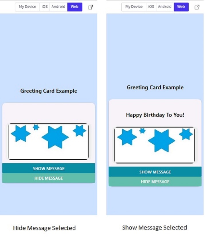
Snack 中 Web 视图中的卡片输出。
算法 2
步骤 1 − 从 'react-native' 中导入 Text、View 和 StyleSheet。还从 react-native-paper 中导入 Card 和 List。
步骤 2 − 创建 App.js 并编写使用 List 的代码。使用 <List.Icon> 标签将图标与列表项集成。
步骤 3 − 使用 <List.Item> 标签指定列表项的左侧和右侧内容以及单击时要执行的操作。在 <List.Item> 标签内使用 <Card> 标签。此外,使用 <Card.Content> 设置卡片内部的内容。
步骤 4 − 为了指定进一步的操作,在 <List.Item> 标签内指定了 onPress() 函数。
步骤 5 − 使用 StyleSheet 实现卡片内容格式化样式。
步骤 6 − 点击项目列表(卡片和图标上的任何位置)并检查结果。
示例 2:使用多个卡片作为列表项。
项目中使用的重要文件是
App.js
App.js:这是此项目的 javascript 主文件。
示例
import{Component}from'react';
import{Text,View,StyleSheet}from'react-native';
import{Card,List}from'react-native-paper';

exportdefaultclassCardsExampleOneextendsComponent{
   constructor(){
      super();
      this.state={
         myMsgNote:''
      };
   }

   render(){
      return(
         <Viewstyle={styles.mainSpace}>

            <Textstyle={styles.textSty}>
               TelephoneDirectory
            </Text>

            <List.Item
               onPress={()=>console.log('CallingHomeNow')}
               left={props=><List.Iconicon="phone"/>}
               right={props=><Cardstyle={styles.cardSty}>

            <Card.Contentstyle={{}}>
               <Textstyle={styles.textSty}>
                  Home
               </Text>
            </Card.Content>

            </Card>}
            />
            <List.Item
               onPress={()=>console.log('CallingSchoolNow')}
               left={props=><List.Iconicon="phone"/>}
               right={props=><Cardstyle={styles.cardSty}>
            <Card.Content>
               <Textstyle={styles.textSty}>
                  School
               </Text>
            </Card.Content>
            </Card>}
            />

            <List.Item
               onPress={()=>console.log('CallingOfficeNow')}
               left={props=><List.Iconicon="phone"/>}
               right={props=><Cardstyle={styles.cardSty}>
            <Card.Content>
               <Textstyle={styles.textSty}>
                  Office
               </Text>
            </Card.Content>
            </Card>}
            />
         </View>
      );
   }
}

conststyles=StyleSheet.create({
   mainSpace:{
      flex:1,
      justifyContent:'center',
      backgroundColor:'#cce0ff',
      padding:8,
   },
   textSty:{
      fontSize:18,
      fontWeight:'bold',
      textAlign:'center',
   },
   cardSty:{
      shadowColor:'black',
      elevation:4,
      width:"90%",
      backgroundColor:"#aaaa2d",
   }
});
输出
结果可以在线查看。
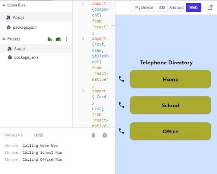
注意 − 此项目使用 'react-native-paper' 中的 List。
本文通过两个不同的示例介绍了在 Expo Snack 上使用卡片的方法。首先介绍了使用带图像的单个卡片的方法,然后指定了执行进一步操作的过程。示例 2 还展示了将多个卡片用作列表项并在点击卡片时执行操作的方法。

264 次查看
