
 数据结构
数据结构 网络
网络 关系数据库管理系统
 操作系统
操作系统 Java
Java MS Excel
 iOS
iOS HTML
HTML CSS
CSS Android
 Python
 C 编程
C 编程 C++
C++ C#
C# MongoDB
 MySQL
MySQL Javascript
 PHP
PHP 物理学
物理学 化学
化学 生物学
生物学 数学
数学 英语
英语 经济学
经济学 心理学
心理学 社会学
社会学 时尚研究
时尚研究 法律研究
法律研究如何在 ReactJS 中使用复选框?
复选框允许用户在表单中选择多个值。此外,它对于获取用户的布尔响应也很有用。例如,Instagram 喜欢的按钮就是一种复选框。当用户喜欢帖子时,它会显示填充的图标;否则,它会显示边框图标。
在这里,我们将学习如何在 ReactJS 中处理单个和多个复选框。首先,我们将创建自定义复选框,然后学习如何使用 Material UI 的复选框组件。
在 ReactJS 中创建自定义复选框组件
我们可以在 ReactJS 中使用普通的 HTML 输入来创建复选框。我们可以添加 onChange 事件作为 prop 来处理复选框的值。
语法
用户可以按照以下语法在 ReactJS 中使用复选框。
function handleChange(e) {
   setChecked(e.target.checked);
}
<input value="test" type="checkbox" onChange={handleChange} />
在上述语法中,每当用户选中或取消选中复选框时,我们都会调用 handleChange() 函数。
示例
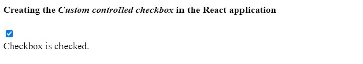
在下面的示例中,我们使用 <input> 元素创建了复选框。在 handleChange() 函数中,我们将复选框的布尔值设置为 checked 变量。
我们根据 checked 变量的 true 和 false 值在输出中显示消息。
import React from "react";
const App = () => {
   const [checked, setChecked] = React.useState(false);
   function handleChange(e) {
      setChecked(e.target.checked);
   }
   return (
      <div>
         <h4>
            {" "}
            Creating the <i> Custom controlled checkbox </i> in the React application {" "}
         </h4>
         <input value = "test" type = "checkbox" onChange = {handleChange} />
         <br></br>
         {checked ? (
            <div> Checkbox is checked. </div>
         ) : (
            <div> Checkbox is not checked. </div>
         )}
      </div>
   );
};
export default App;
输出
示例
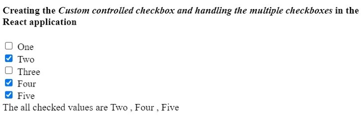
在下面的示例中,我们使用 <input> 元素创建了多个复选框。每当用户选中或取消选中任何复选框时,它都会调用 handleChage() 函数。
在 handleChange() 函数中,我们检查复选框是否被选中,并将复选框值添加到 allChecked 数组中。如果复选框未选中,我们将从 allChecked 数组中删除复选框值。
import React from "react";
const App = () => {
   const [allchecked, setAllChecked] = React.useState([]);
   function handleChange(e) {
      if (e.target.checked) {
         setAllChecked([...allchecked, e.target.value]);
      } else {
         setAllChecked(allchecked.filter((item) => item !== e.target.value));
      }
   }
   return (
      <div>
         <h4>
            {" "}
            Creating the {" "}
            <i>
               {" "}
               Custom controlled checkbox and handling the multiple checkboxes
               {" "}
            </i>{" "} in the React application {" "}
         </h4>
         <div>
            <input value = "One" type = "checkbox" onChange = {handleChange} />
            <span> One </span>
         </div>
         <div>
            <input value = "Two" type = "checkbox" onChange = {handleChange} />
            <span> Two </span>
         </div>
         <div>
            <input value = "Three" type = "checkbox" onChange = {handleChange} />
            <span> Three </span>
         </div>
         <div>
            <input value = "Four" type = "checkbox" onChange = {handleChange} />
            <span> Four </span>
         </div>
         <div>
            <input value = "Five" type = "checkbox" onChange = {handleChange} />
            <span> Five </span>
         </div>
         <div>The all checked values are {allchecked.join(" , ")}</div>
      </div>
   );
};
export default App;
输出
在 ReactJS 中使用 Material UI 的复选框组件
Material UI 提供了 Checkbox 组件,我们可以将其导入 React 应用程序并直接使用它。
使用以下命令在 React 项目中安装 Material UI 库。
npm install @mui/material @emotion/react @emotion/styled
语法
用户可以按照以下语法使用 Material UI 的 Checkbox 组件。
<FormControlLabel control = {<Checkbox />} label = "Checkbox" />
在上述语法中,我们将 Checkbox 作为 'control' prop 的值添加。
示例
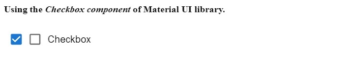
在下面的示例中,我们使用了 Material UI 的复选框组件。用户可以在输出中选中和取消选中复选框。
我们使用 ForControlLabel 组件为复选框添加标签。在输出中,用户可以看到我们添加了“checkbox”标签。
import React from "react";
import Checkbox from "@mui/material/Checkbox";
import FormControlLabel from "@mui/material/FormControlLabel";
const App = () => {
   return (
      <div>
         <h4>
            Using the <i> Checkbox component </i> of Material UI library. {" "}
         </h4>
         <Checkbox defaultChecked />
         <FormControlLabel control = {<Checkbox />} label = "Checkbox" />
      </div>
   );
};
export default App;
输出
示例
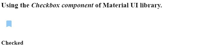
在下面的示例中,我们自定义了 Material UI 的 Checkbox 组件。我们更改了第一个复选框的颜色。还为第二个复选框添加了自定义图标。每当用户选中时,它会显示填充的图标;每当用户取消选中复选框时,它会显示带边框的图标。
import React from "react";
import Checkbox from "@mui/material/Checkbox";
import BookmarkBorderIcon from "@mui/icons-material/BookmarkBorder";
import BookmarkIcon from "@mui/icons-material/Bookmark";
import { green, blue } from "@mui/material/colors";
const App = () => {
   const [isChecked, setChecked] = React.useState(false);
   function handleChange(event) {
      setChecked(event.target.checked);
   }
   return (
      <div>
         <h3>
            Using the <i> Checkbox component </i> of Material UI library. {" "}
         </h3>
         <Checkbox
            Icon = {<BookmarkBorderIcon />}
            checkedIcon = {<BookmarkIcon />}
            onChange = {handleChange}
            sx = {{
               color: green[500],
               "&.Mui-checked": {
                  color: blue[200],
               },
            }}
         />
            {isChecked ? <h4> Checked </h4> : <h4> Not Checked </h4>}
      </div>
   );
};
export default App;
输出
用户学习了如何在 ReactJS 中使用复选框。在第一种方法中,用户学习了如何在 ReactJS 中处理多个复选框。在第二种方法中,我们学习了如何使用 Material UI 的 Checkbox 组件。此外,我们可以通过更改样式和图标来自定义 Material UI 的 Checkbox 组件。

24K+ 浏览量
