
 数据结构
数据结构 网络
网络 关系型数据库管理系统 (RDBMS)
 操作系统
操作系统 Java
Java MS Excel
 iOS
iOS HTML
HTML CSS
CSS Android
 Python
 C 编程
C 编程 C++
C++ C#
C# MongoDB
 MySQL
MySQL Javascript
 PHP
PHP 物理
物理 化学
化学 生物
生物 数学
数学 英语
英语 经济学
经济学 心理学
心理学 社会学
社会学 服装设计
服装设计 法律研究
法律研究如何在 ReactJS 中使用 Paper 组件?
在 Material UI 中,Paper 组件与卡片组件非常相似,基本上它也创建了所需尺寸的卡片。
Card 和 Paper 组件的主要区别在于“Elevation”属性。Elevation 属性允许设置 Paper 组件的阴影以添加 3D 效果。
语法
用户可以按照以下语法使用 Material UI 的 Paper 组件。
<Paper/>
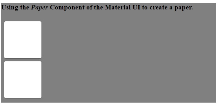
示例 1(Paper 组件的基本用法)
在下面的示例中,我们在 Material UI 的 Box 组件内添加了 Paper 组件。此外,我们通过将属性传递给 Box 组件来设置 Paper 组件的尺寸。
import React from "react";
import Paper from "@mui/material/Paper";
import Box from "@mui/material/Box";
const App = () => {
   return (
      <div style = {{ backgroundColor: "grey" }}>
         <h3>
            {" "}
            Using the <i> Paper </i> Component of the Material UI to create a paper.{" "}
         </h3>
         <Box
            sx={{
               display: "inline-block", "& > :not(style)": {
                  m: 1,
                  width: 200,
                  height: 200,
               },
            }}
            >
            <Paper />
            <Paper />
         </Box>
      </div>
   );
};
export default App;
输出
在输出中,用户可以看到类似于卡片的 Paper。
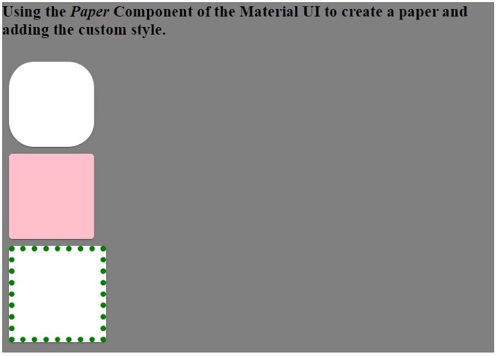
示例 2(向 Paper 组件添加自定义 CSS)
在下面的示例中,我们将样式作为 Paper 组件的属性传递。我们更改了第一个 Paper 组件的圆角。此外,我们更改了第二个 Paper 组件的背景颜色和第三个 Paper 组件的边框。
import React from "react";
import Paper from "@mui/material/Paper";
import Box from "@mui/material/Box";
const App = () => {
   return (
      <div style = {{ backgroundColor: "blue" }}>
         <h3>
            {" "}
            Using the <i> Paper </i> Component of the Material UI to create a paper and adding the custom style.{" "}
         </h3>
         <Box
            sx={{
               display: "inline-block", "& > :not(style)": {
                  m: 1,
                  width: 100,
                  height: 100,
               },
            }}
            >
            <Paper style = {{ borderRadius: "30px" }} />
            <Paper style = {{ backgroundColor: "pink" }} />
            <Paper style = {{ border: "7px dotted green" }} />
         </Box>
      </div>
   );
};
export default App;
输出
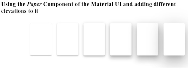
示例 3(使用 Elevation 属性)
在下面的示例中,我们使用了 elevation 作为 Paper 组件的属性。elevation 属性表示阴影,并接受 0,1,2,3,4,8,12,16,24 作为值。根据深色和浅色主题,elevation 将为 0 值应用 0px 阴影,为 24 elevation 值应用 40px 阴影。
增加 elevation 值会增加 Paper 组件的 3D 效果,因为阴影会增加。
import React from "react";
import Paper from "@mui/material/Paper";
import Box from "@mui/material/Box";
const App = () => {
   return (
      <div>
         <h3>
            {" "}
            Using the <i> Paper </i> Component of the Material UI and adding different elevations to it {" "}
         </h3>
         <Box
            sx = {{
               display: "flex", "& > :not(style)": {
                  m: 1,
                  width: 100,
                  height: 100,
               },
            }}
            >
            <Paper elevation = {0} />
            <Paper elevation = {1} />
            <Paper elevation = {2} />
            <Paper elevation = {4} />
            <Paper elevation = {8} />
            <Paper elevation = {12} />
            <Paper elevation = {24} />
         </Box>
      </div>
   );
};
export default App;
输出
本教程中,用户学习了如何使用 Material UI 的 Paper 组件。在第一个示例中,我们看到了 Paper 组件的基本用法。在第二个示例中,我们学习了如何将自定义 CSS 作为 Paper 组件的属性传递,在最后一个示例中,我们学习了如何将 elevation 属性与 Paper 组件一起使用。

更新于:2023年3月7日
浏览量 1K+

广告