
 数据结构
数据结构 网络
网络 关系数据库管理系统 (RDBMS)
 操作系统
操作系统 Java
Java MS Excel
 iOS
iOS HTML
HTML CSS
CSS Android
 Python
 C语言编程
C语言编程 C++
C++ C#
C# MongoDB
 MySQL
MySQL Javascript
 PHP
PHP 物理学
物理学 化学
化学 生物学
生物学 数学
数学 英语
英语 经济学
经济学 心理学
心理学 社会学
社会学 服装学
服装学 法学
法学如何在 Material UI 中使用单选按钮组件?
单选按钮用于允许用户在一组值中选择一个值。例如,单选按钮的最佳用例是允许用户在表单中选择性别。
Material UI 提供了预先设计的 Radio 组件,我们可以用它来创建一组单选按钮。
用户可以在终端中使用以下命令在 React 项目中安装 Material UI 库。
npm install @mui/material @emotion/react @emotion/styled
语法
用户可以按照以下语法使用 Material UI 的 Radio 组件。
<FormControlLabel value = "Delhi" control = {<Radio />} label = "Delhi"/>
在上面的语法中,我们将 Radio 组件作为 FormControlLabel 的 control 属性的 props 值传递。
示例
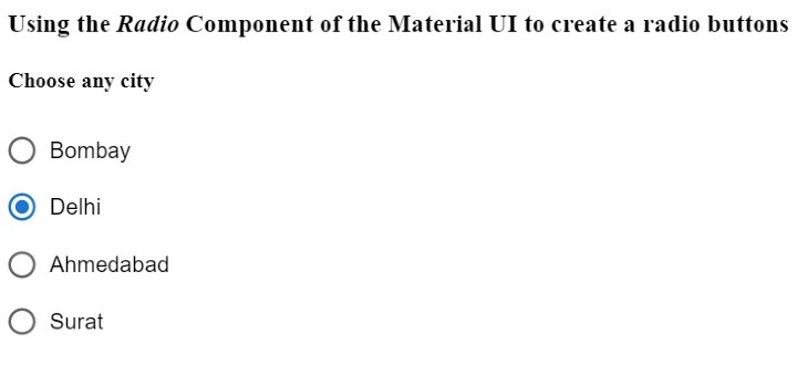
在下面的示例中,我们导入了 Radio 组件来创建单选按钮,RadioGroup 组件来创建一组单选按钮,以及 FormControlLabel 组件来在表单中使用 Radio 组件。
在输出中,用户可以看到单个列中的三个单选按钮,并且可以选择一个单选按钮。
import React from "react";
import RadioGroup from "@mui/material/RadioGroup";
import FormControlLabel from "@mui/material/FormControlLabel";
import Radio from "@mui/material/Radio";
const App = () => {
   return (
      <div>
         <h3>
            {" "}
            Using the <i> Radio </i> Component of the Material UI to create a radio buttons {" "}
         </h3>
         <h4> Choose any city </h4>
         <RadioGroup defaultValue = "Delhi" name = "radio-buttons-group">
            <FormControlLabel value = "Bombay" control = {<Radio />} label="Bombay" />
            <FormControlLabel value = "Delhi" control = {<Radio />} label = "Delhi" />
            <FormControlLabel
               value = "Ahmedabad"
               control = {<Radio />}
               label = "Ahmedabad"
            />
            <FormControlLabel value = "Surat" control = {<Radio />} label = "Surat" />
         </RadioGroup>
      </div>
   );
};
export default App;
输出
示例
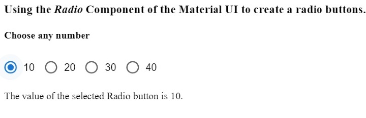
在下面的示例中,我们将 row 作为 RadioGroup 组件的一个 prop 传递,以便在一行中显示所有单选按钮。此外,我们还将 'onChange' 事件与 RadioGroup 组件一起使用,以便每当用户选择另一个单选按钮时调用 handleChange() 函数。
此外,用户可以在输出中看到所选单选按钮的值。
import React from "react";
import RadioGroup from "@mui/material/RadioGroup";
import FormControlLabel from "@mui/material/FormControlLabel";
import Radio from "@mui/material/Radio";
const App = () => {
   const [selected, setSelected] = React.useState("Delhi");
   function handleChange(event) {
      setSelected(event.target.value);
   }
   return (
      <div>
         <h3>
            {" "}
            Using the <i> Radio </i> Component of the Material UI to create a radio buttons. {" "}
         </h3>
         <h4> Choose any number </h4>
         <RadioGroup
               row
               defaultValue = "30"
               name = "radio-buttons-group"
               onChange = {handleChange}
            >
            <FormControlLabel value = "10" control = {<Radio />} label = "10" />
            <FormControlLabel value = "20" control = {<Radio />} label = "20" />
            <FormControlLabel value = "30" control = {<Radio />} label = "30" />
            <FormControlLabel value = "40" control = {<Radio />} label = "40" />
         </RadioGroup>
         <p> The value of the selected Radio button is {selected}. </p>
      </div>
   );
};
export default App;
输出
示例
在下面的示例中,我们将学习如何自定义 Material UI 的 Radio 组件。值为 10 的单选按钮是标准的。我们使用 'color' 属性更改了第二个单选按钮的颜色。
我们为第三个单选按钮设置了自定义颜色,并增加了第四个单选按钮的大小。通过这种方式,用户可以使用组件 props 自定义单选按钮。
import React from "react";
import RadioGroup from "@mui/material/RadioGroup";
import FormControlLabel from "@mui/material/FormControlLabel";
import Radio from "@mui/material/Radio";
const App = () => {
   const [selected, setSelected] = React.useState("Delhi");
   function handleChange(event) {
      setSelected(event.target.value);
   }
   return (
      <div>
         <h3>
            {" "}
            Using the <i> Radio </i> Component of the Material UI to create a radio buttons and customize them. {" "}
         </h3>
         <h4> Choose any number </h4>
         <RadioGroup
               row
               defaultValue = "30"
               name = "radio-buttons-group"
               onChange = {handleChange}
            >
            <FormControlLabel value = "10" control = {<Radio />} label = "10" />
            <FormControlLabel
               value = "20"
               control = {<Radio />}
               label = "20"
               color = "secondary"
            />
            <FormControlLabel
               value = "30"
               control = {<Radio />}
               label = "30"
               sx = {{
                  color: "blue",
               }}
            />
            <FormControlLabel
               value = "40"
               control = {<Radio />}
               label = "40"
               sx = {{
                  "& .MuiSvgIcon-root": {
                     fontSize: 58,
                  },
               }}
            />
         </RadioGroup>
         <p> The value of the selected Radio button is {selected}. </p>
      </div>
   );
};
export default App;
输出

在本教程中,我们学习了如何使用 Material UI 的 Radio 组件。此外,我们还学习了如何使用 props 自定义 Radio 组件。用户可以根据需要传递各种 props 并控制单选按钮组件。

2K+ 次浏览
