
 数据结构
数据结构 网络
网络 关系数据库管理系统 (RDBMS)
 操作系统
操作系统 Java
Java MS Excel
 iOS
iOS HTML
HTML CSS
CSS Android
 Python
 C语言编程
C语言编程 C++
C++ C#
C# MongoDB
 MySQL
MySQL Javascript
 PHP
PHP 物理学
物理学 化学
化学 生物学
生物学 数学
数学 英语
英语 经济学
经济学 心理学
心理学 社会学
社会学 服装设计
服装设计 法律研究
法律研究如何在 Material UI 中使用 UseFormControl() hook?
在 React MUI 中,管理表单状态或验证表单是一个很大的任务。为了解决这个问题,MUI 提供了 useFormControl() hook。此 hook 允许根据不同的项目需求自定义状态等。在本文中,我们将探讨在 React 的 Material UI 中使用 UseFormControl() hook 的方法。
useFormControl API
useFormControl API 或 hook 返回父 FormControl 组件的上下文值。它提供了一个抽象层,允许管理表单状态和给定表单控件的验证。
API 返回对象
useFormControl hook 返回不同的值,下面我们讨论了一些重要的返回值:
value.adornedStart − 这是一个布尔值返回值,表示子 Input 或 Select 组件是否具有起始装饰。
value.setAdornedStart − 这是一个函数类型返回值,设置 adornedStart 状态值。
value.color − 这是一个字符串类型返回值,表示正在使用的主题颜色。
value.disabled − 这是一个布尔值返回值,表示组件是否处于禁用状态。
value.variant − FormControl 组件及其子组件正在使用的变体。
value.onBlur − 只有当输入字段失去焦点时才调用的函数。
value.onFilled − 只有当输入字段完全填充时才调用的函数。
value.fullWidth − 这是一个布尔值返回值,表示组件是否占据其容器的全部宽度。
value.hiddenLabel − 这是一个布尔值返回值,表示输入字段标签是否隐藏。
value.error − 这是一个布尔值返回值,表示组件是否处于错误状态。
value.filled − 这是一个布尔值返回值,表示输入是否已填充。
value.focused − 这是一个布尔值返回值,表示组件及其子组件是否处于焦点状态。
value.required − 这是一个布尔值返回值,表示输入字段标签是否显示为必填项。
value.size − 组件的大小。
如何在 MUI 中使用 useFormControl() hook
以下是如何在 Material UI 中使用 useFormControl hook 的步骤:
步骤 1:创建 React 应用程序
在 MUI 中使用 useFormControl hook 的第一步是创建一个 React 应用程序。要创建一个新的 React 应用,请在终端中运行以下命令:
npx create react app formcontrolproject
项目创建完成后,运行以下命令导航到其目录:
cd formcontrolproject
步骤 2:在 React 中添加 MUI
创建 React 应用后,就可以将 Material UI 安装到 React 应用程序中。要安装 MUI,请运行以下命令:
npm install @mui/material @emotion/react @emotion/styled
步骤 3:定义 hook
现在,是时候定义 useFormControl hook 了,以便我们可以在 React MUI 中创建表单控件或添加任何输入元素。以下是在 React 中定义 hook 的方法:
import { useFormControl } from '@mui/material/FormControl';
const UseFormControl() {
   const valueobject = useFormControl() || {};
   …
}
//Add the App component below this
就是这样!现在我们已经成功学习了在 MUI 中使用 useFormControl hook 的步骤。让我们来看一些不同方法的示例。
示例
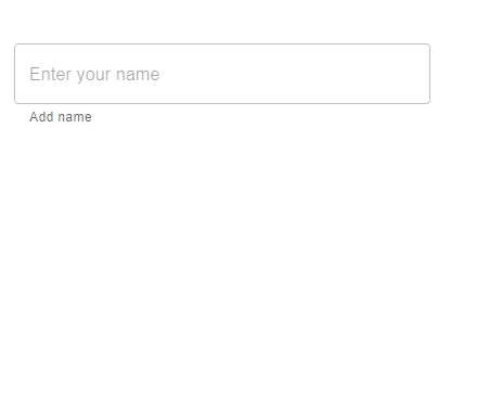
在这个例子中,我们使用了 useFormControl hook 来向用户显示输入字段是否处于焦点状态。当用户在输入框中输入任何文本时,会显示一个辅助文本,显示输入框处于焦点状态。value.focused 返回文本字段是否处于焦点状态。
//App.js file
import React, { useMemo } from "react";
import { FormControl, FormHelperText, OutlinedInput, useFormControl } from "@mui/material";

function CustomFormControl() {
   const { focused } = useFormControl() || {};
   const customHelperTxt = useMemo(() => {
      if (focused) {
         return 'You are editing...';
      }

      return 'Add name';
   }, [focused]);
   return <FormHelperText>{customHelperTxt}</FormHelperText>;
}
const App = () => {
   return (
      <div style={{
         padding: 40,
         width: '20%',
         display: 'flex',
         flexDirection: 'column',
         gap: 20}}>
         <FormControl>
            <OutlinedInput placeholder="Enter your name" />
            <CustomFormControl />
         </FormControl>
      </div>
   );
};

export default App;
要运行以上代码,请运行以下命令:
npm run start
输出
示例
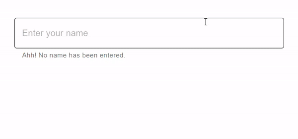
在这个例子中,我们使用了 useFormControl hook 来向用户显示输入字段是否已填充。当用户在输入框中输入任何文本时,会显示一个辅助文本,显示输入字段是否已填充。value.filled 返回文本字段输入是否已填充。
import React, { useMemo } from "react";
import { FormControl, FormHelperText, OutlinedInput, useFormControl } from "@mui/material";

function CustomFormControl() {
   const { filled } = useFormControl() || {};
   const customHelperTxt = useMemo(() => {
      return filled ? 'You have filled the name' : 'Ahh! No name has been entered.';
   }, [filled]);

   return <FormHelperText>{customHelperTxt}</FormHelperText>;
}

const App = () => {
   return (
      <div style={{
         padding: 40,
         display: 'flex',
         flexDirection: 'column',
         gap: 20}}>
         <FormControl>
            <OutlinedInput placeholder="Enter your name" fullWidth />
            <CustomFormControl />
         </FormControl>
      </div>
   );
};

export default App;
要运行以上代码,请运行以下命令:
npm run start
输出
示例
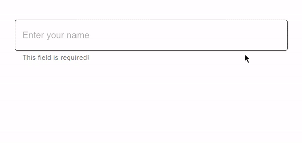
在这个例子中,我们使用了 useFormControl hook 来向用户显示输入字段是否为必填项。这里我们使用了 value.required 来检查文本标签是否显示输入是必填项。当用户在输入框中输入任何文本时,会显示一个辅助文本,显示一条消息。
//App.js file
import React, { useMemo } from "react";
import { FormControl, FormHelperText, OutlinedInput, useFormControl } from "@mui/material";

function CustomFormControl() {
   const { required } = useFormControl() || {};
   const customHelperTxt = useMemo(() => {
      return required ? 'Enter name' : 'This field is required!';
   }, [required]);

   return <FormHelperText>{customHelperTxt}</FormHelperText>;
}
const App = () => {
   return (
      <div style={{
         padding: 40,
         display: 'flex',
         flexDirection: 'column',
         gap: 20}}>
         <FormControl>
            <OutlinedInput placeholder="Enter your name" fullWidth />
            <CustomFormControl />
         </FormControl>
      </div>
   );
};

export default App;
要运行以上代码,请运行以下命令:
npm run start
输出
示例
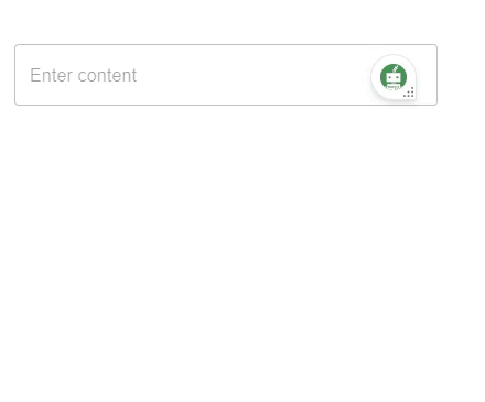
在这个例子中,我们使用了 useFormControl hook 来创建一个自定义 TextField 组件。此文本字段允许使用名为“multiline”的 prop 输入多行内容。“multiline” prop 允许用户通过提供文本框区域来输入大量内容。当用户在输入框中输入大量内容时,会显示一个辅助文本,显示一条消息。
//App.js file
import React, { useMemo } from "react";
import { FormControl, FormHelperText, OutlinedInput, useFormControl } from "@mui/material";

function CustomFormControl() {
   const { filled } = useFormControl() || {};

   const customHelperTxt = useMemo(() => {
      if (filled) {
         return 'You content is too long!';
      }
   }, [filled]);

   return <FormHelperText>{customHelperTxt}</FormHelperText>;
}

const App = () => {
   return (
      <div style={{
         padding: 40,
         width: '20%',
         display: 'flex',
         flexDirection: 'column',
         gap: 20}}>
         <FormControl>
            <OutlinedInput placeholder="Enter content" multiline />
            <CustomFormControl />
         </FormControl>
      </div>
   );
};

export default App;
要运行以上代码,请运行以下命令:
npm run start
输出
结论
本文讨论了如何在 React MUI 中使用 useFormControl hook。在本文中,我们学习了使用 React 实现此 hook 的完整步骤,并了解了 useFormControl hook API 的返回值。本文还讨论了不同的示例,例如使用必填输入、已填充、已聚焦等,以及它们各自的输出。

652 次浏览
