
 数据结构
数据结构 网络
网络 关系数据库管理系统
 操作系统
操作系统 Java
Java MS Excel
 iOS
iOS HTML
HTML CSS
CSS Android
 Python
 C 编程
C 编程 C++
C++ C#
C# MongoDB
 MySQL
MySQL Javascript
 PHP
PHP 物理学
物理学 化学
化学 生物学
生物学 数学
数学 英语
英语 经济学
经济学 心理学
心理学 社会学
社会学 时尚研究
时尚研究 法律研究
法律研究如何在 Material UI 中使用 Button 组件?
按钮用于执行某些操作,例如表单提交、文件上传、链接点击、网页路由等。Material UI 提供了预先样式化的按钮组件,用户可以将其导入 React 应用程序并在 React 组件内部使用。
Material UI 中提供了不同类型的按钮,用户可以根据自己的需求使用任何一种。
在终端中执行以下命令以安装 Material UI 库。
npm install @mui/material @emotion/react @emotion/styled
语法
用户应遵循以下语法来使用 Material UI 库的 Button 组件。
<Button> Click </Button>
示例 1(基本按钮)
在下面的示例中,我们使用了 Material UI 库的 Button 组件在 App 组件中添加按钮。第一个按钮只会显示文本,因为我们使用了“text”变体。第二个按钮是默认按钮。第三个按钮是“contained”变体,表示填充按钮。最后一个按钮被禁用,因为我们已将“disabled”属性作为 prop 传递。
import React from "react";
import Button from "@mui/material/Button";

function App() {
   return (
      <div>
         <Button variant = "text"> Content </Button>
         <Button> Click </Button>
         <Button variant = "contained"> Filled button </Button>
         <Button disabled> Can't click </Button>
      </div>
   );
}

export default App;
输出

示例 2(向按钮添加颜色和链接)
在下面的示例中,我们将学习如何更改 Material UI 的 Button 组件的颜色。用户可以看到,他们可以将“primary”、“secondary”或“error”作为 color prop 的值来应用标准颜色。此外,用户应使用 style 属性来应用自定义颜色。
此外,我们添加了“href”作为 Button 组件的 prop。我们需要将网页链接作为“href”prop 的值传递,以使按钮充当链接。
import React from "react";
import Button from "@mui/material/Button";

function App() {
   return (
      <div>
         <Button variant = "outlined" color = "primary">
            {" "}
            Content {" "}
         </Button>
         <br></br>
         <Button variant = "outlined" color = "error">
            {" "}
            Click {" "}
         </Button>
         <br></br>
         <Button variant = "contained" href = "#">
            {" "}
            Link button {" "}
         </Button>
         <br></br>
      </div>
   );
}
export default App;
输出

示例 3(向按钮添加图标)
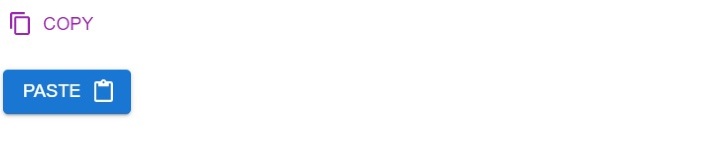
当我们在按钮中添加图标时,它看起来比没有图标的按钮好得多。在下面的示例中,我们已向按钮添加了图标。在第一个按钮中,我们在开头添加了复制图标,在第二个按钮中,我们在结尾添加了粘贴图标。
此外,我们已从 Material UI 库中导入了图标,但用户可以创建自定义组件来使用自定义图标。
import React from "react";
import Button from "@mui/material/Button";
import ContentCopyIcon from "@mui/icons-material/ContentCopy";
import ContentPasteIcon from "@mui/icons-material/ContentPaste";

function App() {
   return (
      <div>
         <h2>
            Using the <i> Button Component </i> of Material Ui with icons to add
            buttons in the React applications. {" "}
         </h2>
         <Button
            Variant = "contained"
            startIcon = {<ContentCopyIcon />}
            color = "secondary"
            >
            Copy
         </Button>
         <br></br> <br></br>
         <Button variant = "contained" endIcon = {<ContentPasteIcon />}>
            Paste
         </Button>
      </div>
   );
}

export default App;
输出
示例 4(向按钮添加点击事件)
按钮主要用于在点击时执行某些操作。在这里,我们添加了“onClick”事件来检测按钮的点击。每当用户点击按钮时,它都会调用 handleClick() 函数。在 handleClick() 函数中,我们设置消息值,例如按钮被点击,用户可以在输出中观察到。
import React from "react";
import Button from "@mui/material/Button";

function App() {
   let [message, setMessage] = React.useState("");

   function handleClick() {
      setMessage("You clicked the button!");
   }

   return (
      <div>
         <Button variant = "contained" onClick = {handleClick} color = "secondary">
            Click me
         </Button>
         <br></br>
         {message}
      </div>
   );
}

export default App;
输出

用户学习了如何使用 Material UI 的按钮组件。在第一个示例中,我们学习了如何使用 Button 组件的不同变体。在第二个示例中,我们学习了如何向按钮添加颜色并使其像链接一样。在第三个示例中,我们在最后一个示例中向按钮添加了图标和点击事件。

717 次查看
