
 数据结构
数据结构 网络
网络 关系数据库管理系统
 操作系统
操作系统 Java
Java MS Excel
 iOS
iOS HTML
HTML CSS
CSS Android
 Python
 C 编程
C 编程 C++
C++ C#
C# MongoDB
 MySQL
MySQL Javascript
 PHP
PHP 物理
物理 化学
化学 生物
生物 数学
数学 英语
英语 经济学
经济学 心理学
心理学 社会学
社会学 时尚研究
时尚研究 法律研究
法律研究如何在 Material UI 中处理单选按钮的错误?
通常,建议单选按钮具有默认选中的值。如果未满足此条件,则在提交表单时如果没有选择任何值,则可以显示错误消息。在本文中,我们将深入探讨在 Material UI 中管理单选按钮错误的过程。
什么是错误处理?
处理单选按钮中的错误涉及在用户与表单中的单选按钮输入交互时管理并向用户提供反馈。在处理单选按钮的错误时,需要考虑两个方面:
验证 - 在用户可以继续提交表单之前,必须验证用户是否已进行选择。如果未选择任何选项,则应显示错误消息,提示用户进行选择。
反馈 - 当用户与单选按钮交互时,他们应该收到反馈,指示所选的选项。
处理单选按钮错误的步骤
下面,我们概述了处理单选按钮错误的完整步骤:
步骤 1:创建一个新的 React 应用并安装 MUI
首先,让我们从创建一个 React 应用并安装 Material UI 开始。请按照以下步骤操作:
打开您的终端并运行以下命令:
npx create react app projectname
项目创建完成后,通过运行以下命令导航到项目目录:
cd projectname
通过运行以下命令安装 Material UI 及其依赖项:
npm install @mui/material @emotion/react @emotion/styled
步骤 2:将所需的组件导入 React
现在,当创建新的 React 应用时,在 src 文件夹中有一个主要的 App.js 文件。打开它并导入所需的组件。
import React from "react";
import { Radio, RadioGroup } from '@mui/material

export default function App() {
   return (
      <RadioGroup>
         <Radio />
         <Radio />
      </RadioGroup>
   )
}
步骤 3:处理错误
处理单选按钮中的错误是一项非常简单的任务。为了处理错误,我们使用 React 中的 useState() 并创建一个包含单选按钮的 if-else 语句。
const [val, setVal] = useState(" ");
const [error, setError] = useState(false);

const handleRadioChange = (e) => {
   setVal(e.target.value);
   setError(false);
};

const hdlRadio = (e) => {
   e.preventDefault();

   if (val === "Correct Value") {
      setError(false);
   } else (val === "Incorrect Value") {
      setError(true);
    }
    …
};
Radio API
<Radio> - 此 API 用于使用 Material UI 将单选按钮添加到 React 项目中。
属性
checked - 此属性用于在为 true 时选中组件。
checkedIcon - 此属性用于在为 true 时显示图标。
classes - 此属性用于覆盖或向元素添加样式。
color - 此属性用于向浮动操作按钮添加颜色。包括 primary、secondary、success、info、error、warning 等。
disabled - 此属性用于禁用 FAB。
disableRipple - 此属性用于禁用 FAB 波纹效果。
icon - 此属性用于在单选按钮未选中时显示图标。
id - 此属性用于为单选按钮组件提供 ID。
inputProps - 此属性定义应用于单选按钮的属性。
inputRef - 此属性用于将 ref 传递给输入或单选按钮组件。
name - 此属性用于向单选按钮添加名称。
onChange - 此属性用于在输入更改时触发回调函数。
required - 此属性定义如果为 true,则必须提供输入。
size - 此属性用于更改单选按钮的大小。
sx - 此属性用于向 Material UI 组件添加自定义样式。
value - 此属性用于为组件提供值。
示例
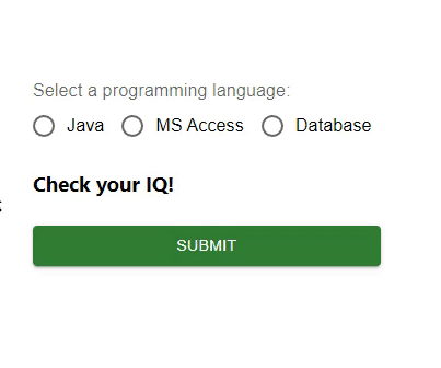
在此示例中,我们处理了单选按钮中的错误。首先,我们创建了三个带有某些值的单选按钮和一个按钮来选择正确的选项。现在,当用户尝试选择任何错误的选项时,用户会看到错误消息“抱歉,答案错误!”,如果选择的选项正确,则会显示另一条消息。因此,通过在 React 中管理状态,单选按钮中的错误处理非常容易。
import { Button, Radio, RadioGroup } from "@mui/material";
import * as React from "react";
import FormControlLabel from "@mui/material/FormControlLabel";
import FormControl from "@mui/material/FormControl";
import FormLabel from "@mui/material/FormLabel";
import { useState } from "react";

const App = () => {

   const [val, setVal] = useState('');
   const [error, setError] = useState(false);
   const [option, setOption] = useState('Check your IQ!');

   const handleRadioChange = (e) => {
      setVal(e.target.value);
      setOption(' ');
      setError(false);
   };

   const hdlRadio = (e) => {
      e.preventDefault();

      if (val === 'Java') {
         setOption('You are correct!');
         setError(false);
      } else if (val === 'MS Access') {
         setOption('Sorry, incorrect answer!');
         setError(true);
      } else if (val === 'Database') {
         setOption('Sorry, incorrect answer!');
         setError(true);
      } else {
         setOption('Choose any option.');
         setError(true);
      }
   };

   return (
      <div>
         <form onSubmit={hdlRadio}>
            <FormControl sx={{p: 10}}>
               <FormLabel>Select a programming language:</FormLabel>
               <RadioGroup value={val}
               onChange={handleRadioChange} row aria-labelledby="label-pl" name="rg-pl">
                  <FormControlLabel
                     value="Java"
                     control={<Radio color="info" />}
                     label="Java"
                  />
                  <FormControlLabel
                     value="MS Access"
                     control={<Radio color="success" />}
                     label="MS Access"
                  />
                  <FormControlLabel
                     value="Database"
                     control={<Radio color="warning" />}
                     label="Database"
                  />
               </RadioGroup>
               <h3>{option}</h3>
               <Button sx={{ mt: 1, mr: 1 }} type="submit" color="success" variant="contained">
                  Submit
               </Button>
            </FormControl>
         </form>
      </div>
   );
};

export default App;
输出
示例
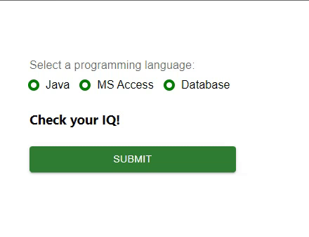
在此示例中,我们处理了单选按钮中的错误。这里也创建了三个单选按钮,但是这些单选按钮是借助 Material “styled” 组件进行自定义的。在这里,我们使用单选按钮创建了一些选项以及一个按钮来选择正确的选项。现在,当用户尝试选择任何错误的选项时,用户会看到错误消息“抱歉,答案错误!”,如果选择的选项正确,则会显示另一条消息。因此,通过在 React 中管理状态,单选按钮中的错误处理非常容易。
import { Button, Radio, RadioGroup } from "@mui/material";
import * as React from "react";
import FormControlLabel from "@mui/material/FormControlLabel";
import FormControl from "@mui/material/FormControl";
import FormLabel from "@mui/material/FormLabel";
import { useState } from "react";
import { styled } from "@mui/material/styles";

const MyRadioButton = styled((props) => (
   <Radio
      icon={<div className="MuiRadioUnchecked" />}
      checkedIcon={<div className="MuiRadioChecked" />}
      disableRipple
      color="default"
      {...props}
   />
))(() => ({
   "& .MuiRadioChecked": {
      backgroundColor: "lightgreen",
      borderRadius: "50%",
      height: 8,
      width: 8,
      boxShadow: `0 0 0 4px green`,
   },
   "& .MuiRadioUnchecked": {
      border: `4px solid green`,
      borderRadius: "50%",
      height: 8,
      width: 8,
   },
}));

const App = () => {
   const [val, setVal] = useState("");
   const [error, setError] = useState(false);
   const [option, setOption] = useState("Check your IQ!");

   const handleRadioChange = (e) => {
      setVal(e.target.value);
      setOption(" ");
      setError(false);
   };

   const hdlRadio = (e) => {
      e.preventDefault();

      if (val === "Java") {
         setOption("You are correct!");
         setError(false);
      } else if (val === "MS Access") {
         setOption("Sorry, incorrect answer!");
         setError(true);
      } else if (val === "Database") {
         setOption("Sorry, incorrect answer!");
         setError(true);
      } else {
         setOption("Choose any option.");
         setError(true);
      }
   };

   return (
      <div>
         <form onSubmit={hdlRadio}>
            <FormControl sx={{ p: 10 }}>
               <FormLabel>Select a programming language:</FormLabel>
               <RadioGroup
                  value={val}
                  onChange={handleRadioChange}
                  row
                  aria-labelledby="label-pl"
                  name="rg-pl">
                  <FormControlLabel
                     value="Java"
                     control={<MyRadioButton />}
                     label="Java"
                  />
                  <FormControlLabel
                     value="MS Access"
                     control={<MyRadioButton />}
                     label="MS Access"
                  />
                  <FormControlLabel
                     value="Database"
                     control={<MyRadioButton />}
                     label="Database"
                  />
               </RadioGroup>
               <h3>{option}</h3>
               <Button
                  sx={{ mt: 1, mr: 1 }}
                  type="submit"
                  color="success"
                  variant="contained"
                  >
                  Submit
               </Button>
            </FormControl>
         </form>
      </div>
   );
};
export default App;
输出
结论
在本文中,我们学习了如何使用 React 在 Material UI 中处理单选按钮中的错误。

551 次浏览
