
 数据结构
数据结构 网络
网络 关系型数据库管理系统 (RDBMS)
 操作系统
操作系统 Java
Java MS Excel
 iOS
iOS HTML
HTML CSS
CSS Android
 Python
 C语言编程
C语言编程 C++
C++ C#
C# MongoDB
 MySQL
MySQL Javascript
 PHP
PHP 物理学
物理学 化学
化学 生物学
生物学 数学
数学 英语
英语 经济学
经济学 心理学
心理学 社会研究
社会研究 时尚研究
时尚研究 法律研究
法律研究如何在 Material UI 中自定义复选框?
Material UI是一个常用的前端库,它提供各种预先设计和可自定义的UI组件。在构建需要用户输入和选择的表单或应用程序时,复选框通常被使用。但是,如果您想使用属性(例如大小、颜色、设计、文本、图标等)个性化您的复选框怎么办?幸运的是,Material UI 提供了自定义选项,允许您根据应用程序的设计和品牌需求轻松地设置复选框的样式。
在本文中,我们将探讨在 Material UI 中自定义复选框的过程。在深入研究之前,重要的是要设置一个 React 项目并包含 Material UI 库。让我们首先了解如何自定义输入复选框。
自定义复选框的步骤
下面,我们概述了使用 React 在 Material UI 中自定义复选框的分步过程。
步骤 1:创建一个新的 React 应用并安装 MUI
首先,让我们创建一个 React 应用并安装 Material UI。请按照以下步骤操作:
打开您的终端并运行以下命令:
npx create react app projectname
项目创建后,通过运行以下命令导航到项目目录:
cd projectname
运行以下命令安装 Material UI 及其依赖项:
npm install @mui/material @emotion/react @emotion/styled
步骤 2:将所需的组件导入 React
现在,创建新的 React 应用后,在 src 文件夹中有一个 main App.js 文件。打开它并导入所需的组件。
import React from "react";
import { FormControlLabel, Checkbox } from '@mui/material

export default function App() {
   return (
      <FormControlLabel
         control={<Checkbox />}
         …
      />
   )
}
现在我们已经完成了创建和导入所需组件的所有步骤。让我们探索一些说明使用不同方法自定义复选框的示例。
复选框标签 API
<Checkbox> - 此 API 用于使用 Material UI 向项目添加复选框组件功能。
属性
checked - 此属性用于在为 true 时选中复选框。
checkedIcon - 此属性用于在选中时显示图标。
classes - 此属性用于覆盖或向元素添加样式。
color - 此属性用于向复选框添加颜色。它包括 primary、secondary、success、info、error、warning 等。
defaultChecked - 此属性用于在不受用户控制时选中复选框。
disabled - 此属性用于禁用复选框。
disableRipple - 此属性用于禁用复选框的波纹效果。
icon - 此属性用于在未选中时显示图标。
id - 此属性用于定义复选框 ID。
Indeterminate - 此属性用于使复选框处于不确定状态。
indeterminateIcon - 此属性用于在复选框中显示不确定状态图标。
inputProps - 此属性用于向输入元素添加属性。
inputRef - 此属性用于将 ref 传递给复选框。
onChange - 此属性用于触发回调函数。
required - 此属性用于为输入元素添加 required 值。
size - 此属性用于更改复选框的大小。
sx - 此属性用于向 Material UI 组件添加自定义样式。
value - 此属性用于定义组件的值。
示例
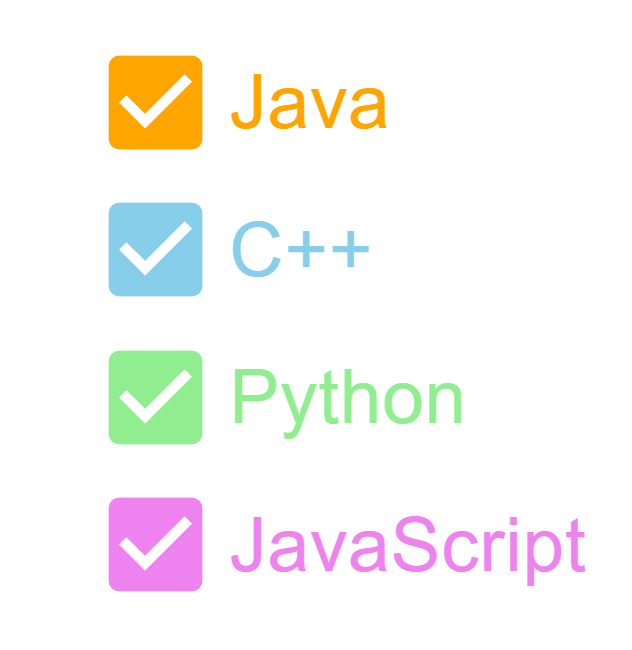
在此示例中,我们开发了复选框,并使用属性对复选框本身及其标签应用了样式。我们使用了实用程序类进行自定义。
import { FormControlLabel, FormGroup } from "@mui/material";
import Checkbox from "@mui/material/Checkbox";
import React from "react";

export default function App() {
   return (
      <div
         style={{
            display: "flex",
            marginTop: 30,
            flexDirection: "column",
            alignItems: "center",
            justifyContent: "center",
            gap: 10,
         }}>
         <FormGroup>
            <FormControlLabel
               control={
                  <Checkbox
                     sx={{
                        "& .MuiSvgIcon-root": {
                           fill: "orange",
                           fontSize: 100,
                        },
                     }}
                  />
               }
               label="Java"
               sx={{
                  "& .MuiFormControlLabel-label": {
                     color: "orange",
                     fontSize: 60,
                  },
               }}
            />
            <FormControlLabel
               control={
                  <Checkbox
                     sx={{
                        "& .MuiSvgIcon-root": {
                           fill: "skyblue",
                           fontSize: 100,
                        },
                     }}
                  />
               }
               label="C++"
               sx={{
                  "& .MuiFormControlLabel-label": {
                     color: "skyblue",
                     fontSize: 60,
                  },
               }}
            />
            <FormControlLabel
               control={
                  <Checkbox
                     sx={{
                        "& .MuiSvgIcon-root": {
                           fill: "lightgreen",
                           fontSize: 100,
                        },
                     }}
                  />
               }
               label="Python"
               sx={{
                  "& .MuiFormControlLabel-label": {
                     color: "lightgreen",
                     fontSize: 60,
                  },
               }}
            />
            <FormControlLabel
               control={
                  <Checkbox
                     sx={{
                        "& .MuiSvgIcon-root": {
                           fill: "violet",
                           fontSize: 100,
                        },
                     }}
                  />
               }
               label="JavaScript"
               sx={{
                  "& .MuiFormControlLabel-label": {
                     color: "violet",
                     fontSize: 60,
                  },
               }}
            />
         </FormGroup>
      </div>
   );
}
输出
示例
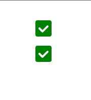
在此示例中,我们使用 styled-components 创建了一个自定义复选框。此示例还使用 FormGroup 组件来组合多个复选框。
import { FormGroup } from "@mui/material";
import Checkbox from "@mui/material/Checkbox";
import React from "react";
import { styled } from "@mui/system";

const UnCheckedIconCustom = styled("span")(() => ({
   width: 32,
   height: 32,
   borderRadius: 4,
   boxShadow: "lightgreen",
   backgroundColor: "green",
   backgroundImage: "green",
   ".Mui-focusVisible &": {
      outline: "#158802",
      outlineOffset: 2,
   },
   "input:hover ~ &": {
      backgroundColor: "#0D5502",
   },
}));

const CheckedIconCustom = styled(UnCheckedIconCustom)({
   backgroundColor: "green",
   "&:before": {
      width: 32,
      height: 32,
      display: "block",
      backgroundImage:
         "url("data:image/svg+xml;charset=utf-8,%3Csvg xmlns='http://www.w3.org/2000/svg' viewBox='0 0 16 16'%3E%3Cpath" +
         " fill-rule='evenodd' clip-rule='evenodd' d='M12 5c-.28 0-.53.11-.71.29L7 9.59l-2.29-2.3a1.003 " +
         "1.003 0 00-1.42 1.42l3 3c.18.18.43.29.71.29s.53-.11.71-.29l5-5A1.003 1.003 0 0012 5z' fill='%23fff'/%3E%3C/svg%3E")",
      content: '""',
   },
   "input:hover ~ &": {
      backgroundColor: "#0D5502",
   },
});

export default function App() {
   return (
      <div
         style={{
            display: "flex",
            marginTop: 30,
            flexDirection: "column",
            alignItems: "center",
            justifyContent: "center",
            gap: 10,
         }}>
         <FormGroup>
            <Checkbox
               sx={{
                  "&:hover": { bgcolor: "transparent" },
               }}
               checkedIcon={<CheckedIconCustom />}
               icon={<UnCheckedIconCustom />}
               disableRipple
            />
            <Checkbox
               sx={{
                  "&:hover": { bgcolor: "transparent" },
               }}
               checkedIcon={<CheckedIconCustom />}
               icon={<UnCheckedIconCustom />}
               disableRipple
            />
         </FormGroup>
      </div>
   );
}
输出
示例
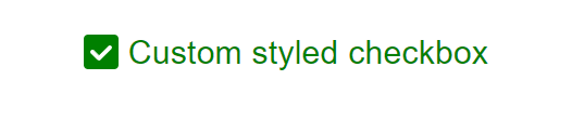
在本例中,我们使用 styled-components 设计了一个复选框并添加了自定义标签。此示例还演示了如何使用 FormGroup 组件来组合复选框。
import { FormControlLabel, FormGroup } from "@mui/material";
import Checkbox from "@mui/material/Checkbox";
import React from "react";
import { styled } from "@mui/system";

const UnCheckedIconCustom = styled("span")(() => ({
   width: 32,
   height: 32,
   borderRadius: 4,
   boxShadow: "lightgreen",
   backgroundColor: "green",
   backgroundImage: "green",
   ".Mui-focusVisible &": {
      outline: "#158802",
      outlineOffset: 2,
   },
   "input:hover ~ &": {
      backgroundColor: "#0D5502",
   },
}));

const CheckedIconCustom = styled(UnCheckedIconCustom)({
   backgroundColor: "green",
   "&:before": {
      width: 32,
      height: 32,
      display: "block",
      backgroundImage:
         "url("data:image/svg+xml;charset=utf-8,%3Csvg xmlns='http://www.w3.org/2000/svg' viewBox='0 0 16 16'%3E%3Cpath" +
         " fill-rule='evenodd' clip-rule='evenodd' d='M12 5c-.28 0-.53.11-.71.29L7 9.59l-2.29-2.3a1.003 " +
         "1.003 0 00-1.42 1.42l3 3c.18.18.43.29.71.29s.53-.11.71-.29l5-5A1.003 1.003 0 0012 5z' fill='%23fff'/%3E%3C/svg%3E")",
      content: '""',
   },
   "input:hover ~ &": {
      backgroundColor: "#0D5502",
   },
});

export default function App() {
   return (
      <div
         style={{
            display: "flex",
            marginTop: 30,
            flexDirection: "column",
            alignItems: "center",
            justifyContent: "center",
            gap: 10,
         }}>
         <FormGroup>
            <FormControlLabel
               label="Custom styled checkbox"
               control={
                  <Checkbox
                     sx={{
                        "&:hover": { bgcolor: "transparent" },
                     }}
                     checkedIcon={<CheckedIconCustom />}
                     icon={<UnCheckedIconCustom />}
                     disableRipple
                  />
               }
               sx={{
                  "& .MuiFormControlLabel-label": {
                     color: "green",
                     fontSize: 30,
                  },
               }}
            />
         </FormGroup>
      </div>
   );
}
输出
结论
Material UI 提供了一系列自定义复选框的选项,使您可以个性化其样式以匹配应用程序的需求和设计偏好。在本文中,我们学习了自定义复选框的完整步骤,并看到了使用不同方法(如 styled-components 等)的示例。通过 CSS、JS 和复选框外观和图标的自定义,您可以创建与您的 UI 无缝集成的复选框。尝试使用不同的样式、颜色和图标来实现能够增强应用程序外观和感觉的复选框设计。

181 次查看
