
 数据结构
数据结构 网络
网络 关系型数据库管理系统(RDBMS)
 操作系统
操作系统 Java
Java MS Excel
 iOS
iOS HTML
HTML CSS
CSS Android
 Python
 C语言编程
C语言编程 C++
C++ C#
C# MongoDB
 MySQL
MySQL Javascript
 PHP
PHP 物理
物理 化学
化学 生物
生物 数学
数学 英语
英语 经济学
经济学 心理学
心理学 社会研究
社会研究 时尚研究
时尚研究 法律研究
法律研究如何在Material UI中使用Grid组件?
网格指的是类似表格的行和列结构。当我们使用HTML的<table>标签创建表格时,可以创建不同尺寸的行和列,但Material UI库的Grid组件也允许我们这样做。
我们可以使用Material UI的Grid组件作为容器和项目。此外,我们可以根据设备屏幕的尺寸自动调整网格。
用户首先需要使用以下命令安装Material UI库,才能在React项目中使用Grid组件。
npm install @mui/material @emotion/react @emotion/styled
根据标准,每个设备包含12列。我们可以传入1到12作为属性来创建一个特定列数的Grid。
语法
用户可以按照以下语法使用Material UI的Grid组件。
<Grid container spacing = {2}>
   <Grid item xs = {12}>
      content
   </Grid>
</Grid>
我们在上面的语法中将外部Grid组件用作容器,通过传递container作为属性。嵌套的Grid组件作为容器中的项目,因为我们传递了'item'作为属性。
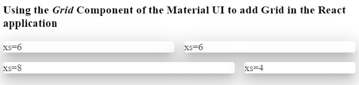
示例1(基本Grid组件)
在下面的示例中,我们使用了Material UI的Grid、Paper和Box组件。Paper组件用于创建卡片。
我们创建了Grid容器,并在其中添加了四个网格。前两个网格尺寸相同,占据六列;第三个网格占据八列;第四个网格在第二行占据四列。
这里,“xs”表示设备断点。用户可以对小型设备使用“sm”。
import React from "react";
import Box from "@mui/material/Box";
import Paper from "@mui/material/Paper";
import Grid from "@mui/material/Grid";
const App = () => {
   return (
      <div>
         <h3>
            {" "}
            Using the <i> Grid </i> Component of the Material UI to add Grid in the React application {" "}
         </h3>
         <Box sx = {{ flexGrow: 1 }}>
            <Grid container spacing = {2}>
               <Grid item xs = {6}>
                  <Paper elevation = {16}> xs=6 </Paper>
               </Grid>
               <Grid item xs = {6}>
                  <Paper elevation = {16}> xs=6 </Paper>
               </Grid>
               <Grid item xs = {8}>
                  <Paper elevation = {16}> xs=8 </Paper>
               </Grid>
               <Grid item xs = {4}>
                  <Paper elevation = {16}> xs=4 </Paper>
               </Grid>
            </Grid>
         </Box>
      </div>
   );
};
export default App;
输出
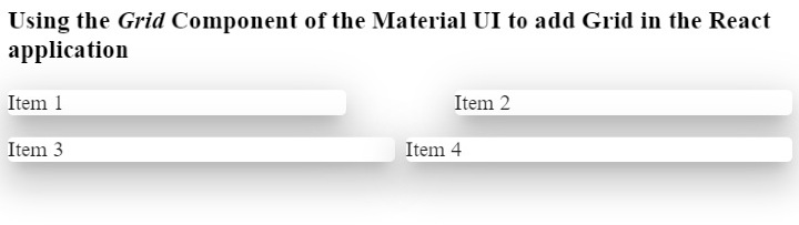
示例2(更改网格之间的间距)
我们可以使用'spacing'属性来更改两个网格之间的间距。例如,我们在前两个网格之间设置了'10'的间距,在后两个网格之间设置了'1'的间距。
import React from "react";
import Paper from "@mui/material/Paper";
import Grid from "@mui/material/Grid";
const App = () => {
   return (
      <div>
         <h3>
            {" "}
            Using the <i> Grid </i> Component of the Material UI to add Grid in the React application {" "}
         </h3>
         <div>
            <Grid container spacing = {10}>
               <Grid item xs = {6}>
                  <Paper elevation = {16}> Item 1 </Paper>
               </Grid>
               <Grid item xs = {6}>
                  <Paper elevation = {16}> Item 2 </Paper>
               </Grid>
            </Grid>
         </div>
         <div style = {{ width: "100%", marginTop: "1rem" }}>
            <Grid container spacing = {1}>
               <Grid item xs = {6}>
                  <Paper elevation = {16}> Item 3 </Paper>
               </Grid>
               <Grid item xs = {6}>
                  <Paper elevation = {16}> Item 4 </Paper>
               </Grid>
            </Grid>
         </div>
      </div>
   );
};
export default App;
输出
在输出中,用户可以观察到每个网格之间的间距差异。同样,用户也可以类似地设置行之间的间距。
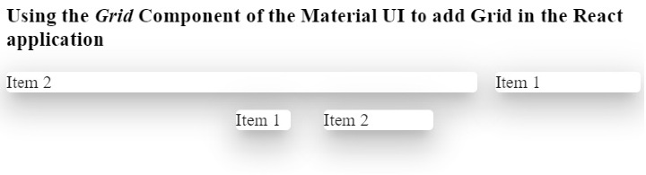
示例3(使用属性自定义Grid样式)
在下面的示例中,我们创建了两个Grid容器,并在两个容器中添加了相同的内容。
在第一个容器中,我们添加了'direction'属性,其值为'row-reverse'。在输出中,用户可以观察到它反向显示所有组件。
在第二个容器中,我们添加了'justifyContent'属性,其值为'flex-end'。
import React from "react";
import Paper from "@mui/material/Paper";
import Grid from "@mui/material/Grid";
const App = () => {
   return (
      <div>
         <h3>
            {" "}
            Using the <i> Grid </i> Component of the Material UI to add Grid in the React application {" "}
         </h3>
         <div>
            <Grid container spacing = {2} direction = "row-reverse">
               <Grid item xs = {3}>
                  <Paper elevation = {16}> Item 1 </Paper>
               </Grid>
               <Grid item xs = {9}>
                  <Paper elevation = {16}> Item 2 </Paper>
               </Grid>
            </Grid>
         </div>
         <div style = {{ width: "50%", marginTop: "1rem", height: 300 }}>
            <Grid container spacing = {10} justifyContent = "flex-end">
               <Grid item xs = {2}>
                  <Paper elevation = {16} style = {{ width: 50 }}>
                     Item 1
                  </Paper>
               </Grid>
               <Grid item xs = {2}>
                  <Paper elevation = {16} style = {{ width: 100 }}>
                     Item 2
                  </Paper>
               </Grid>
            </Grid>
         </div>
      </div>
   );
};
export default App;
输出
在输出中,用户可以观察到它将两个网格显示在div的末尾。这里,div的宽度为50%。
用户学习了如何在ReactJS中使用Material UI的Grid组件。我们学习了如何将Grid用作容器和行。此外,我们还学习了如何为Grid设置尺寸。如果用户不想为Grid组件添加断点,可以添加“auto”布局以使网格响应式。此外,用户可以通过传递style作为属性来自定义Grid的CSS。

浏览量:798
