
 数据结构
数据结构 网络
网络 关系数据库管理系统 (RDBMS)
 操作系统
操作系统 Java
Java MS Excel
 iOS
iOS HTML
HTML CSS
CSS Android
 Python
 C 语言编程
 C++
C++ C#
C# MongoDB
 MySQL
MySQL Javascript
 PHP
PHP 物理学
物理学 化学
化学 生物学
生物学 数学
数学 英语
英语 经济学
经济学 心理学
心理学 社会学
社会学 服装设计
服装设计 法学
法学如何在 Material UI 中使用 Box 组件?
顾名思义,Box 组件允许用户在网页上添加不同尺寸的盒子。用户还可以在 Box 组件内添加任何自定义 HTML 内容。此外,用户可以通过传递样式作为 props 来设置盒子的样式。
要使用 Material UI 的 Box 组件,用户需要在终端运行以下命令来安装 Material 库。
npm install @mui/material @emotion/react @emotion/styled
语法
用户应遵循以下语法来使用 Material UI 库的 Box 组件。
<Box> Content of the Box. </Box>
用户可以在上面的语法中看到如何在 Box 组件内添加内容。
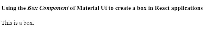
示例 1
在下面的示例中,我们从 Material UI 导入了 Box 组件。之后,我们在 App 组件内使用了 Box 组件,并在 Box 组件内添加了一些文本组件。
import React from "react";
import Box from "@mui/material/Box";

function App() {
   return (
      <div>
         <h2>
            Using the <i> Box Component </i> of Material Ui to create a box in React
            applications. {" "}
         </h2>
         <Box> This is a box. </Box>
      </div>
   );
}

export default App;
输出
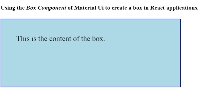
示例 2
在第一个示例中,Box 组件不够清晰可见。因此,在下面的示例中,我们使用 ‘sx’ prop 为 Box 组件添加了一些样式。
我们设置了盒子的尺寸。此外,我们还为盒子元素添加了背景颜色和边框。在输出中,用户可以看到该盒子。
import React from "react";
import Box from "@mui/material/Box";

function App() {
   return (
      <div>
         <h4>
            Using the <i> Box Component </i> of Material Ui to create a box in React
            applications. {" "}
         </h4>
         <Box
            sx = {{
               width: 400,
               height: 100,
               backgroundColor: "lightblue",
               border: "2px solid blue",
               padding: 5,
               fontSize: 20,
            }}
            >
            This is the content of the box.
         </Box>
      </div>
   );
}

export default App;
输出
本教程介绍了如何使用 Material UI 的 Box 组件。用户可以像我们在第二个示例中所做的那样,使用不同的 CSS 规则来设置 Box 组件的样式。

更新于:2023年4月6日
992 次浏览

广告