- Seaborn 教程
- Seaborn - 首页
- Seaborn - 简介
- Seaborn - 环境搭建
- 导入数据集和库
- Seaborn - 图表美化
- Seaborn - 调色板
- Seaborn - 直方图
- Seaborn - 核密度估计
- 可视化成对关系
- Seaborn - 绘制分类数据
- 观测值的分布
- Seaborn - 统计估计
- Seaborn - 绘制宽格式数据
- 多面板分类图
- Seaborn - 线性关系
- Seaborn - Facet Grid
- Seaborn - Pair Grid
- 函数参考
- Seaborn - 函数参考
- Seaborn 有用资源
- Seaborn - 快速指南
- Seaborn - 有用资源
- Seaborn - 讨论
Seaborn.JointGrid 类
Seaborn.JointGrid 类用作网格,用于绘制带有边缘单变量图的双变量图。
通常,可以使用名为 jointplot() 的图级别接口绘制许多图;但是,如果需要数据可视化更灵活,则可以使用此类。从根本上说,此类设置网格并在内部存储数据,以便更容易进行绘图。
以下是 seaborn.JointGrid 的语法
class seaborn.JointGrid(**kwargs)
__init__(self, *, x=None, y=None, data=None, height=6, ratio=5, space=0.2, dropna=False, xlim=None, ylim=None, size=None, marginal_ticks=False, hue=None, palette=None, hue_order=None, hue_norm=None)
seaborn.JointGrid 的参数
下面显示了此类的一些参数。
| 序号 | 参数和描述 |
|---|---|
| 1 | 数据 接收数据框,其中每一列是一个变量,每一行是一个观测值。 |
| 2 | 色调 (hue) 指定将在特定网格面上显示的数据部分的变量。要调整此变量的级别顺序,请参考变量顺序参数。 |
| 3 | 类型 (Kind) 从 {‘scatter’, ‘kde’, ‘hist’, ‘reg’} 中取值,并据此确定要绘制的图的类型。 |
| 4 | 比例 (ratio) 接收数值,并确定联合轴高度与边缘轴高度的比例。 |
| 5 | 高度 (Height) 接收标量值,并确定面的高度。 |
| 6 | 颜色 (Color) 接收 matplotlib 颜色作为输入,并确定未使用色调映射时的单一颜色规范。 |
| 7 | 边缘刻度 (Marginal_ticks) 接收布尔值,如果为 False,则抑制边缘图的计数/密度轴上的刻度。 |
| 8 | 色调顺序 (hue_order) 接收列表作为输入,并由此顺序确定分面变量的级别顺序。 |
在继续绘制图形之前,让我们加载 seaborn 库和数据集。
加载 seaborn 库
要加载或导入 seaborn 库,可以使用以下代码行。
Import seaborn as sns
加载数据集
在本文中,我们将使用 seaborn 库中内置的 Tips 数据集。使用以下命令加载数据集。
tips=sns.load_dataset("tips")
以下命令用于查看数据集中前 5 行。这使我们能够了解可以使用哪些变量来绘制图表。
tips.head()
以下是上述代码的输出:
index,total_bill,tip,sex,smoker,day,time,size
0,16.99,1.01,Female,No,Sun,Dinner,2
1,10.34,1.66,Male,No,Sun,Dinner,3
2,21.01,3.5,Male,No,Sun,Dinner,3
3,23.68,3.31,Male,No,Sun,Dinner,2
4,24.59,3.61,Female,No,Sun,Dinner,4
现在我们已经加载了数据,我们将继续绘制数据。
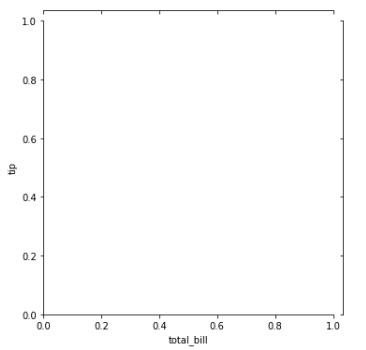
示例 1
在下面的示例中,我们将通过向其传递 tips 数据集和 x、y 列来绘制一个简单的 JointGrid。这将生成一个空的 JointGrid 面。
import seaborn as sns
import matplotlib.pyplot as plt
tips=sns.load_dataset("tips")
tips.head()
sns.JointGrid(data=tips, x="total_bill", y="tip")
plt.show()
输出
生成的输出图如下所示:
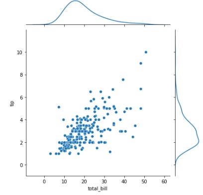
示例 2
在这个示例中,我们将在联合网格面上绘制散点图。散点图绘制在面上,核密度估计图绘制在面的边缘。
import seaborn as sns
import matplotlib.pyplot as plt
tips=sns.load_dataset("tips")
tips.head()
g = sns.JointGrid(data=tips, x="total_bill", y="tip")
g.plot(sns.scatterplot, sns.kdeplot)
plt.show()
输出
输出图如下所示:
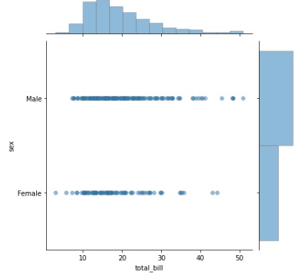
示例 3
与上述示例类似,使用 plot() 函数在联合网格面上绘制散点图,并在面的边缘绘制直方图。除此之外,还向函数传递了一些其他参数,例如边缘颜色、线宽和alpha。
这里,边缘颜色是一个特殊参数,它接收 matplotlib 颜色或“灰色”的值。这是一个可选参数。围绕每个点的线的色调由此参数决定。如果您传递“灰色”,则用于点主体 的颜色方案决定亮度。
线宽是一个接收浮点值的 参数,用于确定划分每个单元格的线的宽度。接下来,传递 alpha 参数。我们可以在 plot 函数中使用 alpha 参数来修改图表的透明度。其值默认为 1。此选项的值介于 0 和 1 之间,并且随着值接近 0,图表变得更加半透明和不可见。
import seaborn as sns
import matplotlib.pyplot as plt
tips=sns.load_dataset("tips")
tips.head()
g = sns.JointGrid(data=tips, x="total_bill", y="sex")
g.plot(sns.scatterplot, sns.histplot, alpha=.5, edgecolor=".5", linewidth=.5)
plt.show()
输出
现在,获得的图如下所示:
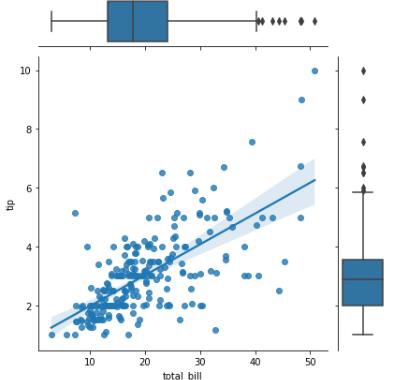
示例 4
还可以绘制分类图在 JointGrid 面的边缘。在这个示例中,我们将展示如何绘制箱线图。
import seaborn as sns
import matplotlib.pyplot as plt
tips=sns.load_dataset("tips")
tips.head()
g = sns.JointGrid(data=tips, x="total_bill", y="tip")
g.plot(sns.regplot, sns.boxplot)
plt.show()
输出
获得的输出如下: