
 数据结构
数据结构 网络
网络 关系数据库管理系统 (RDBMS)
 操作系统
操作系统 Java
Java MS Excel
 iOS
iOS HTML
HTML CSS
CSS Android
 Python
 C语言编程
C语言编程 C++
C++ C#
C# MongoDB
 MySQL
MySQL Javascript
 PHP
PHP 物理学
物理学 化学
化学 生物学
生物学 数学
数学 英语
英语 经济学
经济学 心理学
心理学 社会学
社会学 服装设计
服装设计 法学
法学ReactNative SwitchSelector 组件详解
SwitchSelector 组件类似于单选按钮。它允许您选择超过 2 个值。
要使用 SwitchSelector,您需要按照以下步骤安装软件包:
npm i react-native-switch-selector --save-dev
基本的 SwitchSelector 如下所示:
<SwitchSelector
   106
   React Native – Q&A
   options={youroptions}
   initial={0}
   onPress={value => console.log(`value selected is : ${value}`)}
/>
以下是一些 SwitchSelector 的重要属性:
| 属性 | 描述 |
|---|---|
| options | 一个包含标签、值和图像图标 ID 的数组(必填)。 |
| initial | 将被选择的数组中的初始项。 |
| value | 将随 onPress 事件一起使用的开关值。 |
| onPress | 当开关更改时将调用的回调函数事件。 |
| fontSize | 标签的字体大小。 |
| selectedColor | 所选项的颜色。 |
| buttonColor | 所选项的背景颜色。 |
| textColor | 未选中的项的标签颜色。 |
| backgroundColor | SwitchSelector 组件的背景颜色。 |
| borderColor | 组件的边框颜色。 |
示例:SwitchSelector 的工作原理
要使用 SwitchSelector,我们必须按如下方式导入组件:
import SwitchSelector from "react-native-switch-selector";
在 SwitchSelector 中,我们将显示两个选项:女/男。
在这个例子中,我们使用了女性和男性的图像,并且在 options 数组中使用了相同的图像。
let male = require('C:/myfirstapp/myfirstapp/assets/male.png');
let female = require('C:/myfirstapp/myfirstapp/assets/female.png');
const images = {
   "female": female,
   "male": male,
};
const options =[
   { label: "Female", value: "f", imageIcon: images.female },
   { label: "Male", value: "m", imageIcon: images.male }
];
SwitchSelector 如下所示:
<SwitchSelector
   initial={0}
   onPress={value => this.setState({ gender: value })}
   textColor='#ccceeaa'
   selectedColor='#7a44cf'
   buttonColor='#ccc'
   borderColor='#ccc'
   hasPadding
   options={options}
/>
以下是 SwitchSelector 的完整代码:
示例
import React, { Component } from 'react';
import { StyleSheet, SafeAreaView } from 'react-native';
import SwitchSelector from "react-native-switch-selector";
let male = require('C:/myfirstapp/myfirstapp/assets/male.png');
let female = require('C:/myfirstapp/myfirstapp/assets/female.png');
const images = {
   "female": female,
   "male": male,
};
const options =[
   { label: "Female", value: "f", imageIcon: images.female },
   { label: "Male", value: "m", imageIcon: images.male }
];
export default class MySwitchSelectorComponent extends Component {
   render() {
      return (
         <SafeAreaView style={styles.container}>
            <SwitchSelector
               initial={0}
                  onPress={value => this.setState({ gender: value })}
                  textColor='#ccceeaa'
                  selectedColor='#7a44cf'
                  buttonColor='#ccc'
                  borderColor='#ccc'
                  hasPadding
                  options={options}
            />
         </SafeAreaView>
      )
   }
}
const styles = StyleSheet.create({
   container: {
      flex: 1,
      alignItems: "center",
      justifyContent: "center"
   },
});
输出
输出结果如下:

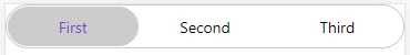
示例 2:带有三个选项的 SwitchSelector
在下面的示例中,我们使用了三个选项:
const options =[
   { label: "First", value: "a"},
   { label: "Second", value: "b" } ,
   { label: "Third", value: "c" }
];
显示三个选项的完整代码如下:
示例
import React, { Component } from 'react';
import { StyleSheet, SafeAreaView } from 'react-native';
import SwitchSelector from "react-native-switch-selector";
const options =[
   { label: "First", value: "a"},
   { label: "Second", value: "b" } ,
   { label: "Third", value: "c" }
];
export default class MySwitchSelectorComponent extends Component {
   render() {
      return (
         <SafeAreaView style={styles.container}>
            <SwitchSelector
               initial={0}
               onPress={value => this.setState({ gender: value })}
               textColor='#ccceeaa'
               selectedColor='#7a44cf'
               buttonColor='#ccc'
               borderColor='#ccc'
               fontSize='30'
               hasPadding
               options={options}
            />
         </SafeAreaView>
      )
   }
}
const styles = StyleSheet.create({
   container: {
      flex: 1
   }
});
输出

更新于:2021年7月1日
浏览量:331

广告