- ggplot2 教程
- ggplot2 - 首页
- ggplot2 - 简介
- ggplot2 - R 的安装
- ggplot2 - R 中的默认绘图
- ggplot2 - 使用坐标轴
- ggplot2 - 使用图例
- ggplot2 - 散点图 & 抖动图
- ggplot2 - 条形图 & 直方图
- ggplot2 - 饼图
- ggplot2 - 边缘图
- ggplot2 - 气泡图 & 计数图
- ggplot2 - 发散图
- ggplot2 - 主题
- ggplot2 - 多面板图
- ggplot2 - 多个绘图
- ggplot2 - 背景颜色
- ggplot2 - 时间序列
- ggplot2 有用资源
- ggplot2 - 快速指南
- ggplot2 - 有用资源
- ggplot2 - 讨论
ggplot2 - 散点图 & 抖动图
散点图类似于通常用于绘图的线图。散点图显示了一个变量与另一个变量的相关程度。变量之间的关系称为相关性,通常用于统计方法。我们将使用相同的数据集“Iris”,其中包含每个变量之间的大量差异。这是一个著名的数据集,它给出了三种鸢尾花物种中每种 50 朵花的萼片长度和宽度以及花瓣长度和宽度的厘米测量值。这些物种被称为 Iris setosa、versicolor 和 virginica。
创建基本散点图
使用“ggplot2”包创建散点图涉及以下步骤:
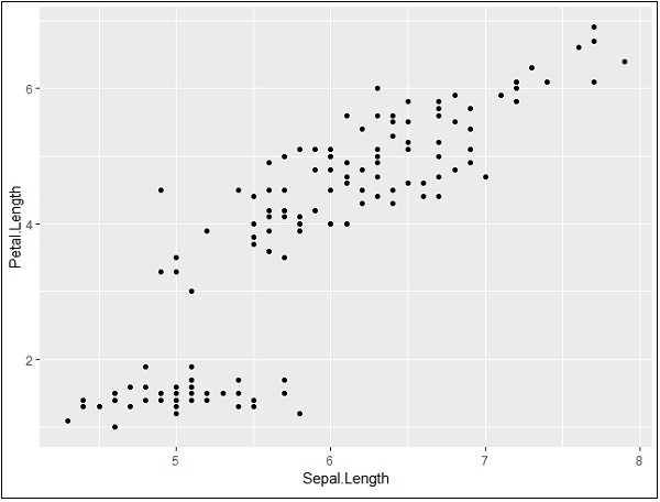
要创建基本散点图,请执行以下命令:
> # Basic Scatter Plot
> ggplot(iris, aes(Sepal.Length, Petal.Length)) +
+    geom_point()
添加属性
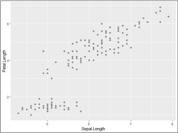
我们可以使用 geom_point() 函数中的 shape 属性更改点的形状。
> # Change the shape of points
> ggplot(iris, aes(Sepal.Length, Petal.Length)) +
+    geom_point(shape=1)
我们可以为点添加颜色,这些颜色添加到所需的散点图中。
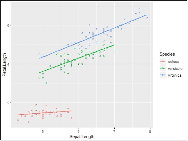
> ggplot(iris, aes(Sepal.Length, Petal.Length, colour=Species)) +
+    geom_point(shape=1)
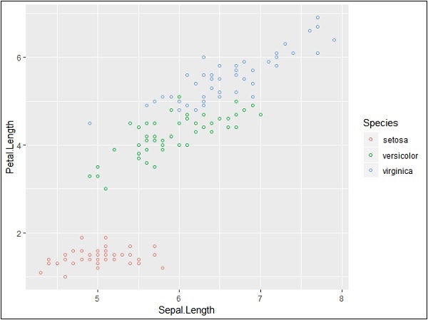
在这个例子中,我们根据图例中提到的物种创建了颜色。这三个物种在提到的图中得到了独特的区分。
现在我们将重点关注建立变量之间的关系。
> ggplot(iris, aes(Sepal.Length, Petal.Length, colour=Species)) +
+    geom_point(shape=1) +
+    geom_smooth(method=lm)
geom_smooth 函数有助于重叠模式的建立以及所需变量模式的创建。
属性方法“lm”指的是需要生成的回归线。
> # Add a regression line
> ggplot(iris, aes(Sepal.Length, Petal.Length, colour=Species)) +
+    geom_point(shape=1) +
+    geom_smooth(method=lm)
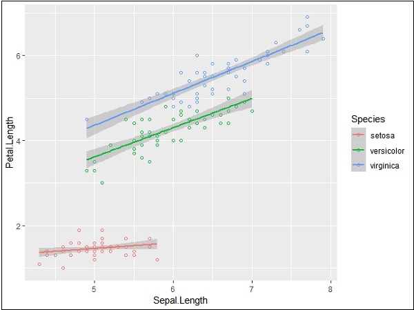
我们还可以使用下面提到的语法添加没有阴影置信区域的回归线:
># Add a regression line but no shaded confidence region
> ggplot(iris, aes(Sepal.Length, Petal.Length, colour=Species)) +
+    geom_point(shape=1) +
+    geom_smooth(method=lm, se=FALSE)
阴影区域代表置信区域以外的事物。
抖动图
抖动图包括特殊效果,可以使用这些效果来描绘散点图。抖动只不过是分配给点以将它们分开的一个随机值,如下所示:
> ggplot(mpg, aes(cyl, hwy)) +
+    geom_point() +
+    geom_jitter(aes(colour = class))

广告