- 大数据分析教程
- 大数据分析 - 首页
- 大数据分析 - 概述
- 大数据分析 - 特点
- 大数据分析 - 数据生命周期
- 大数据分析 - 架构
- 大数据分析 - 方法论
- 大数据分析 - 核心交付成果
- 大数据采用与规划考虑
- 大数据分析 - 关键利益相关者
- 大数据分析 - 数据分析师
- 大数据分析 - 数据科学家
- 大数据分析有用资源
- 大数据分析 - 快速指南
- 大数据分析 - 资源
- 大数据分析 - 讨论
大数据分析 - 图表
分析数据的首要方法是进行可视化分析。这样做的目标通常是寻找变量之间的关系和变量的单变量描述。我们可以将这些策略分为:
- 单变量分析
- 多变量分析
单变量图形方法
单变量是一个统计术语。实际上,这意味着我们希望独立于其余数据分析单个变量。能够有效地做到这一点的图表包括:
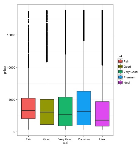
箱线图
箱线图通常用于比较分布。这是直观检查不同分布之间是否存在差异的好方法。我们可以查看不同切割方式下钻石价格是否存在差异。
# We will be using the ggplot2 library for plotting
library(ggplot2)
data("diamonds")

# We will be using the diamonds dataset to analyze distributions of numeric variables
head(diamonds)

#    carat   cut       color  clarity  depth  table   price    x     y     z
# 1  0.23    Ideal       E      SI2    61.5    55     326     3.95  3.98  2.43
# 2  0.21    Premium     E      SI1    59.8    61     326     3.89  3.84  2.31
# 3  0.23    Good        E      VS1    56.9    65     327     4.05  4.07  2.31
# 4  0.29    Premium     I      VS2    62.4    58     334     4.20  4.23  2.63
# 5  0.31    Good        J      SI2    63.3    58     335     4.34  4.35  2.75
# 6  0.24    Very Good   J      VVS2   62.8    57     336     3.94  3.96  2.48

### Box-Plots
p = ggplot(diamonds, aes(x = cut, y = price, fill = cut)) +
   geom_box-plot() +
   theme_bw()
print(p)
我们可以从图中看出,不同切割类型的钻石价格分布存在差异。
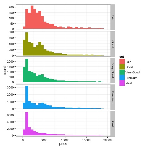
直方图
source('01_box_plots.R')

# We can plot histograms for each level of the cut factor variable using
facet_grid
p = ggplot(diamonds, aes(x = price, fill = cut)) +
   geom_histogram() +
   facet_grid(cut ~ .) +
   theme_bw()

p
# the previous plot doesn’t allow to visuallize correctly the data because of
the differences in scale
# we can turn this off using the scales argument of facet_grid

p = ggplot(diamonds, aes(x = price, fill = cut)) +
   geom_histogram() +
   facet_grid(cut ~ ., scales = 'free') +
   theme_bw()
p

png('02_histogram_diamonds_cut.png')
print(p)
dev.off()
上述代码的输出如下:
多变量图形方法
探索性数据分析中的多变量图形方法旨在寻找不同变量之间的关系。通常使用两种方法来实现此目的:绘制数值变量的相关矩阵,或者简单地将原始数据绘制为散点图矩阵。
为了演示这一点,我们将使用diamonds数据集。要运行代码,请打开脚本bda/part2/charts/03_multivariate_analysis.R。
library(ggplot2)
data(diamonds)

# Correlation matrix plots
keep_vars = c('carat', 'depth', 'price', 'table')
df = diamonds[, keep_vars]
# compute the correlation matrix
M_cor = cor(df)

#          carat       depth      price      table
# carat 1.00000000  0.02822431  0.9215913  0.1816175
# depth 0.02822431  1.00000000 -0.0106474 -0.2957785
# price 0.92159130 -0.01064740  1.0000000  0.1271339
# table 0.18161755 -0.29577852  0.1271339  1.0000000

# plots
heat-map(M_cor)
代码将产生以下输出:
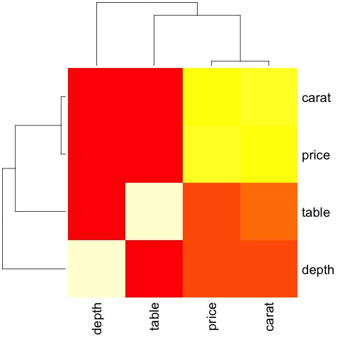
这是一个摘要,它告诉我们价格和克拉之间存在很强的相关性,而其他变量之间则相关性不大。
当我们有很多变量时,相关矩阵非常有用,在这种情况下,绘制原始数据是不切实际的。如前所述,也可以显示原始数据:
library(GGally)
ggpairs(df)
我们可以从图中看到热图中显示的结果得到了证实,价格和克拉变量之间存在0.922的相关性。
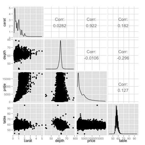
可以在散点图矩阵的(3, 1)索引中找到价格-克拉散点图,可以直观地看到这种关系。
广告