
 数据结构
数据结构 网络
网络 关系数据库管理系统(RDBMS)
 操作系统
操作系统 Java
Java MS Excel
 iOS
iOS HTML
HTML CSS
CSS Android
 Python
 C语言编程
C语言编程 C++
C++ C#
C# MongoDB
 MySQL
MySQL Javascript
 PHP
PHP 物理学
物理学 化学
化学 生物学
生物学 数学
数学 英语
英语 经济学
经济学 心理学
心理学 社会学
社会学 服装设计
服装设计 法律研究
法律研究如何在Material UI中使用输入装饰(Input Adornments)向TextField添加图标?
在本文中,我们将学习如何在Material UI中使用输入装饰(input adornments)向文本字段添加图标。但在学习如何使用输入装饰向文本字段添加图标之前,我们必须了解什么是输入装饰?输入装饰只不过是添加到文本字段的额外文本或图标。它们位于三个不同的位置,包括前缀、后缀和操作。
InputAdornment API
<InputAdornment> - 此API用于在React MUI中的输入元素添加前缀、后缀或操作。
属性
position − 此属性用于将输入装饰位置设置为末尾或开头。
children − 此属性用于添加子组件和/或IconButton组件。
classes − 此属性允许您自定义或向组件添加样式。
component − 此属性用于根节点。
disablePointerEvents − 此属性用于禁用根元素的指针事件。
disableTypography − 此属性用于禁用包装Typography组件(仅当子元素为字符串类型时)。
sx − 此属性用于在Material UI中添加样式。
variant − 此属性用于添加不同的变体,例如标准、填充或轮廓。
向TextField添加图标的步骤
以下是使用其各自语法在Material UI中添加图标以及输入装饰的步骤:
步骤1:创建React应用程序
在我们进一步添加图标作为输入装饰之前,我们必须拥有一个React应用程序。要创建一个新的React应用程序,请在您的终端中运行以下命令:
npx create react app sliderproject
项目创建完成后,运行以下命令导航到其目录:
cd sliderproject
步骤2:安装Material UI
创建React应用程序后,是时候将Material UI安装到React应用程序中了。要安装MUI,请运行以下命令:
npm install @mui/material @emotion/react @emotion/styled
步骤3:使用TextField添加图标
现在,让我们使用输入装饰导入并添加带有TextField的图标。要在文本字段或普通输入组件中添加装饰,我们使用MUI中的InputAdornment组件。以下是该组件与输入组件一起使用的示例。
<Input
   id="input-with-adorn"
   endAdornment={
      <InputAdornment position="position">
         <IconComponent color=”red” />
      </InputAdornment>
   }
/>
步骤4:运行项目
要运行React MUI应用程序,请在终端中运行以下命令:
npm run start
就是这样!现在我们已经成功学习了在MUI中使用输入装饰向文本字段添加图标的步骤。
示例
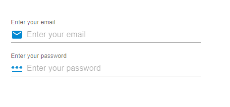
在这个示例中,我们创建了电子邮件和密码输入字段。在这里,我们将图标与文本字段添加为前缀输入装饰,或者可以说是在输入组件的开头。
import React from "react";
import { FormControl, Input, InputAdornment, InputLabel } from "@mui/material";
import { Mail, PasswordOutlined } from "@mui/icons-material";

const App = () => {

   return (
      <div style={{
         padding: 40,
         width: '70%',
         display: 'flex',
         flexDirection: 'column',
         gap: 20
      }}>
         <FormControl variant="standard">
            <InputLabel htmlFor="label-suffix-adornment">
               Enter your email
            </InputLabel>
            <Input
               id="suffix-adornment"
               placeholder="Enter your email"
               startAdornment={
                  <InputAdornment position="start">
                     <Mail color="info" />
                  </InputAdornment>
               }
            />
         </FormControl>
         <FormControl variant="standard">
            <InputLabel htmlFor="label-suffix-adornment">
               Enter your password
            </InputLabel>
            <Input
               id="suffix-adornment"
               placeholder="Enter your password"
               startAdornment={
                  <InputAdornment position="start">
                     <PasswordOutlined color="info" />
                  </InputAdornment>
               }
            />
         </FormControl>
      </div>
   );
};
export default App;
输出
示例
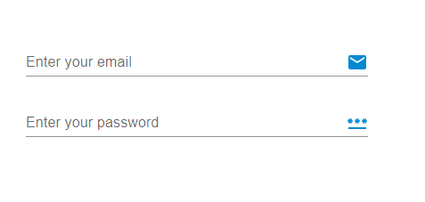
在这个示例中,我们也创建了电子邮件和密码输入字段。但是在这里,我们将图标与文本字段添加为后缀输入装饰,或者可以说是在输入组件的结尾。
import React from "react";
import { FormControl, Input, InputAdornment, InputLabel } from "@mui/material";
import { Mail, PasswordOutlined } from "@mui/icons-material";

const App = () => {

   return (
      <div style={{
         padding: 40,
         width: '70%',
         display: 'flex',
         flexDirection: 'column',
         gap: 20
      }}>
         <FormControl variant="standard">
            <InputLabel htmlFor="label-prefix-adornment">
               Enter your email
            </InputLabel>
            <Input
               id="prefix-adornment"
               placeholder="Enter your email"
               endAdornment={
                  <InputAdornment position="end">
                     <Mail color="info" />
                  </InputAdornment>
               }
            />
         </FormControl>
         <FormControl variant="standard">
            <InputLabel htmlFor="label-prefix-adornment">
               Enter your password
            </InputLabel>
            <Input
               id="prefix-adornment"
               placeholder="Enter your password"
               endAdornment={
                  <InputAdornment position="end">
                     <PasswordOutlined color="info" />
                  </InputAdornment>
               }
            />
         </FormControl>
      </div>
   );
};
export default App;
输出
示例
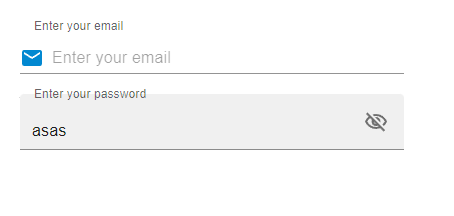
在这个示例中,我们创建了电子邮件和密码输入字段。但是在这里,我们为密码输入字段创建了一个操作。当用户在输入字段中输入密码并想要查看密码时,按钮中的可见性图标允许他们查看密码,因为它会隐藏或显示文本字段输入中的文本。
import React from "react";
import { FilledInput, FormControl, IconButton, Input, InputAdornment, InputLabel } from "@mui/material";
import { Mail, VisibilityOffOutlined, VisibilityOutlined } from "@mui/icons-material";
import { useState } from "react";

const App = () => {
   const [psw, setPsw] = useState(false);
   const handleShowPsw = () => setPsw((show) => !show);
   const handleHidePsw = (e) => {
      e.preventDefault();
   };

   return (
      <div style={{
         padding: 40,
         width: '70%',
         display: 'flex',
         flexDirection: 'column',
         gap: 20
      }}>
         <FormControl variant="outlined">
            <InputLabel htmlFor="label-prefix-adornment">
               Enter your email
            </InputLabel>
            <Input
               id="suffix-adornment"
               placeholder="Enter your email"
               startAdornment={
                  <InputAdornment variant="outlined" position="start">
                     <Mail color="info" />
                  </InputAdornment>
               }
            />
         </FormControl>
         <FormControl variant="outlined">
            <InputLabel htmlFor="label-prefix-adornment">
               Enter your password
            </InputLabel>
            <FilledInput
               type={psw ? 'text' : 'password'}
               endAdornment={
                  <InputAdornment position="start">
                     <IconButton
                        onClick={handleShowPsw}
                        onMouseDown={handleHidePsw}
                        edge="end"
                     >
                        {psw ? <VisibilityOffOutlined /> : <VisibilityOutlined />}
                     </IconButton>
                  </InputAdornment>
               }
            />
         </FormControl>
      </div>
   );
};
export default App;
输出
示例
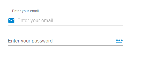
在这个示例中,我们向输入文本字段添加了前缀和后缀。startAdornment和endAdornment属性允许用户添加这些装饰。此处开头和结尾的图标充当前缀和后缀。
import React from "react";
import { FormControl, Input, InputAdornment, InputLabel } from "@mui/material";
import { Mail, PasswordOutlined } from "@mui/icons-material";

const App = () => {
   return (
      <div style={{
         padding: 40,
         width: '80%',
         display: 'flex',
         flexDirection: 'column',
         gap: 20
      }}>
      <FormControl variant="outlined">
         <InputLabel htmlFor="label-prefix-adornment">
            Enter your email
         </InputLabel>
         <Input
            id="suffix-adornment"
            placeholder="Enter your email"
            startAdornment={
               <InputAdornment variant="outlined" position="start">
                  <Mail color="info" />
               </InputAdornment>
            }
         />
      </FormControl>
      <FormControl variant="standard">
         <InputLabel htmlFor="label-prefix-adornment">
            Enter your password
         </InputLabel>
         <Input
            id="prefix-adornment"
            placeholder="Enter your password"
            endAdornment={
               <InputAdornment position="end">
                  <PasswordOutlined color="info" />
               </InputAdornment>
            }
         />
      </FormControl>
      </div>
   );
};
export default App;
输出
结论
在本文中,我们学习了在MUI中使用输入装饰向文本字段添加图标的完整分步过程。我们已经看到了使用的API及其相关的属性,以便将图标添加为输入装饰。除此之外,我们还看到了多个示例及其输出,例如添加前缀或后缀装饰、向装饰添加操作以及同时使用两者。这些输入装饰有助于提供良好的用户界面,并帮助用户轻松识别输入字段中需要填写哪种类型的输入。

1K+ 浏览量
