
 数据结构
数据结构 网络
网络 关系型数据库管理系统
 操作系统
操作系统 Java
Java MS Excel
 iOS
iOS HTML
HTML CSS
CSS Android
 Python
 C 语言编程
 C++
C++ C#
C# MongoDB
 MySQL
MySQL Javascript
 PHP
PHP 物理学
物理学 化学
化学 生物学
生物学 数学
数学 英语
英语 经济学
经济学 心理学
心理学 社会学
社会学 时尚研究
时尚研究 法律研究
法律研究如何在 Material UI 中使用表单组创建受控开关?
React MUI 中的开关是一种输入元素,允许用户选择任何一种状态,通常是开或关状态。这些通常用于调整移动设备上的设置。它只是一个检查类型的按钮,有助于切换两种预定义状态之一。
在本文中,我们将学习如何在 Material UI 中使用表单组创建受控开关。使用 FormGroup 的原因是它提供了一个包装器,允许对选择控制组件进行分组,并提供更简单的 API。
创建受控开关的步骤
以下是使用 Material UI 创建受控开关组件的步骤,以及它们各自的语法:
步骤 1:创建 React 应用程序
在进一步创建滑块之前,我们必须拥有一个 React 应用程序。要创建一个新的 React 应用程序,请在您的终端中运行以下命令:
npx create react app sliderproject
项目创建完成后,通过运行以下命令导航到其目录:
cd sliderproject
步骤 2:安装 Material UI
创建 React 应用程序后,是时候将 Material UI 安装到 React 应用程序中了。要安装 MUI,请运行以下命令:
npm install @mui/material @emotion/react @emotion/styled
步骤 3:使用 Switch 定义 FormGroup
现在,让我们使用表单组导入和定义开关组件:
<FormGroup>
   <FormControlLabel
      control={
         <Switch
            checked={checked}
            onChange={handleSwitch}
            inputProps={{ 'aria-label': 'controlled-switch' }}
         />
      }
      label="Controlled Switch 1"
   />
   <FormControlLabel
      control={
         <Switch
            checked={checked}
            onChange={handleSwitch}
            inputProps={{ 'aria-label': 'controlled-switch' }}
         />
      }
      label="Controlled Switch 2"
   />
   …
</FormGroup>
步骤 4:运行项目
要运行 React MUI 应用程序,请在终端中运行以下命令:
npm run start
就是这样!现在我们已经成功学习了在 MUI 中使用表单组创建受控开关的步骤。
Switch API
<Switch> - 此 API 用于创建开关组件,以便在 React MUI 中打开或关闭状态。
属性
"checked" - 用于指示组件是否应被选中。
"checkedIcon" - 用于指定组件被选中或切换时应显示的图标。
"classes" - 允许您自定义或向组件添加样式。
"color" - 允许您为开关组件选择颜色。
"defaultChecked" - 当开关不受控时设置默认值。
"disabled" - 禁用开关组件,阻止用户交互。
"disableRipple" - 关闭开关组件中的效果。
"edge" - 在组件的一侧添加负边距。
"icon" - 允许您添加在未选中或未切换时显示的图标。
"id" - 为与此开关组件关联的输入元素分配 ID 属性。
"inputProps" - 将属性应用于此开关的输入元素。
"inputRef" - 将引用传递到此开关内的输入元素。
"onChange" - 指定一个回调函数,当此开关的值发生变化时将触发该函数。
required - 此属性用于将开关组件定义为必填元素。
size - 此属性用于更改滑块的大小。
sx - 此属性用于在 Material UI 中添加样式。
value - 此属性用于向开关添加值。
示例
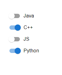
在此示例中,我们创建了基本的控制开关,这些开关在 FormGroup 组件和 Material UI 中进行了分组。
import React from "react";
import { FormControl, FormControlLabel, FormGroup, Switch } from "@mui/material";
import { useState } from "react";

const App = () => {
   const [swt, setSwt] = useState({
      java: false,
      cpp: true,
      javascript: false,
      python: true,
   });

   const handleSwitch = (e) => {
      setSwt({
         ...swt,
         [e.target.name]: e.target.checked,
      });
   };

   return (
      <div style={{
            padding: 40,
            width: '50%'
         }}>
         <FormControl component="fieldset" variant="standard">
            <FormGroup>
               <FormControlLabel
                  control={
                     <Switch
                        checked={swt.java}
                        onChange={handleSwitch}
                        inputProps={{ 'aria-label': 'controlled-switch' }}
                        name="java"
                     />
                  }
                  label="Java"
               />
               <FormControlLabel
                  control={
                     <Switch
                        checked={swt.cpp}
                        onChange={handleSwitch}
                        inputProps={{ 'aria-label': 'controlled-switch' }}
                        name="cpp"
                     />
                  }
                  label="C++"
               />
               <FormControlLabel
                  control={
                     <Switch
                        checked={swt.javascript}
                        onChange={handleSwitch}
                        inputProps={{ 'aria-label': 'controlled-switch' }}
                        name="javascript"
                     />
                  }
                  label="JS"
               />
               <FormControlLabel
                  control={
                     <Switch
                        checked={swt.python}
                        onChange={handleSwitch}
                        inputProps={{ 'aria-label': 'controlled-switch' }}
                        name="python"
                     />
                  }
                  label="Python"
               />
            </FormGroup>
         </FormControl>
      </div>
   );
};

export default App;
输出
示例
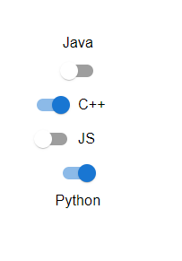
在此示例中,开关已使用控制状态创建,并且标签位于不同的位置。
import React from "react";
import { FormControl, FormControlLabel, FormGroup, Switch } from "@mui/material";
import { useState } from "react";

const App = () => {
   const [swt, setSwt] = useState({
      java: false,
      cpp: true,
      javascript: false,
      python: true,
   });

   const handleSwitch = (e) => {
      setSwt({
         ...swt,
         [e.target.name]: e.target.checked,
      });
   };

   return (
      <div style={{padding: 40,width: '50%'}}>
         <FormControl component="fieldset" variant="standard">
            <FormGroup>
               <FormControlLabel
                  control={
                     <Switch
                        checked={swt.java}
                        onChange={handleSwitch}
                        inputProps={{ 'aria-label': 'controlled-switch' }}
                        name="java"
                     />
                  }
                  label="Java"
                  labelPlacement="top"
               />
               <FormControlLabel
                  control={
                     <Switch
                        checked={swt.cpp}
                        onChange={handleSwitch}
                        inputProps={{ 'aria-label': 'controlled-switch' }}
                        name="cpp"
                     />
                  }
                  label="C++"
                  labelPlacement="right"
               />
               <FormControlLabel
                  control={
                     <Switch
                        checked={swt.javascript}
                        onChange={handleSwitch}
                        inputProps={{ 'aria-label': 'controlled-switch' }}
                        name="javascript"
                     />
                  }
                  label="JS"
                  labelPlacement="left"
               />
               <FormControlLabel
                  control={
                     <Switch
                        checked={swt.python}
                        onChange={handleSwitch}
                        inputProps={{ 'aria-label': 'controlled-switch' }}
                        name="python"
                     />
                  }
                  label="Python"
                  labelPlacement="bottom"
               />
            </FormGroup>
         </FormControl>
      </div>
   );
};
export default App;
输出
示例
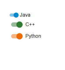
此示例演示了使用不同大小和颜色的表单组创建控制开关。
import React from "react";
import { FormControl, FormControlLabel, FormGroup, Switch } from "@mui/material";
import { useState } from "react";

const App = () => {
   const [swt, setSwt] = useState({
      java: false,
      cpp: true,
      python: true,
   });

   const handleSwitch = (e) => {
      setSwt({
         ...swt,
         [e.target.name]: e.target.checked,
      });
   };

   return (
      <div style={{padding: 40,width: '50%'}}>
         <FormControl component="fieldset" variant="standard">
            <FormGroup>
               <FormControlLabel
                  control={
                     <Switch
                        checked={swt.java}
                        onChange={handleSwitch}
                        inputProps={{ 'aria-label': 'controlled-switch' }}
                        name="java"
                        size="small"
                        color="info"
                     />
                  }
                  label="Java"
               />
               <FormControlLabel
                  control={
                     <Switch
                        checked={swt.cpp}
                        onChange={handleSwitch}
                        inputProps={{ 'aria-label': 'controlled-switch' }}
                        name="cpp"
                        size="medium"
                        color="success"
                     />
                  }
                  label="C++"
               />
               <FormControlLabel
                  control={
                     <Switch
                        checked={swt.python}
                        onChange={handleSwitch}
                        inputProps={{ 'aria-label': 'controlled-switch' }}
                        name="python"
                        size="large"
                        color="warning"
                     />
                  }
                  label="Python"
               />
            </FormGroup>
         </FormControl>
      </div>
   );
};
export default App;
输出
示例
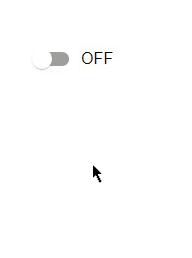
此示例演示了如何在 Material UI 中使用表单组创建受控开关。在这里,我们创建了一个由 React 中的状态管理控制的开关。现在,当开关切换时,它显示 ON;否则,它显示 OFF。
import React from "react";
import { FormControl, FormControlLabel, FormGroup, Switch } from "@mui/material";
import { useState } from "react";

const App = () => {
   const [swt, setSwt] = useState(false);
   const handleSwitch = (e) => {
      setSwt(!swt);
   };

   return (
      <div style={{padding: 40,width: '50%'}}>
         <FormControl component="fieldset" variant="standard">
            <FormGroup>
               <FormControlLabel
                  control={
                     <Switch
                        checked={swt.java}
                        onChange={handleSwitch}
                        inputProps={{ 'aria-label': 'controlled-switch' }}
                        name="Switch"
                        color={swt ? "success": "default"}
                        size="medium"
                     />
                  }
                  label={swt ? "ON" : "OFF"}
               />
            </FormGroup>
         </FormControl>
      </div>
   );
};
export default App;
输出
结论
本文介绍了在 React MUI 中使用表单组创建受控开关的完整过程。本文讨论了不同的示例及其各自的输出。

201 次查看
