
 数据结构
数据结构 网络
网络 关系数据库管理系统
 操作系统
操作系统 Java
Java MS Excel
 iOS
iOS HTML
HTML CSS
CSS Android
 Python
 C 编程
C 编程 C++
C++ C#
C# MongoDB
 MySQL
MySQL Javascript
 PHP
PHP 物理学
物理学 化学
化学 生物学
生物学 数学
数学 英语
英语 经济学
经济学 心理学
心理学 社会学
社会学 时尚研究
时尚研究 法律研究
法律研究如何在 Material UI 中控制徽章的可见性?
徽章在设计 Web UI 中发挥着重要作用,无论您是在构建社交媒体网站、消息应用程序还是任何其他需要使用徽章的应用。Material UI 提供了一种简单的方法来完成此任务,只需使用一个名为 Badge API 的组件。
因此,在本文中,我们将学习如何在 Material UI 中控制徽章的可见性。
但在深入探讨在 MUI 中控制徽章可见性的步骤之前,让我们首先了解徽章到底是什么。
什么是徽章?
徽章是一个小元素,主要附加在称为子组件的组件的右上角。徽章可能包含数字、文本或只是一个点。在 React MUI 中,这些徽章也可以控制,例如何时显示、显示什么内容、递增文本等。
徽章 API
BadgeAPI 用于向 React MUI 的不同组件添加徽章。它带有以下属性:
anchorOrigin - 此属性定义徽章组件的锚点。
badgeContent - 要渲染徽章的内容,使用 badgeContent 属性。
children - 我们可以使用“children”属性在徽章内添加任何所需的内容。
classes - classes 属性用于覆盖组件的样式。
color - color 属性允许自定义徽章颜色。
component - 这会渲染徽章中根组件的组件。
components - 这会渲染徽章或根组件内的其他徽章组件。
componentsProps - 这些是徽章组件的属性。
Invisible - 要使徽章不可见,请使用此属性。
max - 它显示徽章中最大数量的计数。max 值为 99。
overlap - 它允许徽章重叠。
showZero - 当计数为 0 时,此属性用于值控制。
slotProps - 使用此属性渲染插槽的其他属性。
slots - 这些是在徽章内部使用的每个插槽的组件。
sx - 要为此组件添加自定义样式,请使用“sx”属性。
variant - 要添加徽章的不同变体,使用 variant 属性。
控制徽章可见性所需的步骤
以下是控制 Material UI 中徽章可见性的步骤:
步骤 1:创建 React 应用程序
在 MUI 中控制徽章可见性的第一步是创建一个 React 应用程序。要创建一个新的 React 应用程序,请在您的终端中运行以下命令:
npx create react app badgeproject
项目创建完成后,通过运行以下命令导航到其目录:
cd badgeproject
步骤 2:将 MUI 添加到 React
创建 React 应用程序后,是时候将 Material UI 安装到 React 应用程序中了。要安装 MUI,请运行以下命令:
npm install @mui/material @emotion/react @emotion/styled
步骤 3:创建徽章
要添加或创建徽章,我们使用 <Badge> 组件。以下是相同的语法:
//To make the badge visible
<Badge badgeContent={count}>
   <IconName />
</Badge>

//To hide the badge
<Badge badgeContent={1} showZero>
   <IconName />
</Badge>
示例
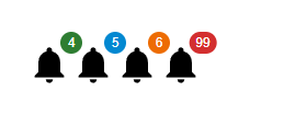
这是一个非常基本的示例,显示了具有不同颜色和值的徽章。在徽章组件中,我们只能有 99 的最大值,如以下输出的最后一个图标所示。
import React from "react";
import { Badge } from "@mui/material";
import Notification from "@mui/icons-material/Notifications";

const App = () => {
   return (
      <div style={{padding: 40,gap: 40,}}>
         <Badge badgeContent={4} color="success">
            <Notification sx={{ fontSize: 40 }} />
         </Badge>
         <Badge badgeContent={5} color="info">
            <Notification sx={{ fontSize: 40 }} />
         </Badge>
         <Badge badgeContent={6} color="warning">
            <Notification sx={{ fontSize: 40 }} />
         </Badge>
         <Badge badgeContent={99} color="error">
            <Notification sx={{ fontSize: 40 }} />
         </Badge>
      </div>
   );
};

export default App;
输出
示例
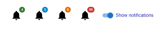
在此示例中,我们创建了不同的图标来显示徽章。在这里,当用户选择切换按钮时,徽章会显示。
import React from "react";
import { Badge, FormControlLabel, Switch } from "@mui/material";
import Notification from "@mui/icons-material/Notifications";
import { useState } from "react";

const App = () => {
   const [visibility, setVisibility] = useState(false);
   const handleBadgeVisibility = () => {
      setVisibility(!visibility);
   };
   return (
      <div style={{padding: 40, gap: 40, display: 'flex', flexDirection: 'row'}}>
         <Badge badgeContent={4} color="success" invisible={visibility}>
            <Notification sx={{ fontSize: 40 }} />
         </Badge>
         <Badge badgeContent={5} color="info" invisible={visibility}>
            <Notification sx={{ fontSize: 40 }} />
         </Badge>
         <Badge badgeContent={6} color="warning" invisible={visibility}>
            <Notification sx={{ fontSize: 40 }} />
         </Badge>
         <Badge badgeContent={99} color="error" invisible={visibility}>
            <Notification sx={{ fontSize: 40 }} />
         </Badge>
         <FormControlLabel
            sx={{ color: 'blue' }}
            control={<Switch checked={!visibility} onChange={handleBadgeVisibility} />}
            label="Show notifications"
         />
      </div>
   );
};

export default App;
输出
示例
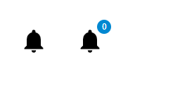
在此示例中,我们创建了一个在 MUI React 中没有值的徽章。这里,在第一个图标中,没有徽章,因为 badgeCount 设置为 0,而在第二个图标中,徽章的值为 0。在这里您会注意到一个变化,我们使用了 showZero 属性来显示带有 0 值的徽章。
import React from "react";
import { Badge } from "@mui/material";
import Notification from "@mui/icons-material/Notifications";
const App = () => {
   return (
      <div
         style={{
            padding: 40,
            gap: 40,
            display: 'flex',
            flexDirection: 'row'
         }}>
         <Badge badgeContent={0} color="success">
            <Notification sx={{ fontSize: 40 }} />
         </Badge>
         <Badge badgeContent={0} color="info" showZero={true}>
            <Notification sx={{ fontSize: 40 }} />
         </Badge>
      </div>
   );
};
export default App;
输出
示例
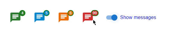
在此示例中,我们使用 & 创建了一个自定义徽章。MuiBadge-badge 属性在 MUI React 中可用。在这里,我们还使用切换创建了一个使用 React 状态的自定义函数,该函数在选中时使徽章可见。这里徽章使用不同的属性(如背景颜色、边框、填充等)进行自定义。
import React from "react";
import { Badge, FormControlLabel, Switch } from "@mui/material";
import {styled} from "@mui/material/styles";
import { useState } from "react";
import { Chat } from "@mui/icons-material";

const MyCustomBadge = styled(Badge)(() => ({
   '& .MuiBadge-badge': {
      right: -3,
      top: 5,
      border: `2px solid green`,
      padding: '0 4px',
   },
}));

const App = () => {
   const [visibility, setVisibility] = useState(false);

   const handleBadgeVisibility = () => {
      setVisibility(!visibility);
   };

   return (
      <div
         style={{
            padding: 40,
            gap: 40,
            display: 'flex',
            flexDirection: 'row'
         }}>
         <MyCustomBadge badgeContent={4} color="success" invisible={visibility}>
            <Chat sx={{ fontSize: 40 }} color="success" />
         </MyCustomBadge>
         <MyCustomBadge badgeContent={5} color="info" invisible={visibility}>
            <Chat sx={{ fontSize: 40 }} color="info" />
         </MyCustomBadge>
         <MyCustomBadge badgeContent={6} color="warning" invisible={visibility}>
            <Chat sx={{ fontSize: 40 }} color="warning" />
         </MyCustomBadge>
         <MyCustomBadge badgeContent={99} color="error" invisible={visibility}>
            <Chat sx={{ fontSize: 40 }} color="error" />
         </MyCustomBadge>
         <FormControlLabel
            sx={{ color: 'blue' }}
            control={<Switch checked={!visibility} onChange={handleBadgeVisibility} />}
            label="Show messages"
         />
      </div>
   );
};
export default App;
输出
结论
在本文中,我们学习了使用 React 中的 MUI 控制徽章可见性的完整过程。我们已经看到了控制徽章可见性的完整步骤,并且还看到了 Badge API 使用的属性。文章中还讨论了不同方法的不同示例,以便更好地理解整个过程。

22 次查看
